Molly Dilworth - projects
August 2010, Google Earth view of 16 Manhattan Avenue, Brooklyn NY Paintings for Satellites I have an inclination to work with materials that have had an obvious life before I use them; it's a challenge and a pleasure to make something from nothing. In the last year my practice has grown out of the studio in the form of large-scale rooftop paintings for Google Earth. My work is generally concerned with human perception of current conditions; the Paintings for Satellites are specifically concerned with the effects of the digital on our physical bodies. All my work begins a series of rules derived from existing conditions. As this project proliferates, it will take two forms - a community model, using local volunteers and paint from the waste stream and a design/build model, using solar-reflective paint, solar panels and green roofing contractors.
English to French, Italian, German & Spanish Dictionary - WordReference.com
MIT Creates Amazing UI From Levitating Orbs
Anyone else see The Avengers? Just like in Iron Man 1 and 2, Tony Stark has the coolest interactive 3-D displays. He can pull a digital wire frame out of a set of blueprints or wrap an exoskeleton around his arm. Those moments aren’t just sci-fi fun; they’re full of visionary ideas to explore and manipulate objects in 3-D space. Except for one thing: How would Stark feel all of these objects to move them around? Jinha Lee, from the Tangible Media Group of the MIT Media Lab, in collaboration with Rehmi Post and Hiroshi Ishii, has been playing with the idea of manipulating real floating objects in 3-D space to create a truly tactile user interface. It’s essentially a small field in which gravity doesn’t overcome an object. “There is something fundamental behind motivations to liberate physical matter from gravity and enable control. Interviewing Lee, I realized he’s one-part scientist, one-part philosopher. As of now, the concept has been proven, and Lee is already focusing on scale.
Backward Rain Forecast
Abbreviations and acronyms dictionary: Find definitions for over 4,219,000 abbreviations, acronyms, and initialisms
Can We Please Move Past Apple's Silly, Faux-Real UIs?
In recent years, the aesthetic of UIs has followed a dominant ideology that attempts to replicate the physical world. With a handful of software/product updates and new releases in the last few months, we’ve begun to see how it might be time to find a new balance (see Clive Thompson’s article in Wired and Sam Biddle’s on Gizmodo. As both Thompson’s and Biddle’s articles describe, the philosophy that drives the majority of contemporary UIs is called skeuomorphism. There is validity to a skeuomorphic approach. However, how Kindles replicate physical books is very subtle. Unfortunately, the iPad book app doesn’t achieve this level of sophistication. The point is that there’s something that feels gratuitously obvious about the philosophical approach Apple takes to the design of the iPad book app and many of its other recent application designs. However obvious Apple’s skeuomorphic approach to UI might be, it’s an approach that is hard to argue with. Really, iCal? [Image: J.
Google inscrit les données aux Beaux-Arts
Le Data-Art : ou comment utiliser des données comme matière première pour des projets artistiques. À l'image des expériences souvent réussies menées par le Creative Lab, ou la Google Data Arts Team, qui cherche à s'imposer sur le sujet. Avec, du côté de Google, quelques arrières pensées marketing, comme l'a montré l'une de ses récentes opérations de com'. Des données chiffrées utilisées comme matériel artistique. Ça s’appelle du Data-Art. Une démarche innovante poussée par Google pour soigner sa com’ et flatter l’efficacité de ses produits. Au-delà de ces effets d’annonce, Google fait du Data-Art un de ses principaux sujets de R&D, comme le raconte son service presse : Le Creative Lab est une équipe de designers, de rédacteurs, de technologues créatifs, de producteurs, de directeurs créatifs et de directeurs marketing dont la mission est de travailler sur des projets créatifs très divers qui font vivre l’image de Google. Not your mother’s JavaScript Expérimental et avant-gardiste.
Google Scholar
An E-Book UI That Lets You Flip Digital Pages, Just Like A Real Book
If a book is good, you should be so immersed in it that you don’t care how far you’ve read or how much further there is to go. Does that sound like a good rationalization for the generally terrible navigation schemes that we put up with in our e-books? I love my Kindle, but using percentages instead of page numbers makes me feel like I’m reading a calculator instead of a book. What if there were a way to tactilely navigate through an e-book in the same intuitive way we do with paper pages? This won’t help me with my Kindle issues, but iPad and tablet users, rejoice and flip to your heart’s content! Or will they? I don’t have quite that level of contempt for interfaces that dare to use metaphors from the physical world, but there is something uncanny-valley-ish about KAIST’s idea. And that’s the trouble. A page-flippable interface like KAIST’s isn’t going to let you do everything you expect it to, which means it’s just another language you have to learn.
Googlegeist
TutorGig Encyclopedia
iPhone App Tries To Make You Feel The Weather, Via Color
Both iOS and Android have weather widgets built right in, but weather apps have carved out a huge chunk of the app market all the same. So what’s missing in core weather apps? Detailed forecasts? Probably. But what about something a touch more visceral? Brisk, by TwoSolid, is an iPhone app with simple style. But on the other hand, Brisk cuts through the excess to focus on the core, answering the question “what is the weather like at this very moment?” Brisk’s UI features a warm-to-cool color gradient that’s more than just pretty. All the same, Brisk seems worth checking out when it’s available in the coming weeks. Sign up here.

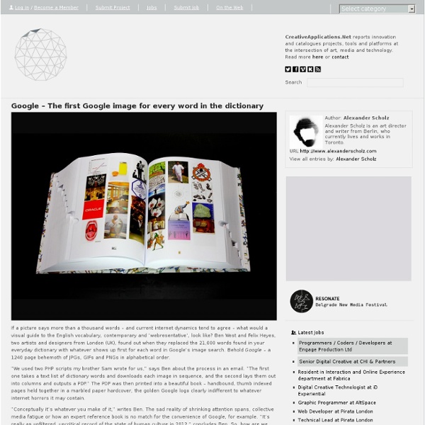
Ben West and Felix Heyes, two artists and designers from London (UK), found out when they replaced the 21,000 words found in your everyday dictionary with whatever shows up first for each word in Google’s image search. by agnesdelmotte May 29