
50 Great Examples of Data Visualization Wrapping your brain around data online can be challenging, especially when dealing with huge volumes of information. And trying to find related content can also be difficult, depending on what data you’re looking for. But data visualizations can make all of that much easier, allowing you to see the concepts that you’re learning about in a more interesting, and often more useful manner. Below are 50 of the best data visualizations and tools for creating your own visualizations out there, covering everything from Digg activity to network connectivity to what’s currently happening on Twitter. Music, Movies and Other Media Narratives 2.0 visualizes music.
15 Stunning Examples of Data Visualization Data Visualization is a method of presenting information in a graphical form. Good data visualization should appear as if it is a work of art. This intrigues the viewer and draws them in so that they can further investigate the data and info that the graphic represents. In this post there are 15 stunning examples of Data Visualization that are true works of art. The top 20 data visualisation tools One of the most common questions I get asked is how to get started with data visualisations. Beyond following blogs, you need to practise – and to practise, you need to understand the tools available. In this article, I want to introduce you to 20 different tools for creating visualisations: from simple charts to complex graphs, maps and infographics.
A Beautiful Poster Packed With a Year of Global Weather Data The Weather Radials poster is about as much meteorological data as you can cram onto a single sheet of paper. Raureif GmbH Each day of 2013 is represented by a single line. The bottom is the low temp; the top is the high. The color is dictated by the average.
10 Tools for Creating Infographics and Visualizations The author's posts are entirely his or her own (excluding the unlikely event of hypnosis) and may not always reflect the views of Moz. Hello there! I'm Miranda Rensch, Product Manager at SEOmoz and lover of visual communication. Communicating visually is one of the most effective ways to explain complex concepts and relationships, and can be a great way to explain your services/products and create valuable site content. I often use diagrams and whiteboarding in order to communicate new features and concepts internally with my team. 100 Diagrams That Changed the World Since the dawn of recorded history, we’ve been using visual depictions to map the Earth, order the heavens, make sense of time, dissect the human body, organize the natural world, perform music, and even concretize abstract concepts like consciousness and love. 100 Diagrams That Changed the World (public library) by investigative journalist and documentarian Scott Christianson chronicles the history of our evolving understanding of the world through humanity’s most groundbreaking sketches, illustrations, and drawings, ranging from cave paintings to The Rosetta Stone to Moses Harris’s color wheel to Tim Berners-Lee’s flowchart for a “mesh” information management system, the original blueprint for the world wide web. It appears that no great diagram is solely authored by its creator. Most of those described here were the culmination of centuries of accumulated knowledge. Most arose from collaboration (and oftentimes in competition) with others.
ImagePlot visualization software: explore patterns in large image collections What is ImagePlot? ImagePlot is a free software tool that visualizes collections of images and video of any size. It is implemented as a macro which works with the open source image processing program ImageJ. ImagePlot was developed by the Software Studies Initiative with support from the National Endowment for Humanities (NEH), the California Institute for Telecommunications and Information Technology (Calit2), and the Center for Research in Computing and the Arts (CRCA).
This site publishes high-touch, time-intensive data visualizations (and has a business that sustains it) Over 7,000 artists played in the New York City area in 2013. Only 21 of those later made it, really made it, headlining at a venue with an over 3,000-person capacity — among them, bigger names like Chance the Rapper, X Ambassadors, Sam Smith, and Sylvan Esso. I learned this sort of random but fascinating tidbit from a data visualization titled “The Unlikely Odds of Making it Big,” from the site The Pudding. The Pudding is the home to high-touch, painstakingly crafted data visualizations — what the site calls “visual essays” — that are distinct in their obsessive complexity over points of cultural curiosity. Most pieces stand wholly apart from the U.S. news cycle; no anxiety-inducing interactives around budget, taxes, health care. Want to see everywhere jazz legend Miles Davis is mentioned across Wikipedia, and how he’s connected to other people, recordings, and places?
pas mal pour les photos avant/après by sophiecommunication Nov 28
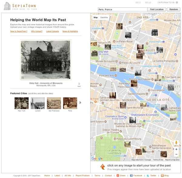
Mapped historical photos, film, and audio. by markbillson Aug 14