Accept Payments Online - WePay
10 Best Wireframe Tools for Creating Web Design
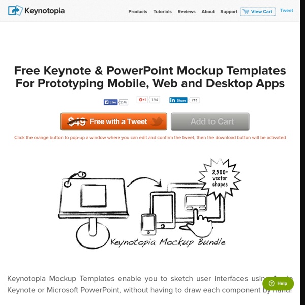
You can create wireframes in many ways and by using many tools, depending on how much money you are willing to spend on it and what you want out of it. Sometimes a pen and a paper is all you need. Some designers use some tools like Illustrator, Fireworks or PowerPoint for creating wireframes. We have a list of 10 Best Wireframe Tools For Web Designers. Pencil Pencil is the one of the most popular and widely used tools available out there. Advertisement Pidoco Pidoco is a really easy to use web-based prototyping tool that allows quick creation of clickable wireframes and UI prototypes for web, mobile and enterprise apps. PowerMockup PowerMockup is an add-on that converts Microsoft PowerPoint into a wireframe creation tool. ForeUI ForeUI is a really handy UI prototyping tool. Gliffy Gliffy is a really cool wireframe creation tool which allows dragging and dropping boxes, buttons, and lines from the web wireframe tool shape library to any place on the page. ProtoShare Balsamiq Mockups SketchFlow
Wavii
40 Innovative UI Concepts from Dribbble
Innovative concepts, whether practical or imaginative, can help progress creatives and their work to the next level. By breaking rules, ignoring common conventions, and testing the limits of design, we can create opportunities that allow us to enhance and improve our work. Take a look at some of these brilliantly designed interactions from Dribbble, and let them inspire creativity in your own work today. The Side Nav Revisited Appointment by Paresh Khatri Browse Shows – iOS App by Umar Irshad Dialoggs – Collapsible Menu by Drew Wilson Dashboard – Realtor Project by Brian Waddington Zendesk Project Lotus by Jason Wu Page Curls and Peels Qiwy iOS app curl test by Mikael Eidenberg Inside (first draft) – iPad – UI/UI/iOS by Cuberto Peel Back by Juan Sanchez Curl by Prathyush Pramod Bookmark for Magazines by Ugur Akdemir Folding Screens Photofold by Supratim Nayak Fold to unlock iOS style by Anton Kudin Flipweek agenda by Wouter ● Bread&Pepper UX/iOS idea with video process by Cuberto Dashboard by Kerem Suer
Web.AppStorm | Web Applications Reviewed, Rounded Up & Explained
How Many Daily Downloads Does It Take To Reach The Top Of The App Store?
It’s hard to underestimate how important ranking in Apple’s top 25 in the iTunes store is for mobile app developers. After all, the top 25 is probably the single most important app discovery mechanism for most iOS users. But how many downloads does it take to rank in the top 25? Mobile app store analytics firm Distimo today published some interesting data that answers just this question. Turns out, in the U.S. store, the answer currently is about 38,400 daily downloads for free iPhone apps and 3,530 for paid iPhone apps. To rank in the top 25 per category, of course, takes significantly fewer downloads, with games unsurprisingly being the most competitive category. For free apps, other competitive categories include ‘entertainment’ (6,700 daily downloads), ‘social networking’ (5,800), ‘lifestyle’ (3,900) and ‘music’ (3,900). These numbers, of course, are always changing and this just represent a snapshot of what Distimo found when it compiled this data last month.
[Infographic] Taking HTML5 to the Next Level for Mobile
By 2013, there will be more than 1 billion HTML5-capable browsers in use throughout the world. Applications for those HTML5 browsers will be created by 2 million HTML Web developers, according to research from IDC. There is no question that HTML5 is going to be a major factor in mobile development during the next five to 10 years. The rise of HTML5 does not mean the death of native applications, but as the standard progresses, many developers will begin to incorporate more HTML5 into their apps than native code. By 2015, IDC predicts that 80% of all mobile apps will be based wholly or in part on HTML5. It takes a village to raise a child - or, in this case, HTML5. But the mobile universe is not quite ready for a full-fledged HTML5 ecosystem yet. This is where Ringmark comes in. We did a couple of Ringmark tests by visiting Rng.io on mobile browsers to see how well they stack up. Here are the results: Opera Mini/Mobile Dolphin HD iOS Safari R.0: 97 passed -- R.1: 34 failed, 106 passed
The 7 deadly sins of mobile app design
This story is brought to you by Sourcebits, a Global leader in Strategy, User Experience & Engineering for Mobile & Cloud. Follow Sourcebits on Twitter for recent news and updates. In Anna Karenina, Leo Tolstoy wrote that “happy families are all alike; every unhappy family is unhappy in its own way.” Oddly, the same could be said of mobile apps. The best mobile apps share a set of common characteristics: they are elegant, effortless to use, pleasant to look at, and accomplish something needed or wanted. There are some common pitfalls to avoid when designing your own mobile app. One: Kitchen sink Above: I can fit one … more … feature … in! You are in love with the power of your app, but no-one else will be if you try to cram too much into it, or too much into your design. Think of Bump, the app for sharing data between phones easily. Simple is easy. Two: Inconsistency Above: I think it’s beautiful! Set a design language and keep to it. Three: Over designing Four: Speed (the lack thereof)


