Fantastic Information Architecture and Data Visualization Resources
Maps In Modern Web Design: Showcase and Examples - Smashing Magazine
Advertisement Geo-location was a hot topic in 2009. With so many applications on GPS-enabled smartphones, more maps than ever were accessible to the average person. But how can Web designers and developers take advantage of an increasingly location-aware user base? The Fundamentals Of Online Maps When most people think of maps on the Internet, Google, MapQuest and TomTom might come to mind. This isn’t a lesson in cartography, but understanding the purposes that maps can serve in modern Web design is important. Navigation and directions,Show relationships and trends geographically,Show points of interest. Interactive Maps The expansion of Web technology over the past decade has opened a number of doors to presenting data online. Interactive maps on the Internet present data most effectively when they invite action from the user. Panning and zooming are fundamental to the interactive map. No Legend Required On traditional print maps, the legend serves as a translator for the symbols used.
Understanding by Design
ARISTOTLE" (THE KNOWLEDGE WEB) By W. Daniel Hillis
Bush's imagined solution to this problem was something he called Memex. Memex was envisioned as a system for manipulating and annotating microfilm (computers were just then being invented). The system would contain a vast library of scholarly text that could be indexed by associations and personalized to the user Although Memex was never built, the World Wide Web, which burst onto the scene half a century later, is a rough approximation of it. As useful as the Web is, it still falls far short of Alexander's tutor or even Bush's Memex. For one thing, the Web knows very little about you (except maybe your credit card number). A New Tool for Learning Let's put aside the World Wide Web for a moment to consider what kind of automated tutor could be created using today's best technology. For example, one topic in the knowledge web might be Kepler's third law (that the square of a planet's orbital period is proportional to the cube of its distance from the sun). Table of Affordances
Dynamic Diagrams' take on the world of visual explanation, information architecture, design, and technology
UX Booth: User Experience & Usability Blog
Cool Infographics - Blog
Visualisation Magazine | collates the most creative and innovative visualisations of information
Jesse James Garrett: experience design and information architecture resources
The Ludologist » A History of Matching tile Games: Am I Missing Something?
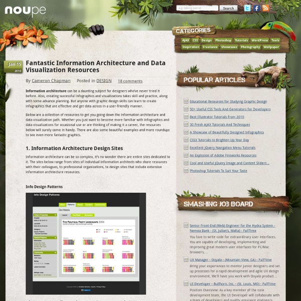
I am working on an article about the most disrespected and despised game genre there is. That’s right, matching tile games. For that, I am looking at tracing the innovations and developments of the last 20 or so years. The following tree is an attempt at illustrating the lineages of gameplay innovations from roughly Tetris to Chuzzle. For each game you can see the year of publication plus the innovations of that game listed with a “+” to the side. Arrows mean “family resemblance and probably inspiration” – I will not attempt to verify that a specific game designer was inspired by a specific other game. Question: Am I missing a game that contributed to the history of matching tile games? Click here to open a larger version of the diagram.
Related:
Related:
