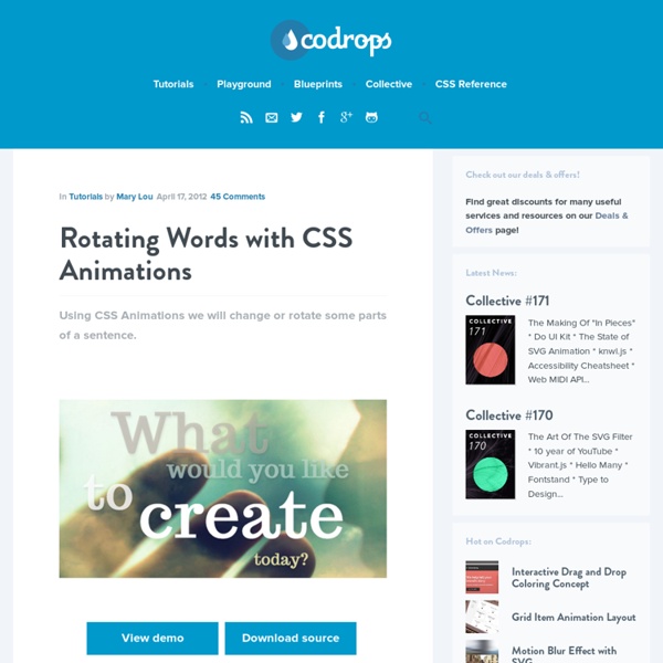
The Guide To CSS Animation: Principles and Examples Advertisement With CSS animation now supported in both Firefox and Webkit browsers, there is no better time to give it a try. Regardless of its technical form, whether traditional, computer-generated 3-D, Flash or CSS, animation always follows the same basic principles. In this article, we will take our first steps with CSS animation and consider the main guidelines for creating animation with CSS. We’ll be working through an example, building up the animation using the principles of traditional animation. Finally, we’ll see some real-world usages. CSS Animation Properties Before diving into the details, let’s set up the basic CSS: Animation is a new CSS property that allows for animation of most HTML elements (such as div, h1 and span) without JavaScript or Flash. Because the technology is still relatively new, prefixes for the browser vendors are required. All you need to get some CSS animation happening is to attach an animation to an element in the CSS: Those are the basics. Staging Arcs
All About Buttons: Inspiration, PSDs for Download, CSS Generators and Frameworks Whether they are used to subscribe to services, send a contact form or simply to call the user’s attention to a specific page, buttons are a very important part of websites. When well designed, they have the power to change conversion rates, bring new customers to a service or help users perform and validate specific tasks. No wonder web designers tend to put so much time and effort into creating nice, appealing buttons. In this article, we will present a showcase of websites that can inspire designers in their quest for the perfect button design, some websites to find and download nice PSD button templates. We will then take a look at some online tools to create nice HTML CSS buttons using CSS3 goodness, and finish with a showcase of pretty CSS button frameworks ready for use. All About Buttons Finding Inspiration on the Web: Button Showcases House of Buttons House of buttons is a nice Tumblr website that showcases great UI buttons spotted all over the web. CSS Button Makers Conclusion
Les sprites CSS - Alsacréations Le temps des onmouseover, des images préchargées via JavaScript et des autres joyeusetés héritées des grandes périodes de tag soup est, comme le temps des Elfes de la Terre du Milieu, définitivement révolu : faire des effets de rollover sur des images est tout à fait possible en utilisant uniquement les CSS. La technique consiste à exploiter un fichier unique pour stocker de multiples images, positionnées les unes à côté des autres. Celles-ci seront ensuite appelées dans la feuille de style, et la fenêtre d'affichage sur l'une ou l'autre image sera définie en CSS grâce à la propriété background-position. Attention : la technique exposée dans ce tutoriel est à manier avec précaution car elle peut engendrer des problèmes d'accessibilité (typiquement lorsque les images ne sont pas actives). Les avantages des sprites CSS sont multiples : Des sites à fort trafic (Youtube, Google, Facebook, Amazon, ...) exploitent cette technique sur des pages que vous consultez tous les jours : Inconvénients
Media Queries Experimental CSS3 Animations for Image Transitions Today we want to share some experimental 3D image transitions with you that use CSS3 animations and jQuery. We'll be using CSS3 3D Transforms for Webkit only. View demo Download source Today we want to share some experimental 3D image transitions with you that use CSS3 animations and jQuery. We’ll be using CSS3 3D Transforms for Webkit only. The images used in the demo are by Joanna Kustra. Please note that the 3D effects will only work in Webkit browsers. How it works Given a set of images, we’ll add the first image to the wrapper with the class te-cover. The main idea is to always show the regarding image using te-cover. Demos Each demo will have a group of possible transitions that can be selected from the dropdown menu above the image. We hope you like our little experiment and find it inspiring and useful!
CSS Buttons with Pseudo-elements In this tutorial, I'll show you how to create buttons with a twist, using just one anchor tag per button and the great power of CSS. View demo Download source Hola, amigos. For the last month or so, I’ve been experimenting with the power of CSS pseudo-elements, specially when it comes to mixing them with buttons and that way recreating some great effects that were only possible to do with sprites, in the past. In this tutorial, I’ll show you how to create buttons with a twist, using just one anchor tag per button and the great power of CSS. The font used is ‘Open Sans’ by Steve Matteson. Disclaimer:I’ll not be using CSS vendor prefixes in this tutorial or else it would be crazy long, but you will find them in the downloadable files. I avoided CSS transitions since, right now, Firefox is the only browser that supports them on pseudo-elements. Markup Example 1 I think this is the easiest one, with a very regular CSS. Then, we create the gray container using the ::before pseudo-element. Example 2
CSS3 Lightbox Today we want to show you how to create a neat lightbox effect using only CSS. The idea is to have some thumbnails that are clickable, and once clicked, the respective large image is shown. Using CSS transitions and animations, we can make the large image appear in a fancy way. View demo Download source With the help of the pseudo-class :target, we will be able to show the lightbox images and navigate through them. The beautiful images are by Joanna Kustra and they are licensed under the Attribution-NonCommercial 3.0 Unported Creative Commons License. Please note that this will only work with browsers that support the :target pseudo class. Let’s do it! The Markup We want to show a set of thumbnails, each one having a title that will appear on hover. The anchor for the thumbnail will point to the element with the id image-1 which is the division with the class lb-overlay. Note that we only use a navigation in the last demo. Let’s beautify this naked markup. The CSS And that’s all the style! Demos
Introduction · Intro to CSS 3D transforms › Docs Ladies and gentlemen, it is the second decade of the second millennium and we are still kicking around the same 2D interface we got three decades ago. Sure, Apple debuted a few apps for OSX 10.7 that have a couple more 3D flourishes, and Microsoft has had that Flip 3D for a while. But c’mon, 2011 is right around the corner. That’s Twenty Eleven folks. Granted, the capability of rendering complex 3D environments has been present for years. Rationale Like a beautiful jewel, 3D transform can be dazzling, a true spectacle to behold. The entire application does not, and should not, take advantage of 3D. Take for instance the Weather App on the iPhone. Also consider slide cycle plugins. 3D transforms are more than just eye candy. Current Support Environment The CSS 3D transforms module has been out in the wild for several year now. This all adds up to a bit of a challenge for those of us excited for 3D transforms. The choice is yours. So I bid you, in the words of the eternal Optimus Prime