
Anagrama | Brand Intelligence Group untitled Artist Vladimir Arkhipov About Vladimir Arkhipov You could say that Vladimir Arkhipov is one of the most versatile figures in Russian photography today, whose diversity of styles and genres never ceases to amaze. His preference for the classical … Read Moreframe composition and lighting often earns his pieces comparisons to Dutch painters' artwork. Russians rightfully call him Russia's Helmut Newton, a master of the scandalous who spares neither his health nor his equipment to incarnate his fearless vision in all sorts of extreme locations and weather conditions.
Star Wars™ Pancake Molds Mitsuko Nagone Photography | Inspiration Now Article collected from Fubiz™. Visit source. Mitsuko Nagone, a Japanese photographer, tried with her series New Self, New to Self to ‘create herself artistically instead of finding an identity. Hiding her face in various situations, discover wacky and successful shots in the article. Faber Films - Faceout Books Faber FilmsDesigner: Ed CornishAuthor: VariousTypefaces: Berthold Akzidenz Grotesk and ImpactGenre: FilmPublisher: Project sponsored by Faber and Faber, but these designs were never published Here is a great series designed by Ed Cornish. When I first saw these, I thought these were extremely unique covers. The more I learned about their creation, the more unique they became to me. Though not final covers, I think they merit being examined closely. Background These covers were designed as a response to the 2009 D&AD student award brief for typography, sponsored by Faber and Faber. I took inspiration from the perspex tile lettering commonly used in cinema signage. Creative Process It became clear early on that I would have to remove myself, quite a bit, from the design process if I was to make the covers look convincingly naive and clumsy. My tutor was keen on keeping the covers black and white so the categories were differentiated by arrangement and cropping of type rather than colour.
Phoebe | Ellen Rogers Photography I originally shot these for mother’s day, and wrote a very neurotic blog post to accompany it. It was neurotic by my standards which quite frankly frightened me. I got rid of it. I intended to mix these with images by my ever inspiriting sister and mother to be Annie. In time I hope we merge them to make a wholly suitable tribute to our mothers. The little girl in the images is called Phoebe, and she is wonderful, so inquisitive and playful.
Nigel Slater cooks a light and simple Sunday supper Strange, isn't it, how we often want a little something to eat in the evening, so soon after passing round the Sunday roast? Sometime around seven, I find an excuse (any excuse) to wander into the kitchen in search of the second, occasionally third, meal of the day. My head is keen to object on the grounds of greed. My tummy thinks otherwise. Last weekend was no exception. Four hours later, the sight of the cool, fudgy flesh of the leftover fish looked tempting, but the remains of Sunday lunch are too precious to scoff in a fit of Sunday evening peckishness. The "other Sunday meal" has long been made up of bits of the preceding lunch: snippets and nuggets from the roast, maybe leftover potatoes and greens fried up as a contemporary version of bubble and squeak, the meat stuffed into a doorstop sandwich of the best bread we can find on a Sunday. Puddings from Sunday lunch are often appreciated even more later in the day, when they have had time to settle. Heat an overhead grill.
CHOOSE FOREVER Designed with the LEO BURNETT Department of Design Team: Alisa Wolfson, Peter Ty, Casey Martin, Kelly Dorsey, Andy Luce Retail Ticket — Designed at Leo Burnett DOD Outfield — Designed at Leo Burnett DOD with DOD team Letterhead — Designed at Leo Burnett DOD Bill Murray at bat — Designed at Leo Burnett DOD with DOD team Celebrity Tickets — Designed at Leo Burnett DOD Booklet — Designed at Leo Burnett DOD Fans — Designed at Leo Burnett DOD Collateral — Designed at Leo Burnett DOD Kerry Wood — Designed at Leo Burnett DOD Designed at Leo Burnett DOD Pennant — Designed at Leo Burnett DOD Bill Murray — Designed at Leo Burnett DOD Designed at LB Department of Design, Alisa Wolfson Creative Director Cy's Tavern / co-op design with Matt George Materiel Magazine / co-op design with Michael Freimuth
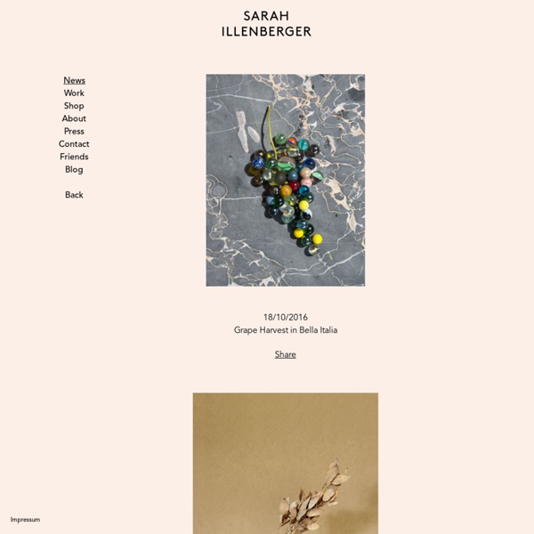
this isn't happiness.™ Peter Nidzgorski, tumblr ABOUT ARCHIVE FOLLOW Facebook Twitter Instagram Google+ Ads Via The Deck Math Rick and Morty (cont.) “Nothing is funnier than unhappiness.” — Samuel Beckett How to bend light, Mona Kuhn Cat power Going. Iron Man mashups Hey, that’s my bike. The man who fell the Earth Design Crush On the brink Louis-Ferdinand Céline Right now
claudia rogge's human body photography looks like baroque art ‘lost in paradise -paradise lost IV‘all images courtesy of claudia rogge german artist and photographer claudia rogge uses the human form as the study for her imagery influenced by the elaborate ornamentation of baroque style paintings. the specific arrangement and composition of the bodies often bring about visual illusions and complex patterning. her work often describes themes of mortality, beauty, lust, and sin. images from rogge’s recent series ‘lost in paradise’ sees variations of classical heavenly panoramas, translating the theme of baroque ceiling frescoes into photographic form. a hand-painted impression is achieved, represented by dramatic chiaroscuro and ornate motifs. the posing of the models strips them of their 3dimetionally, enhancing the optical trick. ‘lost in paradise – paradise lost 1′ ‘lost in paradise – paradise lost III’ ‘everafter purgatory III’ ‘everafter inferno I’ ‘foam city I’ ‘foam city II’ ‘hiob’ ‘camouflage I’ nina azzarello I designboom
molecular gastronomy In 1969, the hungarian born physicist Nicholas Kurti (1908-1998) held a presentation for the Royal Society entitled “The Physicist in the Kitchen”. He started of by refering to one of the aphorisms in Brillat-Savarin’s book “The physiology of taste” which translates to something like: “The invention of a new dish is of greater importance to the happiness of mankind, than the discovery of a new star” It was also in this presentation that we find the perhaps most quoted words by Nicholas Kurti: “I think it is a sad reflection on our civilization that while we can and do measure the temperature in the atmosphere of Venus we do not know what goes on inside our soufflés.” In his lecture, Kurti suggest using syringes to inject rum into mince pies and to use the proteolytic enzymes in fresh ananas juice to tenderize meats. Kurti also advocated low temperature cooking. This quotation is said to be one of Nicholas Kurti’s favorite quotations! Hervé This showing eggs immersed in colored solutions.
Top 100 des plus belles affiches de festivals français 2013 Né sur feu Fm-r en 2012, le Top 100 des plus belles affiches de festivals français revient en 2013 sur Konbini. Se basant sur trois critères (originalité, idée et sens, performance graphique), voici donc le classement de 265 affiches de l’année écoulée. Clairement, le niveau s’est élevé. Et c’est tant mieux ! Il est bien entendu question de dissocier illustration (art) et communication (stratégie). Illustrateurs, graphistes, peintres, photographes, dessinateurs : place aux artistes ! #1 : la claque de l’année. #4 : on avait oublié l’affiche 2012 (pourtant superbe) dans notre top l’an dernier. #7 : un homard qu’on croirait échappé de La Marche du Crabe. #14 : il y a comme une douce “rebellitude” qui émane de ce visuel : typo verticale, texture, sweat à capuche, tête baissée, yeux cachés, allumette au bec…#15 : Picasso période cubisme vs années 50. #17 : le corbeau & le rhino sur un arbre perché. #20 : là aussi, on était déjà passé à côté de l’affiche en 2012 : une perle.