
Measure Anything, Measure Everything Measure Anything, Measure Everything Posted by Ian Malpass | Filed under data, engineering, infrastructure If Engineering at Etsy has a religion, it’s the Church of Graphs. If it moves, we track it. Sometimes we’ll draw a graph of something that isn’t moving yet, just in case it decides to make a run for it. In general, we tend to measure at three levels: network, machine, and application. Application metrics are usually the hardest, yet most important, of the three. Meet StatsD StatsD is a simple NodeJS daemon (and by “simple” I really mean simple — NodeJS makes event-based systems like this ridiculously easy to write) that listens for messages on a UDP port. We like graphite for a number of reasons: it’s very easy to use, and has very powerful graphing and data manipulation capabilities. Not only is it super easy to start capturing the rate or speed of something, but it’s very easy to view, share, and brag about them. Why UDP? So, why do we use UDP to send data to StatsD? Measure Anything
Visualize This: The FlowingData Guide to Design, Visualization, and Statistics ZoomSphere - Global social statistics Monitor Your Digital Life With These Badass Smart Gauges | Gadget Lab The Nimbus syncs with your Android or iOS device via Wi-Fi. Photo: Quirky Your day at a glance. Photo: Quirky It doubles as an alarm clock. The Nimbus syncs with your Android or iOS device via Wi-Fi. Gauges are cool. The Nimbus personal dashboard has four of them and they’d look at home on the dash of any 1970′s muscle car. Information is displayed digitally with physical needles acting as a barometer of your watched items. The Nimbus syncs with your Android and iOS device with the Wink app over your home Wi-Fi. The only thing it’s missing is the rumble of V8.
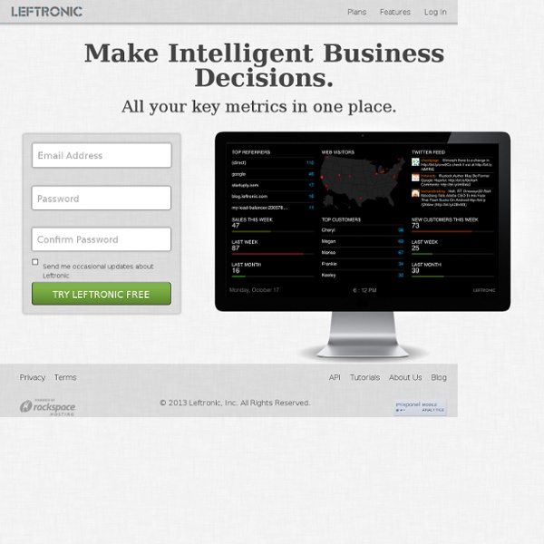
Leftronic services Peity • progressive <canvas> pie charts Peity (sounds like deity) is a jQuery plugin that converts an element's content into a <svg> mini pie 2/5 donut 5,2,3 line 5,3,9,6,5,9,7,3,5,2 or bar chart 5,3,9,6,5,9,7,3,5,2 and is compatible with any browser that supports <svg>: Chrome, Firefox, IE9+, Opera, Safari. Download version 3.2.1 Uncompressed 8.7Kb jquery.peity.js Minified 3.6Kb (+gzipped 1.7Kb) jquery.peity.min.js Source github.com/benpickles/peity Pie Charts Call peity("pie") on a jQuery selection. You can also pass delimiter, fill, height, radius and width options. <span class="pie">1/5</span><span class="pie">226/360</span><span class="pie">0.52/1.561</span><span class="pie">1,4</span><span class="pie">226,134</span><span class="pie">0.52,1.041</span><span class="pie">1,2,3,2,2</span> JavaScript $("span.pie").peity("pie") Donut Charts Donut charts are the same as pie charts and take the same options with an added innerRadius option which defaults to half the radius. $('.donut').peity('donut') Line Charts $(".line").peity("line") Events
DataClarity Corporation - IBM SPSS Predictive analytics helps your organization anticipate change so that you can plan and carry out strategies that improve outcomes. By applying predictive analytics solutions to data you already have, your organization can uncover unexpected patterns and associations and develop models to guide front-line interactions. Discover patterns and trends in your structured and unstructured data IBM SPSS Modeler is a powerful, versatile data mining workbench that helps you build accurate predictive models quickly and intuitively, without programming. With IBM SPSS Modeler you can: Discover patterns and trends in structured or unstructured data more easily, using a unique visual interface supported by advanced analytics.Model outcomes and understand what factors influence them so you can take advantage of opportunities and mitigate risks. IBM SPSS Modeler Products SPSS Modeler Premium Get all of the data mining features included with SPSS Modeler Professional, and much more! IBM SPSS Modeler Features
Real Time Search - Social Mention Focus on your KPIs | Leftronic Your business is unique and so are your metrics. We don’t force the same generic “business dashboard” onto everyone. Change the look and feel of your dashboards and focus on the KPIs that you care about. Our dashboards will put the emphasis on YOUR company. See the relevant KPIs Define your data range and add in goal markers for your graphs. Customize your widgets instantly Drag and drop to customize widget position and size. Custom CSS support Have full control over every pixel and color on your dashboard with custom CSS and build your own templates!