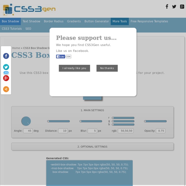
Box Shadow Generator
Use this CSS3 box shadow generator to quickly generate box shadow CSS for your project. Your browser does not support the CSS3 box-shadow property. You can still use this tool to generate the CSS3 rule, but you won't be able to see the results. <div class="error_msg">Please enable Javascript to use this page.</div> Box Shadow Explained The CSS3 box-shadow property allows you to add depth to your website's design without the need for images or extra container elements. While the syntax is easy to understand, it is hard to visualise the style using just code. The box-shadow syntax works as follows: The first value defines the distance of the box shadow in the x (horizontal) direction and the second value defines the distance in the y (vertical) direction. Optionally you can include an additional parameter after the blur distance: This defines the spread distance of the shadow. Supporting Browsers
Web development tutorials for HTML, XHTML, CSS, Javascript, PHP, and Java
Jquery Lightbox - jQuery Lightbox
960 Grid System
Free Online Image Editor
Responsive Web Design Layout Builder | Blog | Frecosse Website Design
We’re delighted to announce the launch of our great new utility for all web developers who are new to Responsive Web Design. This Responsive Web Design Template Builder, will create the framework code ready for your content. To help you get the most from this new utility, we’ve put together a quick how-to video, embedded in this post, that will have you up and running with responsive layouts in no time at all. So what is Responsive Web Design? Generally speaking, web developers will receive artwork, and then have to interpret that into a web layout, and for Responsive Web Design, this usually means adopting a grid system. Here at Frecosse, we often use the Skeleton grid system, developed by Dave Gamanche, who works for Twitter. To help, we’ve developed an internet first (we think!) This utility is in beta at the moment, and we’d love to hear your constructive criticism as to how it could be improved. We look forward to receiving your feedback.
Responsive Web Design Template Builder | Frecosse Website Design
The following tool is designed to allow you to quickly set-up the required code for your page layout using Dave Gamache's excellent Skeleton Grid System, which has been designed to help you present your content on multiple devices. You can add as many sections and cells as are required for your layout, and adjust the size of your grid cells by dragging the bottom-right corner (highlighted in red) in either horizontal direction. You can also adjust the order of your cells, even across sections, by doing a drag and drop when you see the move cursor. If you want to remove a grid cell, simply double-click on it. 26/07/2012 - Now if you enter 'header', 'nav' or 'footer' as your section id, it swaps it out for these new HTML5 open/close tags. We've made a quick video that shows you how to use this tool: We think we've already identified some obvious areas for improvement: Add feature to drag grid cells from one section to another? Have you got any ideas on how this utility could be improved?
Related:
Related:
