
CSS Layout Generator About the CSS Layout Generator The CSS Layout Generator was first released by Tony Aslett in October 2003, since then over 871,000 layouts have been generated. Updated in November 2010, HTML5 doctype can now be selected and a simple HTML5 template with appropriate tags will be created. Other HTML and XHTML doctypes are still available. The generator helps you create the structure of your website template using valid HTML and CSS. You can create a fluid or fixed width floated column layout, with up to 3 columns and with header and footer. The generator requires a modern DOM capable browser with JavaScript enabled. Instructions To create your layout select the structural elements your site requires (header, footer, columns). Info popups are available where you see InfoMore info example :) icon, just hover over it for more information. Join the CSS Forum to suggest changes or ask for help where needed. Author: Tony Aslett
Data Visualization Review: Gephi, Free Graph Exploration Software I do not often get to play with networks, yet I find them fascinating and full of knowledge gathering potential. The data visualization works of Moritz Stefaner, Jer Thorp, and Mark Lombardi captivate me. I am intrigued by relationships, how we perceive them, and how we can understand them. Gephi, the "Open Graph Viz Platform", is not just for the hobbiest node nerd. So what is Gephi capable off? Gephi interface displaying airline traffic data. Pros — Options! Cons — Interface is a bit cluttered. Main interface displaying the Diseasome data. Review Overall, Gephi is a useful and interesting tool. There are some plugins available for Gephi that extend the functionality. The only thing keeping Gephi from being a professional grade tool is its bugginess and lack of documentation. Graph of Minard's data using Gephi and the GeoLayout plugin. For the Purists Gephi is a purist's delight. Two nerdy charts of network statistics that Gephi will output.
[Boîte à outils] 5 applications pour créer sa propre infographie Esthétiques, claires, efficaces et surtout très virales, les infographies en tous genres envahissent la toile. Très sollicitées pour mettre en avant les chiffres clefs d’une études, les principales tendances d’un marché, elles sont utilisées par un panel d’acteurs : agences, cabinet d’études, blogueurs, médias, etc. Surfant sur cette tendance, plusieurs startups ont mis au point des web applications permettant à n’importe quel internaute de créer tout seul une infographie en ligne, en y insérant ses propres données. Tour d’horizon des 5 principaux outils actuellement disponibles. 1. En mars dernier, la plateforme de datavisualisation Visual.ly a lancé une nouvelle fonctionnalité baptisée Visual.ly Create. Visual.ly Create propose ainsi aux utilisateurs 7 types de templates différents. Visual.ly Create télécharge automatiquement en quelques secondes les données nécessaires. Lancé en juillet 2011, Visual.ly permet aux professionnels de partager leurs travaux de data-visualisation. 2. 3.
Case study: A brief review of online visualisation tools that can help There is a growing range of online tools to help users their data. This brief review highlights four online visualisation tools that can help. The links page also links to lots more useful resources. Online tools that can help visualise data (these tools are free to use, but any data uploaded is typically then available on the system for other users) highlighted below include: On the resources and links page, we also link to free software applications and libraries for visualising data, and development languages for more sophisticated data visualisation. Many Eyes Many Eyes was started by researchers from the IBM Visual Communication Lab, to encourage sharing and conversation around visualisations. Users can upload datasets to the Many Eyes website, and use the visualisation tools to explore the data (see the image below for some examples). Click for full size Gapminder World and Trendalyzer Maptube Users can:
Logo Creator Online. Design and Create Free Logos web 2.0 Quickly create a nice looking professional style logo using the SimWebSol free online logo creation tool. Choose background color, logo color, font face, font style (bold, italic, or underline) and font size. Add a reflection or a symbol to the left or right side to make it even more unique. Then choose PNG, GIF, or JPG, with DPI ranging from 72 to 1200. 20+ Tools to Create Your Own Infographics A picture is worth a thousand words – based on this, infographics would carry hundreds of thousands of words, yet if you let a reader choose between a full-length 1000-word article and an infographic that needs a few scroll-downs, they’d probably prefer absorbing information straight from the infographic. What’s not to like? Colored charts and illustrations deliver connections better than tables and figures and as users spend time looking back and forth the full infographic, they stay on the site longer. Plus, readers who like what they see are more likely to share visual guides more than articles. While not everyone can make infographics from scratch, there are tools available on the Web that will help you create your very own infographics. Read Also: The Infographic Revolution: Where Do We Go From Here? What About Me? “What About Me?” Vizualize.me Vizualize.me allows you to create an online resume format that is beautiful, relevant and fun, all with just one click. Piktochart easel.ly
A Community Where Developers & Designers Improve Their Craft CSS Query (I've been out of practice) James Robert Gardiner Hi guys, I've been majorly out of practice with website development, and I'm currently developing a website for a friend of mine. Desktop This software has been renamed to Gapminder World Offline Because of technical problems the software on this page is no longer being maintained! Please visit Gapminder World Offline (Beta) instead. Gapminder Desktop With Gapminder Desktop you can show animated statistics from your own laptop! Install the free software and watch the how-to video with Hans Rosling. Install With the Gapminder World you will be able to:Use the software without internet accessSave a list of your own favorite graphsUpdate automatically to the latest version Video: “How to use Gapminder Desktop” Installation instructions (Windows, Mac and Linux) 1. 2. If you are having trouble installing Gapminder Desktop using the button above you may try an alternative way.
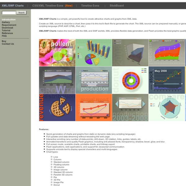
Aplicación para generar gráficas a partir de XML by valzor Jun 17