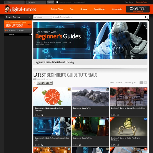


http://www.digitaltutors.com/training/beginners_guide-tutorials/
60 Awesome Search Engines for Serious Writers June 20th, 2010 Finding the information you need as a writer shouldn’t be a chore. Luckily, there are plenty of search engines out there that are designed to help you at any stage of the process, from coming up with great ideas to finding a publisher to get your work into print. Astronomer's guide to the solar system Dr Marek Kukula, Public Astronomer at the Royal Observatory, Greenwich, takes readers on a hitch-hiker's guide to our solar system using this collection of photographs showing the best "tourist" attractions of our solar system. The collection of pictures has been put together as the Royal Observatory launches its 2011 Astronomy Photographer of the Year contest, for pictures captured by humans. For more information on the competition, visit
8 Cheat Sheet Wallpapers for Designers and Developers Web designers and developers have a lot to remember, from keyboard shortcuts to function names. That’s why it’s handy to have cheat sheets near by for a quick reference. Most people like to print out there cheat sheets on paper and have them sitting on their desk, but another convenient place for a cheat sheet is right on your computers desktop in the form of a wallpaper. Here we’ve rounded up a few very useful cheat sheets for web designers and developers that can be used as desktop wallpapers. Photoshop Keyboard Shortcuts Become a Programmer, Motherfucker If you don't know how to code, then you can learn even if you think you can't. Thousands of people have learned programming from these fine books: Learn Python The Hard Way Learn Ruby The Hard Way Learn Code The Hard Way
Personal Finance Free Course Materials Looking for some resources to teach your teens about personal finance? Check out these sites that provide complete courses and lesson plans. They're all free. Building Your Future Here you can download, in PDF format, a financial literacy curriculum that includes three teacher guides and three accompanying student books covering banking, financing and investing. Personal Finance Resource Book Developed by a business education and math teacher, these lessons are provided through Curriki, an open education resource site. Practical Money Skills A collection of teachers guides, student activities and presentations.
Adobe Creative Suite Toolbar Shortcut Wallpapers [Exclusive] Designers can work hours into the night to produce their best work for clients, their portfolio or their pet projects. To make the process easier, most would use shortcut keys on their regular design and development tools particularly Adobe Photoshop, Illustrator, InDesign and Flash, to expediate the process. You can be sure that they are not going to go back to the traditional (and slower) click-and-search methods. That is why you can find tons of cheatsheets on the Web, designed to help designers and developers make better use of their time – in producing their masterpieces, not looking through the rows and rows of commands for the right action. 26 Sites That Pay You to Blog Writing paid post is perhaps the most straight forward ways to earn some revenue from blogging. The way pay post works hasn’t changed much; after reaching mutual agreement with advertisers, you write about them, they pay you. And if there is a 3rd party (middle man company) involve, they take cut. Most middle man company provides marketplace for advertisers to look for publishers, vice versa.
Free Curriculum - PreK - 8 The Easy Peasy All in One Homeschool – I’m working on a complete, online, free curriculum. It is for Pre K through high school. It is everything: reading, language arts, writing, art, music, science, history, math, computer, health/PE, Bible and logic. It has everything laid out. You can do it by course–like just use it for science–or, you can use it for everything. It’s laid out so that your child can go to day 4 and just go down all the assignments for that day.
Beautiful Typography with InDesign Community Translation Your transcript request has been submitted. Adobe TV does its best to accommodate transcript requests. It can take a few weeks for the transcript to become available in the Community Translation Project, so keep checking back. Join the Community Translation Project
12 Blogs That Can Expand Your Web Design Repertoire Web design, much like any technology related field, requires those who make their living in it to stay on top of it’s ever evolving nature. To maintain a high level of work, a web designer must always be looking for ways to expand his or her repertoire. This can involve learning new techniques, finding new software to increase productivity, or staying up to date on the latest design trends. All of this can take a lot of time and effort, but the web design community if full of generous people who offer up their knowledge for free in the form of a blog.