Visualisation de l'information : de multiples outils
Pascal Venier — Consultant | Digital Scholar
L'Œil au Carré : stratégies de veille sur Internet
Chart and image gallery: 30+ free tools for data visualization and analysis
November 7, 2013 03:21 PM ET The chart below originally accompanied our story 22 free tools for data visualization and analysis (April 20, 2011). We're updating it as we cover additional tools, including 8 cool tools for data analysis, visualization and presentation (March 27, 2012) and Six useful JavaScript libraries for maps, charts and other data visualizations (March 6, 2013). Click through to those articles for full tool reviews. Features: You can sort the chart by clicking on any column header once to sort in ascending order and a second time to sort by descending (browser JavaScript required). Skill levels are represented as numbers from easiest to most difficult to learn and use: Users who are comfortable with basic spreadsheet tasks Users who are technically proficient enough not to be frightened off by spending a couple of hours learning a new applicationPower usersUsers with coding experience or specialized knowledge in a field like GIS or network analysis.
Peace of Mind
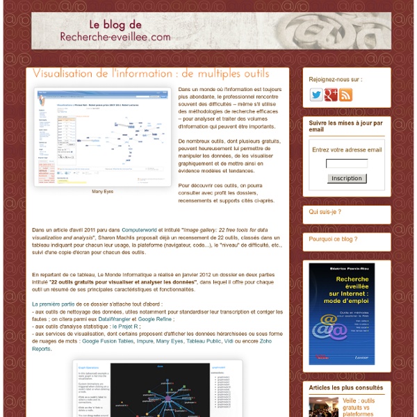
22 outils gratuits pour visualiser et analyser les données (1ère partie)
Vous avez des données à explorer ? Voici quelques outils qui pourront vous être utiles pour les transformer en informations et en graphiques attrayants. Pour faire parler des données, rien ne vaut une panoplie d'outils de visualisation graphique. Il en existe de nombreux, notamment destinés aux professionnels versés dans l'analyse statistique. Computerworld souligne que la correction des textes se fait simplement. DataWrangler (cliquer ici pour agrandir l'image) Niveau de compétences requis : débutant avancé.Fonctionne sur tout navigateur web.En savoir plus : - Google Refine : comme un tableurIl ressemble à un tableur pour examiner à la fois les données numériques et alphanumériques, mais à l'inverse du tableur, il ne permet pas d'effectuer des calculs. Refine intègre plusieurs algorithmes retrouvant les mots orthographiés différemment mais qui devraient en fait être regroupés. Google Refine (cliquer ici pour agrandir l'image)
50 Great Examples of Data Visualization
Wrapping your brain around data online can be challenging, especially when dealing with huge volumes of information. And trying to find related content can also be difficult, depending on what data you’re looking for. But data visualizations can make all of that much easier, allowing you to see the concepts that you’re learning about in a more interesting, and often more useful manner. Below are 50 of the best data visualizations and tools for creating your own visualizations out there, covering everything from Digg activity to network connectivity to what’s currently happening on Twitter. Music, Movies and Other Media Narratives 2.0 visualizes music. Liveplasma is a music and movie visualization app that aims to help you discover other musicians or movies you might enjoy. Tuneglue is another music visualization service. MusicMap is similar to TuneGlue in its interface, but seems slightly more intuitive. Digg, Twitter, Delicious, and Flickr Internet Visualizations
Related:
Related:
