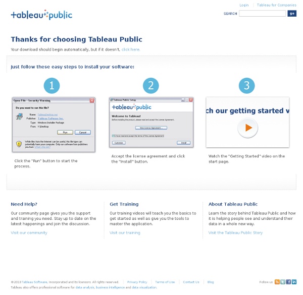
Services, Resources and Tools for Mapping Data — Making Governme
Long ago, putting together a map of data points would be the sole domain of a skilled GIS practitioner employing an application like ArcView. These days, particularly with the advent of Google Maps, Yahoo Maps and OpenStreetMap, et al., there are a multitude of options for an individual to employ in displaying data geographically. Of course, there are, and will always be, technical options that require some level of programming chops. Fortunately, the pool of drop dead easy implementations that anyone can throw together with ease has grown a lot over the last few years. Then, there is the growing middle ground, lying somewhere between easy but rigid and difficult but flexible. Personally, I tend to hover in this netherworld, leveraging existing code, services or tutorials when possible but occasionally finding myself diving into the more technical areas when necessary and learning a lot in the process. <li><a href="
Thinkmap visualization software facilitates communication, learning, and discovery.
Features
Enhanced Pathways and Presentation Tools VUE’s unique pathways tool now supports the construction of interactive presentations. The pathways tool allows the presenter and audience to focus in on specific content while at the same time maintaining a sense of its overall context within a VUE map. VUE authors may also navigate their pathways in a linear or non-linear fashion, allowing for “just-in-time teaching” and more in-depth exploration of a topic. Creating Pathways (Video running time: 48 sec.) Playback Pathways (Video running time: 37 sec.) Visualization Interactive Zoom (Video running time: 20 sec.) Visual Pruning (Video running time: 13 sec.) Exploration Tool (YouTube - time: 1:40) The exploration tools provide dynamic ways to select and fade out nodes and links, in addiiton to zooming in and out of the map during presentations. Dynamic Content Mapping Importing a CSV file into VUE (YouTube - time:1:45) Datasets (CSV) and XML feeds (RSS) can be imported into VUE. Semantic Mapping Tools
50 Great Examples of Data Visualization
Wrapping your brain around data online can be challenging, especially when dealing with huge volumes of information. And trying to find related content can also be difficult, depending on what data you’re looking for. But data visualizations can make all of that much easier, allowing you to see the concepts that you’re learning about in a more interesting, and often more useful manner. Below are 50 of the best data visualizations and tools for creating your own visualizations out there, covering everything from Digg activity to network connectivity to what’s currently happening on Twitter. Music, Movies and Other Media Narratives 2.0 visualizes music. Liveplasma is a music and movie visualization app that aims to help you discover other musicians or movies you might enjoy. Tuneglue is another music visualization service. MusicMap is similar to TuneGlue in its interface, but seems slightly more intuitive. Digg, Twitter, Delicious, and Flickr Internet Visualizations
Products: Google Browser
Use this free Java application to explore the connections between related websites. Try it now! Enter keywords or a URL, and click 'Graph it!' See Getting Started below for more details. Getting Started Make sure you have the latest version of java, at least Java 1.5 Type in your search keywords or a URL, and press "Graph It!" Sample Searches:
Using Wireframes to Streamline Your Development Process
Creating a wireframe is one of the first steps you should take before designing a website. A wireframe helps you organize and simplify the elements and content within a website and is an essential tool in the development process. A wireframe is basically a visual representation of content layout in a website design. The wireframe acts as a prototype that shows the placement of page features, such as header, footer, content, sidebars, and navigation. It also specifies the placement of the elements within these content areas. Benefits of Wireframing Creating a wireframe gives the client, developer, and designer an opportunity to take a critical look at the structure of the website and allows them to make revisions easily early on in the process. Wireframing brings the following key benefits: It gives the client an early, close-up view of the site design (or re-design). Tools for Wireframe Development You have many tools to choose from when creating a wireframe: Wireframe Example Best Practices
CCT General Information
General InformationMapping Great Debates: Can Computers Think? Maps | General information (large file!) | Details and features | Specifications | Issue areas | Press release Methodology | Background paper | The cartographic metaphor | Criteria | How the maps work (large file!) A set of 7 poster-sized argumentation maps that chart the entire history of the debate. Every map presents 100 or more major claims, each of which is summarized succinctly and placed in visual relationship to the other arguments that it supports or disputes. Status: All maps are available for viewing. Here is a list of the seven maps. MacroVU®, Inc.
PivotViewer Control
Getting Started Walking Through a Silverlight Application Take a tour of the XAML and Javascript generated by an application template that's installed with the Silverlight SDK. Organizing XAML Assets Learn how to organize XAML assets in Expression Design and Expression Blend to maximize developer efficiency. Hosting HTML Content This video demonstrates various ways you can use existing HTML content within your Silverlight application including full pages, fragments, or syndicated content. Understanding Mouse Input Learn about Mouse input and how to use some of the mouse functionality available in Silverlight. Using Custom Fonts Learn how to download and use a custom font with a Text Block in Silverlight. Adding Silverlight to a Web Page Learn what "silverlight.js" helper file is used for and what the parameters on the Silverlight plug-in can do. Silverlight 5 Silverlight 5 Release Overview In this video, Pete provides an overview of the new and updated features in the release of Silverlight 5.
Triptrop NYC: extraordinarily pretty subway maps from anywhere to everywhere in new york city
Customizing Block Histogram
Many Eyes Log in Explore Visualizations Data sets Comments Topic centers Participate Create a visualization Upload a data set Create a topic center Register Learn more Quick start Visualization types Data format and style About Many Eyes Blog Contact us Contact Report a bug Legal Terms of use Privacy Provide Feedback Popular tags: 2008 2009 2010 2011 A Obama budget census country crime education energy facebook food government health income internet lyrics media music network obama obesity people politics population president race school smoking social speech spending state states twitter unemployment us world See more » Customizing Block Histogram Data set: internet (Version 1) Your visualization will look like this: Required Visualization title Optional Tags Add your tags (separated by a space): Description (type the code from the image) Accessible Captcha An experiment brought to you by and
My Map | Christopher Baker
Email became an integral part of my life in 1998. Like many people, I have archived all of my email with the hope of someday revisiting my past. I am interested in revealing the innumerable relationships between me, my schoolmates, work-mates, friends and family. My Map can be viewed as a large scale static print (40″x40″ archival inkjet) or as an up-to-date dynamic visualization (see Quicktime video above).