
Responsive Web Design: What It Is and How To Use It Advertisement Almost every new client these days wants a mobile version of their website. It’s practically essential after all: one design for the BlackBerry, another for the iPhone, the iPad, netbook, Kindle — and all screen resolutions must be compatible, too. In the next five years, we’ll likely need to design for a number of additional inventions. When will the madness stop? It won’t, of course. In the field of Web design and development, we’re quickly getting to the point of being unable to keep up with the endless new resolutions and devices. Responsive Web design is the approach that suggests that design and development should respond to the user’s behavior and environment based on screen size, platform and orientation. The Concept Of Responsive Web Design Ethan Marcotte1 wrote an introductory article about the approach, “Responsive Web Design992,” for A List Apart. Transplant this discipline onto Web design, and we have a similar yet whole new idea. Adjusting Screen Resolution
Custom Sidebars Joins WPMU DEV's FREE Plugin Collection Custom Sidebars has become the latest addition to WPMU DEV’s collection of free plugins available for download in the WordPress Plugin Repository. Custom Sidebars allows you to create your own widgetized areas and custom sidebars, and select which sidebars to use on posts or pages. We acquired the highly rated and popular plugin after hiring its creator Javi Marquez. Javi said he originally created the plugin because he was building WordPress sites that required better sidebar functionality. He is now part of a core team at WPMU DEV working on an exciting new theme project. 15 Free WPMU DEV Plugins We have 15 plugins available for free in the repository, including lite editions of our popular Membership and MarketPress plugins. MarketPress – WordPress eCommerce offers a raft of features, including access to major payment gateways, support for major currencies, multiple shipping options, easy customization, powerful widgets and compatibility with Multisite. Chat – Add chat to your site.
11 Reasons why responsive web design isn't that cool! Since Ethan Marcotte published his seminal article on Responsive Web Design there’s been an explosion of articles related to this topic. The guy truly made a good work also publishing a book about it , deepening on what many consider, since then, should be a standard for web design. If you have no idea of what this thing is, this Responsive Web Design thing, but simultaneously you’ve been thinking and working on a way for your web projects to be viewable in multiple devices, then you are instinctively working on responsive web design. Here’s a little insight: The main objective of responsive web design is the inherent flexibility a website can acquire through the application of fluid grids, images and CSS Media Queries to adapt the content and design of the website to any device, even if it is a desktop computer, a laptop, an iPad or a Smartphone. You do not have to create a mobile version of your website; you do not have to create an application for every popular device on earth. 1.
The top 25 responsive web design tools | Web design Over the past few years we've seen an explosion of web-enabled devices with varying resolutions, capabilities, form factors, pixel densities, interaction methods and more. This onslaught of connected devices is just the beginning, and we're bound to see people accessing the web from a greater number of devices in the coming years. It's futile to create a dedicated web experience for every single device class out there, and the need to create a smart, flexible, adaptable web experiences is becoming more apparent every day. Responsive/adaptive/multi-device web design (whatever you want to call it) is here to stay. Just because responsive design is becoming necessary doesn't mean it's easy. Innovative tools These are formidable problems we're up against, but thankfully the web design community is up to the challenge. There's a lot to get excited about, but it can also be a huge task to keep track of the latest tips and tricks. 01. 02. This is where Jetstrap comes in. 03. 04. 05. 06. 07. 08.
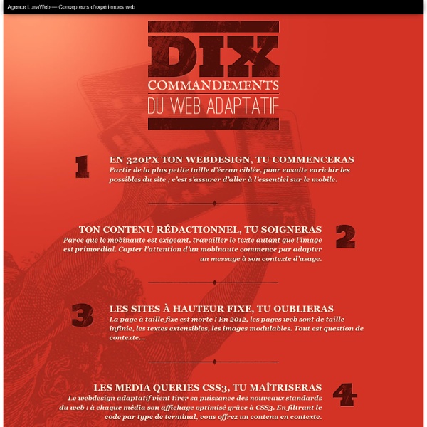
Les fondamentaux du Responsive Web Design I. Introduction▲ Prenons deux exemples simples. Le premier pourrait être ces vitres qui s'opacifient en fonction de la luminosité extérieure. Ou encore ces murs-miroirs où plus nous nous approchons, plus ils nous semblent se déformer. Bref, ce que cherchent les architectes dans ce mouvement, c'est de dépasser/s'abstraire des contraintes inhérentes liées aux différents supports. Le « Responsive Web Design » est né, car nous sommes de plus en plus confrontés aux mêmes problèmes que les architectes : s'adapter aux supports. Voyez plutôt : autrefois, nous n'avions qu'un ou deux navigateurs et les tailles d'écrans variaient peu. Et tout cela, c'est ce que nous avons maintenant. II. Pour faire une application Web qui soit Responsive Web Design, nous devons établir les trois points suivants : Si nous faisons une analogie avec l'architecture, les trois derniers points représentent nos outils. Il est heureusement possible de s'adapter pour y parvenir. III. cible / contexte = résultat IV. V. VI. <!
Installer un espace membres sur son blog Wordpress en 5 mn chrono e vous en parlais hier, quand on veut vraiment décoller avec son blog, il faut plus qu’un ebook de 10 pages, un formulaire Aweber et une liste d’emails pour ça : Il faut que chacun de vos visiteurs puisse s’inscrire sur votre blog pour en devenir membre. Ainsi, ce n’est plus un pauvre ebook en cadeau qui donnera envie à vos visiteurs de s’abonner chez vous, c’est TOUTES les ressources de votre blog qui serviront à faire exploser votre liste de membres ciblés et véritablement intéressés par ce que vous proposez. Mais peut-être que vous pensez que c’est compliqué à mettre en place tout ça ? Pas du tout ! Et ce n’est pas une expression : Ca prend VRAIMENT 5 minutes ! Comment ? Grâce à une fonction de WordPress et à un plugin gratuit que je vous propose d’installer sur votre blog. Vous allez ainsi pouvoir créer votre espace membres en quelques clics. Le tout directement à partir de votre blog. Mais avant de vous parler de ce plugin, rappelons ce qu’est un espace membres. Par exemple, sur ce blog : 1.
Responsive design : définition, fonctionnement, ressources et tutoriels Si vous vous intéressez de près ou de loin au webdesign ou à l’intégration, vous n’avez pas pu échapper au dernier terme à la mode : le “responsive web design”. Cette avancée technologique est également une nouvelle philosophie de création de site. Voici un article pour définir ce qu’est le “responsive web design” et expliquer quels en sont les points-clés (puis plein de liens, de tutoriels et de ressources super cools aussi !). Le “responsive web design” est né suite à un besoin grandissant. De nos jours, il n’y a pas un client qui demande un site Internet sans demander une version mobile de celui-ci. Seulement en quelques années le nombre d’appareils et de résolutions servant à consulter des sites web a tout simplement explosé : ordinateurs, smartphones, tablettes, web TV, grille-pain, format portrait, paysage, etc… Entre 2005 et 2008 on a identifié pas moins de 400 résolutions d’écran différentes pour tous les appareils vendus. Définition du responsive web design La mise en page La typo
10 Common WordPress Theme Issues & How To Fix Them There are thousands of forum posts opened everyday not only on WordPress.org but also on other forums and of course nearly every theme developer’s support site regarding very common issues that can be solved very quickly and easily. I’m sure theme developers and community members are pretty bored of answering these questions over and over again, so I’ve decided to write the following post which addresses some of the most common WordPress theme issues so you can bookmark it and have it ready at your disposal. 1. Stylesheet Is Missing You’ve just downloaded or purchased a super awesome theme and you go to install it and see the lovely message below: Well your first thought might be… “the developer screwed me and gave me a theme without a stylesheet” Of course it is possible the zip file you received didn’t have a style.css file, but more likely the issue is you didn’t upload the root theme folder. Missing Stylesheet Error Solution 2. Failed to Import Error Solution 1 3. 4. 5. 6. 7. 8. 9. 10.
Responsive Web Design with HTML5 and the Less Framework 3 What’s responsive web design? It’s a relatively new technique, first described in mid-2010 by Ethan Marcotte in his A List Apart article of the same name. Put simply, it involves providing a number of site layouts adapted to various screen widths, and then serving those layouts accordingly thanks to the use of CSS3 media queries. In the very aptly put words of Jeffrey Zeldman: It’s what some of us were going for with “liquid” web design back in the 1990s, only it doesn’t suck. That’s all well and good, but how do you put it to use? In this short tutorial, I’ll walk you through taking a fairly simple page design and making it responsive with the help of the Less Framework 3 by Joni Korpi. As such, if you’ve never tested the waters of media queries or responsive design, Less is a good way to get started and see some results fairly quickly. So, let’s do this thing! Less Framework 3 For starters, head over to The Layout The Markup Here’s a skeleton: The Styles Final Notes