
9 Excellent Tools for Design Mockups So you've just taken some killer photos with your new DSLR, or you captured a great video with your iPhone — what's next? While it feels natural to just post media quickly to your Facebook Page, sometimes great photos or video need their own home in the form of a personal website. But on the other hand, it's not easy to make a website layout that complements rich media. We've rounded up nine applications that can help you get the most out of designing your web layout. 1. Perhaps one of the more well-known and popular mockup tools, Balsamiq Mockups is a cloud-based mockup service (with accompanying desktop application) that enables you to quickly and easily create fun and interactive website mockups. The application comes with a huge collection of drop-in components and reusable libraries, and an easy drag-and-drop interface. 2. Mockingbird is another popular web-based wireframing application, with some great functionality baked in for linking and sharing your mockups. 3. 4. 5. 6. 7. 8.
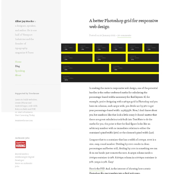
10 Lightweight & Minimal Responsive Grid Frameworks As responsive layouts rapidly move towards being the standard, more and more responsive grid frameworks have been cropping up. And with such a huge variety of frameworks available, and with everyone one of them employing different grid properties and techniques, it can be very difficult to choose the right one. Of course, you could go for one of the popular all-singing-all-dancing frameworks, like Twitter’s Bootstrap or ZURB’s Foundation, as they do offer everything you could possibly need, as well as plenty of documentation and lots of support from the community. Below you will find your solution. Base Framework Base is a 12 column 960px grid (max) responsive CSS framework that contains everything you need to get up and running quickly. Base FrameworkGitHub Toast CSS Framework Toast CSS FrameworkGitHub Titan Framework The Titan Framework, based on 960.gs, comes in two versions, a 12 column grid and a 16 column grid. Titan FrameworkDemo Bourbon Neat Bourbon NeatGitHub The Goldilocks Approach
Useful Web Apps For Prototyping and Wireframing Being able to create rapid prototypes or wireframes of web and mobile apps is crucial for improving efficiency and essentially the end product. Creating wireframes or prototypes will allow you to discuss and amend various different versions of the the project in deeper details with clients, designers and developers without the need to invest hours of staff time creating endless pixel perfect mockups. Wireframing tools will allow you to create initial mockups of your website or app, this will allow you to quickly create many different variations of the skeleton layout. By doing this you can decide which concept will work best for your requirements, this method has the added bonus of saving countless hours creating various Photoshop mockups. Prototyping is a little further down the build line compared to wireframing, with prototyping it is common to create a rough working concept of the final wireframe creation. Hot Gloo HotGloo is entirely web-based which means you can join forces. FluidiA
45 Useful Responsive Web Design Tools and Techniques Here are my favorite responsive web design tools sensitive and techniques, it can help web designer to design easy website templates match. These resources have been selected for their ability to help you complete your web designs meet more effective. Initially, a suitable design has been applied to existing screen-centric websites to allow the layout to fit the smaller screen sizes. Development of technology, particularly devices like smartphones and tablets and more and more control introduces a new concept in web design. You may like this: 50+ useful web development tools Ethan Marcotte defines Responsive Web Design: A responsive design is composed of three distinct parts:A flexible, grid-based layoutFlexible images and media, andMedia queries, a module from the CSS3 specification. Working on the web, however, is a totally different issue. Please kindly find out Responsive Web Design Tools and Techniques bellow: 1. 2. 3. 4. 5. 6. 7. 8. 9. 10. 11. 12. 13. 14. 15. 16. 17. 18. 21. 22. 23.
10 HTML & CSS Online Code Editors for Web Developers Today we bring you some useful resources for web developers: Online or web-based Integrated Development Environments (IDE). With these applications - freely available online - you can develop virtually any type of web work working in a simple and comfortable way with hypertext and style languages ??like HTML, CSS, Script, JavaScript, PHP, and frameworks like Motools or jQuery, which allow users to execute code. In addition, many let you sign in to store and manage your own files in a history, and some offer interesting forms of collaborative coding. Dabblet An interactive CSS playground and code sharing tool developed by Lea Verou.
25 Free Responsive HTML Website Templates 30 Free Responsive HTML Website Templates Details Category: Webdev Hits: 1993 Responsive website design and layouts are mainstream trend in the web design that urge web designers to development and construction responsive website templates and layouts for their sites to promote mobile version for your website of goods among the consumers. This is another beautiful template for you to use. liquid gem Liquid Gem utilises CSS media queries and percentage layouts to give a completely responsive design. Obscura Free Responsive HTML Template If you don’t think you have enough knowledge on HTML and would like to have the theme with an admin panel along with post formats featuring fullscreen gallery, working contact form and font/color/background options, Brownie -Responsive HTML 5 Portfolio template Created by using the latest HTML5 and CSS3 techniques, Brownie is a simple and clean Free Responsive HTML5 portfolio and business website template. Vintage – Responsive HTML5 Template Sunrise Zeni
5 Online Playgrounds for HTML, CSS and JavaScript Compared Local coding environments are great, but it’s often the case that I don’t want to crack open Espresso and spend a few minutes setting up to code when all I really want is to test out an idea or work on a bug. Also, sharing options for most local coding apps are limited and typically require integrating an outside app like Dropbox. Online playgrounds or sandboxes such as jsFiddle solve this problem by providing you with an instantly ready coding environment for you to begin experimenting in as soon as the page loads. These tools let you combine CSS, HTML and often even JavaScript to create and share coding examples. I’m completely addicted to these things and have extensively tested every one I can get my hands on. CSSDesk I’ll start with CSSDesk because it’s one of the oldest on this list. What I Like About CSSDesk There are a lot of things that I just love about CSS Desk. There’s also basic syntax highlighting just like all of the other tools on this list. What I Don’t Like About CSSDesk
Grid Psd Sort by: " the 960 grid system is an effort to streamline web development workflow. " mythemeshop offers the best out of the box premium wordpress themes and top notch support to help you setup your website without any hassle " pixelbrush - Портал о дизайне. " i can make your website as easy to edit as a word document, using wordpress as a cms " webhosting.pl to pierwszy na polskim rynku serwis poruszający w szerokim aspekcie tematy związane z hostingiem, globalną siecią i usługami internetowymi. głównym celem przedsięwzięcia jest dostarczanie przydatnej i bogatej merytorycznie wiedzy osobom, które chcą tworzyć i efektywnie wyko " the best wordpress themes, wordpress plugins and blogging resources - blog perfume " " useful and free online resources for designers and developers " " blog about front end development, ui/ia/ux design, web performance, and interactive media " ãã¶ã¤ã³ãéçºããã¨è¨ãè¦ç¹ã§ãä¼ãããã¯ãªã¨ã¤ãã£ãblog "
Responsify.it - A responsive template generator (Build 20120601045813) Responsive Design: 160 useful tools, plugins and resources Since many of you out there are still struggling to find it all in one spot, when all you may need is just one main source that answers all your questions on Responsive Web Design, here at webdesignshock.com we’ve summed a full collection of 160 Resources that cover all Web Responsive Design related topics sorted in categories that go from framework, grid, bookmarklet, typography, tutorial, media-centric, useful articles, WordPress and Google Chrome; so that whatever it is that you’re looking to find related to web responsive design you’ll find it here at webdesignshock.com. Because With the on growing production of alternate devices’ over the past couple of years, have grown the amount of web responsive resources on the web, and the demand of web designers for them. Responsive design went from being the new “it” word of the web design world, to becoming the biggest growing trend of web design in 2011, to now being the up most necessary implementation when designing a website. Skeleton
Animated QR Code Generator Online Animated QR Code Generator This is a *free service to generate QR codes in colour with embedded animations online for social media and custom branding QR codes. Upload your animation and click on the 'Generate Animated QR Code' button. Note: Supported animation types are multi-frame gif animations only. Looping and animation speed is supported. Transparency of animations is implemented. Sharing the QR code generator with others Copy the code below and paste it in your web site or blog so your visitors know where to go to generate QR codes. Note: When 'animating QR codes' always test the QR code thoroughly before putting it to use, because unfortunately not all smart-phone cameras and QR code reader applications are created alike. For professional QR code tools, services and utilities, please contact QR4 to find out how we can assist you. Examples of animated QR codes created with the generator above: Other QR code generators from QR4 A text message into a QR code.
Reinvigorate