
L' uomo che ha disegnato New York NEW YORK Se siete a New York, e nella metropolitana alzate gli occhi cercando il segnale per Brooklyn, quello è Massimo Vignelli. Se siete arrivati fin qui con un volo American Airlines, quello è Massimo Vignelli. Se bazzicate nell' Upper East Side, e nella bramosia delle compere finite da Bloomingdale' s, quello è Massimo Vignelli. Se invece vi basta l' inseparabile golf Benetton, beh, anche quello è Massimo Vignelli. Typo.cz | typography and graphic design Tutte le grafiche dei campionati mondiali di calcio L’evento sportivo più seguito di tutto il mondo sono i campionati mondiali di calcio, che si svolgono a cadenza quadriennale e coinvolgono le nazionali maschili qualificate mediante le selezioni preliminari. La coppa del mondo ha una storia assai affascinante che vale la pena approfondire. L’idea venne al dirigente sportivo Jean Rimet, francese, che riuscì ad organizzare la coppa nella prima edizione del 1930 in Uruguay. A quella prima manifestazione parteciparono solamente 13 squadre, (non l’Italia fresca vincitrice della coppa internazionale per motivi mai veramente chiariti), e vinse la nazionale ospitante in un appassionante match con l’Argentina vinta per 4 reti a 2. L’Italia prese la soddisfazione di ospitare e vincere l’edizione successiva, nel 1934, avendo la meglio in finale con la Cecoslovacchia. Paese ospitante: Uruguay Nazionale vincitrice: Uruguay Paese ospitante: Italia Nazionale vincitrice: Italia Paese ospitante: Francia Paese ospitante: Brasile Nazionale vincitrice: Uruguay
The History of Visual Communication - The Masters of Typography Download slideshow >>> The Renaissance is the term used to describe the development of Western civilization that marked the transition from medieval to modern times. In the 12th cent. a rediscovery of Greek and Roman literature occurred across Europe that eventually led to the development of the humanist movement in the 14th cent. The 14th cent. through the 16th cent. was a period of economic flux in Europe; the most extensive changes took place in Italy. Renaisance Painting: Sandro Boticelli (1445 - 1510) Renaisance Painting: Michelangelo Caravaggio (1571 - 1610) Beginning in the latter half of the 15th cent., a humanist faith in classical scholarship led to the search for ancient texts that would increase current scientific knowledge. In 1543 Copernicus wrote De revolutionibus, a work that placed the sun at the center of the universe and the planets in semicorrect orbital order around it; his work was an attempt to revise the earlier writings of Ptolemy. Renaisance book bindings
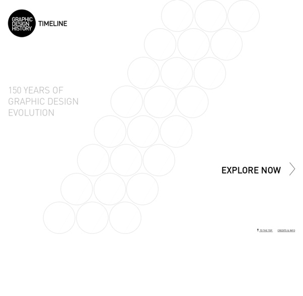
150 anni di grafica in 15 nomi Sintetizzare 150 anni di grafica italiana in 15 nomi non è stato facile, non per trovare i nomi, ma per mettere d’accordo un po’ tutti. Con l’aiuto di Gianni Latino, docente di Graphic Design all’Accademia Belle Arti di Catania, ci abbiamo provato. La scelta è caduta su quindici grafici che hanno avuto riconoscimenti nazionali ed internazionali e che con il loro lavoro progettuale, la sperimentazione e la ricerca hanno esportato il made in Italy nel mondo. Studio Boggeri (1933-1981) La nascita della grafica moderna italiana si deve fondamentalmente a Antonio Boggeri (1900-1989), che dopo aver approfondito le sue conoscenze nel fotomontaggio con l’esperienza acquisita presso la stamperia Alfieri & Lacroix, e prendendo come punto di riferimento i modelli offerti dal Bauhaus, nel 1933 a Milano in via Borghetto, 5 aprì lo Studio Boggeri. Max Huber, Pannello dello Studio Boggeri, 1940 La pagina di Wikipedia Franco Bassi (1920-2006) pubblicità per Olivetti, 1974 Il profilo sul sito dell’AGI Sito web
Intro Lecture Graphic design is a relatively young way of expression, primarily a response to the needs of the industrial revolution. Early Renaissance Since the invention of movable type in the early 1400’s, book design was a craft primarily focused on readability. Typography was neutral, and headings were very rare. Images were used sparingly and mostly for iconic purposes. William Addison Dwiggins William Addison Dwiggins coined the term “graphic design” in 1922 to describe his process of designing books, as combination of typesetting, illustration and design. Dwiggins was the director of the Harvard University Press and founder of the Society of Calligraphers in Boston. This book cover by Dwiggins shows this new way of thinking: That seeing is as important as reading, and that typography and illustration can be used for symbolism. Futurists, Dadaists and De Stijl At the same time in the early 20th century, quite a few artistic movements had a an effect on the developments of graphic design. Today E.
Everything is Design Everything is Design: The Work of Paul Rand. Feb 25 - July 19, 2015 "Everything is Design. Everything!"—Paul Rand Everything Is Design: The Work of Paul Rand features more than 150 advertisements, posters, corporate brochures, and books by this master of American design. Read the press release. Public Programs Revolutions in Graphic DesignThursday, March 19 at 6:30 pmSold out! Branding: Why Good Design is Good BusinessWednesday, April 29 at 6:30 pmJoin leading graphic designers in exploring how Paul Rand paved the way for contemporary forms of business media. You Can Tell a Book by its CoverMonday, June 1 at 6:30 pmJoin a distinguished panel of speakers as they will trace the lineage and influence of Paul Rand and his contemporaries’ designers to practices and trends found today in book cover design. Group Tours Interested in booking a group tour?
Dan Friedman, Radical Modernist, Part 1: Design Observer In 1991, my wife Esther and I rented a cottage on the coast north of Boston. One of our visitors was Dan Friedman. That summer our dog Pica had given birth to three puppies, and Dan planned his stay to correspond with maximum puppy cuteness. He was a regular guest through the 1980s and ’90s, an escapee from Gotham. Two years later, he came with his friend Laurie Mallet (then president of the clothing line WilliWear), and hung out for several days. He was in great spirits, about to start teaching again after a long lapse, this time at Cooper Union in New York. Four months later he was in the hospital. Though our relationship was close and comfortable at the end of his life, it wasn't always that way. We shadowed Dan before we actually knew him. In March 1967, Esther and I got married and decided to take our honeymoon in Switzerland, then the mecca of modern graphic design. Dan was there too. By chance, Esther and I wound up at Basel that same summer.
Bruno Munari Will Make You Fall In Love With Books All Over Again With some books, reading on a screen is virtually the same as on paper. Swipe or turn a page and you'll see words organized into sentences organized into paragraphs organized into chapters. Not so with the work of Bruno Munari (1907–1998), an artist, graphic designer, inventor, futurist, and all around maestro of visual language. "Munari did not just work on books; he was interested in and tried out the full range of artistic possibilities (painting, sculpture, design, graphics, teaching, poetry, writing, photography, film, entertainment), but throughout his career, books were his personal diary in which he noted down his experiences, an authentic register of events," art historian Giorgio Maffei writes in the introduction to Munari's Books: The Definitive Collection of Book Designs by Bruno Munari (Princeton Architectural Press, 2015) In addition to exploring books as art objects, Munari used them to communicate cultural ideas. Munari's Books is available from papress.com for $40.
Addio a Oriano Niccolai, il grafico del Pci amico di Berlinguer - 1 di 1 "Conta il partito, non il singolo", diceva Oriano Niccolai, storico grafico del Pci e amico di Berlinguer. E proprio seguendo questa ideologia, nella maggior parte dei casi, non firmava i suoi manifesti. Anche se lui, Oriano Niccolai, il Rosso creativo, in cinquant'anni di disegni, slogan, di manifesti ha raccontato un pezzo dell'Italia rossa, operaia, comunista. Oriano Niccolai oggi
Come sono cambiati negli anni i loghi delle case cinematografiche Quando andiamo al cinema, il momento in cui appare il logo della casa cinematografica sullo schermo è il segnale preciso ci predispone mentalmente alla visione del film. La tradizione di inserire nei titoli di testa – oltre al titolo del film, ovviamente – anche i loghi delle case cinematografiche è vecchia come la storia del cinema: molte di queste immagini sono entrate nell’immaginario collettivo, diventando delle vere e proprie icone. Nel corso degli anni le case cinematografiche più importanti hanno cambiato spesso la loro identità grafica, ma quasi tutte sono rimaste legate a immagini storiche che hanno subìto solo qualche cambiamento: la caratteristica che le lega tutte è la scelta di simboli definiti, come spazi ampi (le stelle, i pianeti, le nuvole) e la dominanza del colore blu, che evoca il mare e il cielo. 20th Century Fox Warner Bros. La Warner Bros. fu fondata nel 1923 da quattro fratelli ebrei emigrati negli Stati Uniti dalla Polonia: Harry, Albert, Sam e Jack Warner.