
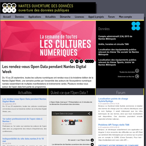
http://data.nantes.fr/accueil/
Related: Webmapping - Datavisualisations - Open dataFree mapping data will elevate flood risk knowledge For the past 17 years we have been capturing LIDAR (Light Detection & Ranging) data in England. LIDAR uses a laser to scan and map the landscape from above and is widely considered to be the best method for collecting very dense and accurate elevation data across the landscape. We use LIDAR to help the work of the Environment Agency in many ways, including creating flood models, assessing coastal change and analysing how land is used. We now have an extensive archive of aerial LIDAR data covering nearly three quarters (72%) of England – the data mainly covers flood plains, coastal zones and urban areas.
OpenData Montpellier Map of scientific collaboration (Redux!) Several years ago, I created a map of scientific collaborations. The attention this map obtained surpassed my wildest expectations; it got published in the scientific and popular press all around the world! I had mainly forgotten about it until I received an email that rekindled my interest in this visualization and I thought it was high time to revisit this visualization. Unfortunately, scientific papers (and associated data) are closely guarded and only a handful of firms have full access to them. I now work in a very different field, so I lost access to this dataset.
OpenData Bordeaux Open Data Zürich - Stadt Zürich Open Data Zürich kümmert sich innerhalb der Stadt Zürich um die Umsetzung von Open Government Data (OGD). Bei Open Government Data handelt es sich um bereitgestellte Datensätze aus öffentlichen Verwaltungen für eine breite Öffentlichkeit in digitaler Form. Die veröffentlichten Datensätze sind maschinell lesbar, kostenlos und zur freien Weiterverwendung gedacht. Die Stadt Zürich hat im Juni 2012 das erste OGD-Portal der Schweiz lanciert. Mit dem von Open Data Zürich angebotene Portal bietet die Stadtverwaltung Zürich einen zentralen Einstiegspunkt für die Suche und Nutzung von offenen Daten der Stadt Zürich.
Population Lines Print I recently produced a map entitled “Population Lines”, which shows population density by latitude. The aim was to achieve a simple and fresh perspective on these well-known data. I have labelled a few key cities for orientation purposes but I’ve left off most of the conventional cartographical adornments. I am really pleased with the end result not least because it resembles Joy Division’s iconic Unknown Pleasures album cover, which in itself is a great example of data visualisation as art. The data, from NASA SEDAC, have been mapped many times before and in many beautiful ways but none seem to me quite as compelling as the simple approach here of using only black and grey lines across the page. What amazes me about this map (from where I sit in London) is just how jagged the lines become throughout India, East China, Indonesia and Japan in comparison to “the West” – evidence that we are definitely in the “Asian Century”.
8 tools for visualizing data with open source Data visualization is the mechanism of taking tabular or spatial data and conveying it in a human-friendly and visual way. There are several open source tools that can help you create useful, informative graphs. In this post we will take a look at eight open source, data visualization tools. Datawrapper Datawrapper was created by journalism organizations from Europe, designed to make data visualization easy for news institutes. Based on a web based GUI (graphics user interface), it promises to let you create a graph in just four steps.
Transforming Data into Visualization Data visualization explains a story to the user; a story that if told well should help the viewer discern information and relationships between the data. Data visualization, for a designer, is the process of taking a complex structure and breaking it down in a way that the reader can easily comprehend. It is a powerful tool used to translate complex data into accessible insights. In this article, I’ll explain the four critical steps we took to create a visualization graph for the World Economic Forum (WEF). Step 1: Decipher the Data Data visualization: Science on the map Illustration by the Project Twins When linguist Lauren Gawne roams the valleys of Nepal documenting endangered Tibetan languages, she takes pains to distinguish each dialect's geographical origin. But when it came to producing maps of her results, for many years her cartographic methods were somewhat crude.
The “Rules” of Data Visualization Get an Update Geoff McGhee is a journalist and data visualizer at Stanford University’s Bill Lane Center for the American West. Data Points is a new series where we explore the world of data visualization, information graphics, and cartography. In the past decade, computer-aided data visualization has migrated from the halls of science and academia into journalism, marketing, political discourse, and many other parts of everyday life. A lively conversation has developed online about data visualization, with blogs and social media accounts devoted to critiquing them. But what are the rules of a complex practice that draws on research into cognitive theory, graphical perception, statistics and journalism? The Antiquities Coalition Site - Culture Under Threat Map LAYER: Areas Under Threat or Control of Terror Groups What it Displays: A heat map of areas that are under the direct control of terrorist groups or threatened by areas they have occupied between January and October 2015. Information from no earlier than 2015 was included due to the continually shifting nature of the MENA conflicts.
Presenting gvSIG Online: the solution for Spatial Data Infrastructures on Open Source software During the last International gvSIG Conference a new product added to the gvSIG Association catalogue was presented for the first time. We think it will be well received because it meets an every time more and more need to have a solution for implementing Spatial Data Infrastructures, using open source software and reducing implementation costs of the current market alternatives. gvSIG Online is result of the experience accumulated by the gvSIG Association at the Spatial Data Infrastructure projects implementation of all types and in any sector, from petrol companies to local administrations.