background preloader

Animated Buttons with CSS3
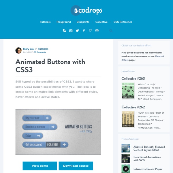
Animated Buttons with CSS3
Still hyped by the possibilities of CSS3, I want to share some CSS3 button experiments with you. The idea is to create some animated link elements with different styles, hover effects and active states. View demo Download source The icons used in some of the examples are by webiconset.com and the symbol font is by Just Be Nice We’ll go through every example and see how the HTML structure looks and what the styles for the normal, the hover and the active states are. Please note that the animations/transitions will only work in browsers that support those CSS3 properties. In order not to bloat the tutorial, I will not be using any CSS vendor prefixes. Example 1 In this example we will create a big button with several details in it. Markup The structure is pretty straightforward: the icon will be an image and the other elements will be spans: In the style we will make sure that the right transitions are set on the element that we want to animate on hover. Example 2 Example 3 Example 4 Example 5

Creative CSS3 Animation Menus Being in the mood for experimenting with CSS3, I'd like to show you some creative menu hover effects in today's tutorial. The idea is to have a simple composition of elements, an icon, a main title and a secondary title, that will be animated on hover using only CSS transitions and animations. We'll be exploring some different effects for the elements. View demo Download source Being in the mood for experimenting with CSS3, I’d like to show you some creative menu hover effects in today’s tutorial. The idea is to have a simple composition of elements, an icon, a main title and a secondary title, that will be animated on hover using only CSS transitions and animations. The icons used in the demos are actually a Web Symbols typeface that we’ll include with @font-face. The Markup The HTML structure for the menu will be an unordered list where each item is a link element that consists of an icon span and a content div that will contain the main title and the secondary title: The CSS Example 1

Free Zocial Button Set: Social CSS3 Buttons Advertisement The idea behind this project was to produce a consistent set of buttons that could be used for the range of social actions frequently taken in Web applications. These actions are often important goals for users, such as connecting third-party accounts or sharing content to third-party platforms, so their appearance has to be attractive and clear. The standard buttons provided by third parties (such as Facebook, Twitter and SoundCloud) vary in size, style and interactivity. The button set was designed from the beginning to require no extra markup, and the elements used are entirely the choice of the (semantically considerate) designer. No raster images or sprites were used. Download The Button Set For Free This button set is free to use and extend, personally or commercially. Features Preview Screenshots of each set are below. Usage The button set was designed with simplicity and semantics in mind. <button class="zocial facebook">Sign in with Facebook</button> (al) Footnotes

Automatic jQuery Slider - jQuery Auto Slider Demo Squares Effect & Noir Style Automatic jquery slider At first glance this slideshow demo is modest and conservative. However, upon further inspection users will notice the details that take this demo from basic to distinctive, including its unique transitions and hidden thumbnail gallery. Websites with a traditional design approach will appreciate the professional-with-a-twist style used to showcase this slider. The borderless frame around the slideshow ensures that any picture used will gain full attention. To the right and left of the frame there are two arrows which only appear when the mouse hovers over the slide. The highlight of this slideshow is the transition from one slide to the next. Many traditional businesses have a classic style and design, and they want a slider that conveys a buttoned-up image while showcasing creative details that allow them to stand out.

Original Hover Effects with CSS3 The power of CSS3 is enormous and in this tutorial we will see how to exploit it in a very creative way. We are going to create some thumbnail hover effects with CSS3 transitions. On hover over a thumbnail, we will reveal some description of the thumbnail, using a different style in each example. View demo Download source Please note that this will only work properly in modern browsers that support the CSS3 properties in use. The Markup The structure of markup is very simple and intuitive. Inside the view insert an element with the class mask that will be responsible for our effects driven by CSS3 and inside it we will put a title, description and a link to the full image. <div class="view"><img src="image.gif" /><div class="mask"><h2>Title</h2><p>Your Text</p><a href="#" class="info">Read More</a></div></div> The CSS After creating our markup we’re going to set our style. And now we’ll look at the ten effects. Example 1 And now comes the heart of our effect. Example 2 Example 3 Example 4

Full CSS3 Text-Shadows — Even In IE In the last few months, I have written two articles where I discussed a few strategies to do CSS3-style transforms in IE (CSS3 Text-Shadow – Can It Be Done in IE Without JavaScript? and CSS Blurred Text-Shadow in IE — Part I). While demonstrating the possibilities to creating a varied range of text-shadows in IE, there wasn’t any silver bullet that produced what I considered one of the Holy Grails of CSS polyfills: a method that could take an existing page and render multiple CSS3 text-shadows in IE with few, if any, changes to the CSS code. To that end, at the end of my last article, I dropped the gauntlet at the end of my last article and challenged the web development community to help come up with a better solution. I got a few takers, but one stood out from the rest. Yeah Whatever! If you are viewing this page in IE7+, here are the droids you are looking for: (Note that the Blur example does not appear correctly in IE7 and 8, due to lack of support of the transparent color)

Orbit: jQuery Image Slider Plugin from ZURB - ZURB Playground - ZURB.com 1.3.0 (1/25/2012): Add custom events to allow control via custom JavaScript. Fixed intermittent loading issue on Chrome. Fixed IE issues. 1.2.3 (3/17/2011): Fixed a number of issues including: Fixed issue of false parameters failingCan now have just 1 slide without it failingReorganized kit download to isolate "demo" pieces and core codeIncluded jQuery 1.5.1We've edited some of the docs here around "Content" slides 1.2.1 (2/3/2011): Changed caption styles to not break on different sized sliders and added documentation in here about positioning other than relative. 1.2 (1/20/2011): Content compatible, new loading animation, thumbnail navigation for bullets, animated captions, no more overflow hidden on the container, restructured the markup & js, changed the base UI, added callback, mouseover pause, better timer interactions and re-browser tested. 1.1 (9/4/2010): Added bullet navigation, linkable images, full HTML captions, a loading animation and greater browser compatibility.

A lire - Design a clean sports web layout in magazine-style with Photoshop I spend my days developing websites, improving WeGraphics and playing football. Well, I’ve tried to mix these three activities designing a blog-magazine style layout, perfect for an on-line football/sport community. This kind of websites generally are focused on the content because they should provide a lot of information to the readers and in this case I’ve choosen to bring out all the contents (the articles) giving more relevance to images and headings. The reason behind the choice of using large images is the direct consequence of my love for this sport: browsing a football-related website I need images, pictures, figures, colors, videos… I want to see my favourite champions. From psd to html/css… In this first tutorial I’ll show you how to realize the layout in Photoshop. Below you can take a look to the final result of our efforts. The Final Result A grid-based magazine web layout with a clean design and a nice look to engage the visitors. Step 0 – The canvas Step 1 – The background

CSS Button Switches with Checkboxes and CSS3 Fanciness In this tutorial we will create some realistic-looking switch buttons using pseudo-elements and checkboxes. View demo Download source Hello everyone! For a while now, I’m having fun with the new CSS properties (CSS3). You won’t see any vendor prefixes in the CSS snippets, but you will of course find them in the files.We won’t use much transitions between states because we often use pseudo-elements to reduce the number of elements to its minimum, and as of writing, only Firefox supports transitions/animations on pseudo-elements.We’ll use the “checkbox hack” (see below).I personally use the box-model where [width] = [element-width] + [padding] + [borders]. About the “Checkbox Hack” The checkbox hack allows us to have a toggle handler in pure CSS. Example 1 Let’s start with a lovely little push button, with a small illuminated LED when it’s on. The Markup The .switch element is our container. The CSS First, we give our button a size by setting the width and height to the container. Example 2

Slicebox - 3D Image Slider Creative Lifesaver Honest Entertainer Brave Astronaut Affectionate Decision Maker Faithful Investor Groundbreaking Artist Selfless Philantropist Example 2: Slideshow with play & pause and horizontal slices

A lire - Converting a clean magazine-style PSD template to HTML/CSS Previous week on WeGraphics we went through the process of designing a clean layout in magazine-style with Photoshop. Now it’s time to convert the visual mockup in a working web page using HTML and CSS. This tutorial will be an overview, with some tips and advices, on how to convert a psd to HTML; it won’t be a complete and specific explanation on HTML tags, CSS properties and techniques but a look to my entire process of getting from Photoshop the HTML layout. Test the live preview in your browser to see how the template will look after the HTML conversion. Become a Premium Member and get unlimited access to source files and premium resources for only 7$/month. Understanding the general structure The first step is the key to create a robust and optimized layout. I’m not a great fan of schematic procedures, a creative process, in building a good web design, can surely start in Photoshop, without a wireframe. From PSD to HTML/CSS – The HTML code Step 0 We are ready to start. <!

Related: