
Settings Manager This information applies to Adobe Flash Player on desktop and notebook computers. To change Flash Player settings on mobile devices, visit the Settings Manager for mobile devices. Who uses this Settings Manager? Beginning with Flash Player 10.3, the Local Settings Manager supersedes this Online Settings Manager for managing global settings on Windows, Mac, and Linux computers. The Local Settings Manager can be accessed in the Control Panel on Windows and in System Preferences on Mac. Users of other operating systems and earlier versions of Flash Player can continue to use the Online Settings Manager described here. To access the local Flash Player Settings Manager that is native to your operating system: Windows: click Start > Settings > Control Panel > Flash Player Macintosh: System Preferences (under Other) click Flash Player Linux Gnome: System > Preferences > Adobe Flash Player Linux KDE: System Settings > Adobe Flash Player What can I do with the Settings Manager?
Fix the RSS update time on the WordPress RSS widget One of the most common complaints on the WordPress support forum is that the content of the RSS widget doesn't update, or doesn't update frequently enough. Here's the scoop, each widget instance checks the feed once every 12 hours. Twice a day — that's it. And that aint much. If you are using WordPress 2.8.3, the most current version as of this writing (and you should be), you can change this setting by adding the following to your current theme's function.php: add_filter( 'wp_feed_cache_transient_lifetime', create_function('$a', 'return 1800;') ); The above code will cause the feeds to be checked every 30 minutes. 1800 = 1800 seconds == 30 minutes. August 4th, 2009 · tech-talk · whoo · Comments (12)
Video for Everybody! Video for Everybody is simply a chunk of HTML code that embeds a video into a website using the HTML5 <video> element, falling back to Flash automatically without the use of JavaScript or browser-sniffing. It therefore works in RSS readers (no JavaScript), on the iPhone / iPad (don’t support Flash) and on many browsers and platforms. Thanks to the rapid adoption of HTML5 video happening right now, Video for Everybody isn’t the only solution around. It is not a neatly packaged, fully-featured solution for those unfamiliar with HTML. How It Works If your browser supports it, HTML5 video is used. If HTML5 video is not supported, Adobe Flash is used. Finally, if all else fails, a placeholder image is shown and the user can download the video using the links provided. VfE different than any other Flash video embedding method. This is all done without JavaScript and requires two video encodes, one Ogg file, and one MP4 file. The Code Here follows the full source code. IMPORTANT Notes Using Video
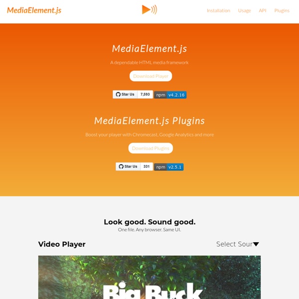
Building HTML5 Applications - Practical Cross-Browser HTML5 Audio and Video When the HTML5 audio and video tags were first introduced, codec and browser incompatibilities made them difficult to use and unrealistic to deploy on large-scale Web sites. The tags were great for companies writing experimental code or doing cross-browser media development, but the HTML5 media API was too unreliable for general use. Today, things are different. Browsers and JavaScript libraries have matured to the point where you can—and should—use HTML5 media as the default for any projects that will display audio and video content. Even retrofitting existing Flash and Silverlight video content for HTML5 playback has become fairly simple. Benefits of HTML5 Media The advantage of using HTML5 for media is that you can leverage your HTML, CSS and JavaScript skills rather than learning Flash or Silverlight. Moreover, media that uses HTML5 video and audio performs better than media played through plug-ins such as Flash or Silverlight, resulting in longer battery life and smoother playback.
Google XML Sitemaps Use this plugin to greatly improve SEO to create special XML sitemaps which will help search engines like Google, Bing, Yahoo and Ask.com to better index your site. With such a sitemap, it’s much easier for the crawlers to see the complete structure of your site and retrieve it more efficiently. The plugin supports all kinds of WordPress generated pages as well as custom URLs. Additionally it notifies all major search engines every time you create a post about the new content. Supported since over 9 years and rated as the best WordPress plugin, it will do exactly what it’s supposed to do – providing a complete XML sitemap for search engines. If you like the plugin, feel free to rate it (on the right side of this page)! Related Links: License Good news, this plugin is free for everyone! Translations The plugin comes with various translations, please refer to the WordPress Codex for more information about activating the translation. Read all 2,059 reviews Contributors Arne Brachhold
jPlayer : HTML5 Audio & Video for jQuery Installation, réinstallation : les logiciels gratuits pour bien commencer 60+ Best Responsive WordPress Themes A responsive WordPress theme is a theme build to adapt with the purpose of giving tablet and smartphone users a great experience. This without maintaining multiple websites and multiple sets of content! For some time dedicated WordPress mobile themes was the best option, but recently responsive WordPress themes have been all over the place. There is no doubt that responsive web design is the new hot trend and so it is to use responsive CSS frameworks to implement the responsive layouts. Having a responsive web design allows your website content to be displayed correctly to all users by adjusting the layout to accommodate screens of different sizes and orientation. The trend now seems to be either creating custom fit for purpose responsive layouts or using Twitter Bootstrap. For testing responsive layouts and tuning you should check out some responsive web design tools. This article is continuously updated with fresh responsive WordPress themes! Advertisement Index DeepFocus - MORE INFO
HTML5 Video - The Developer Community and HTML5 Video Library The Open Video Conference is an annual event that brings together video creators, intellectual property scholars, and developers for a weekend of creating, remixing, and hacking. The conference was combined with the Foundations of Open Media Software workshop which attracted the developers of Opera, Firefox, and Webkit (Perhaps Microsoft should keep an eye out for next year’s conference?). 2011’s OVC departed from last year’s monolithic format of session on top of session, opting for a smaller crowd with tracks devoted to getting things done. Around 400 of us were privileged to attend, and we were able to shift between the creative, copyright, and development tracks as needed to effectively share knowledge between these disparate but related fields–and did we get things done! This post focuses on the development sessions at #ovc2011. Popcorn.js Popcorn.js was the focus of a few working groups. Fork Popcorn.js on GitHub. Popcorn Maker Try it now, or Fork the Popcorn Maker on GitHub. Remixer
Tumblr 2012: guide d'utilisation pour un usage professionnel 40 Useful Responsive Web Design Tools With the great popularity of tablets and smart-phones, the demand for responsive website design is more serious than ever. Right now, more and more websites are adopting responsive layouts and this trend is expected to become more intense as the percentage of mobile Internet users increase. This development have created tremendous demand for the services of web designers and developers proficient in this highly adaptable system of website layouts. Already, we can see responsive WordPress themes, available from major theme providers that meet the challenges of adopting to different screen sizes. As expected, some pretty useful responsive web design tools have surfaced recently to support the design and development process of responsive websites. You can find valuable layout aid tools, prototyping tools, code generators, and even a collection of inspirational responsive website designs in this article. Advertisement Article Index Responsive Wireframes and starting out templates Style Tiles
La sortie de PHP 5.4 La première version de PHP a été créée en 1994 par Rasmus Lerdorf afin de pouvoir compter le nombre de passages sur son CV en ligne, il l’appelle "Personal Home Page Tools". En juin 1995, le code source du langage est offert au public, ce qui permet à celui-ci de le tester pour en éprouver la fiabilité et l'améliorer. En 1996 sort la deuxième version du langage, un gros travail de réécriture est engagé pour que sa syntaxe ressemble au C et à Perl dans le but de ne pas trop perturber les développeurs venant de ces mondes. C'est aussi à cette période qu'il est envisagé de proposer un support de Windows NT. La version 3.0 introduit, en plus de changements dans son architecture, un nouveau nom : Citation : Histoire de PHP Il fut ainsi renommé tout simplement « PHP », dont la signification devint un acronyme récursif - PHP: Hypertext Preprocessor. C'est également à partir de ce moment que PHP s'est ouvert à Windows, Linux et Mac. private public protected Comment fonctionne PHP ? Les nouveautés <? <?