

untitled ALERT: The Psiphon Team has discovered a specific instance of malware disguised as a Psiphon 3 Windows executable. The malware is being distributed as a zip file named "pisphone3.zip" on www.copy.com and may be available from other sources. The zip file contains a malicious binary named "pisphone3.exe" with the properties described at Virus Total. What is Psiphon 3? Psiphon 3 is a circumvention tool from Psiphon Inc. that utilizes VPN, SSH and HTTP Proxy technology to provide you with uncensored access to Internet content. Psiphon 3 is designed to provide you with open access to online content. How do I get Psiphon 3? Click the link to download the client program for Windows XP, Vista, 7, and 8 (desktop) or Android 2.2+. Psiphon 3 clients for iOS and Mac OS X are coming soon. Is my Psiphon 3 for Windows authentic? Psiphon 3 for Windows is never distributed as an installable package. 8f:b7:ef:bd:20:a9:20:3a:38:37:08:a2:1e:0a:1d:2e:ad:7b:ee:6d How do I run Psiphon 3 for Windows? Windows: Q. Q.
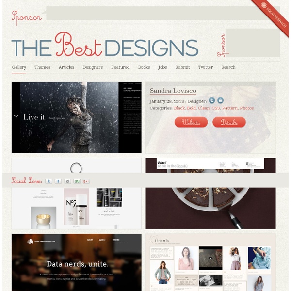
40 Cool Website Design Ideas You Should Check Inspiration February 23, 2011 There is more to web design that meets the eye, but honestly, would you not like it to be a little creative, too? Content and substance definitely are important, however let us not forget the importance of creative web designs in getting and retaining readership. Many people never thought that great content and great web design are possible together. Well, it is more than possible now. The world wide web has definitely turned into a more colorful and exciting virtual world to surf, what with unique designs that just get better and better as time passes by. Sony Ericsson View Source Cornerd View Source Toasted Digital View Source Jeugdraadbrakel View Source Cappen View Source Html 5lab View Source Ben the Bodyguard View Source Ryan Scherf View Source Pointless Corp. View Source Pole Cat View Source Nike Better World View Source The Combine 2010 View Source Art Flavours View Source Still Pointe Llama Sanctuary View Source Notch Studio View Source Web Effectual View Source View Source Psyched
esterni.org Degni di nota Design in Italia in tempi critici Cosa si nasconde dietro un pezzo di design? Un'idea che forse non ci arriva così chiara, molti ragionamenti, una storia produttiva curiosa, un fallimento commerciale, la creatività poetica dei suoi autori. Il progetto di Gianmaria Sforza in collaborazione con Ali Filippini nasce dal desiderio di conoscere a fondo la storia di un oggetto attraverso la testimonianza diretta di chi lo ha concepito, raccontandoli semplicemente, per capire qualcosa del design e dell'Italia di oggi. Oggi si comunica in molti modi, e media, ma sempre meno, le cose più interessanti rimangono non dette, sottintese, sotto la superficie degli oggetti, o confuse tra le pagine illustrate dell'ultima rivista alla moda. Forse ci sono buone idee anche fuori da un certo circuito, e anche altri modi di comunicarle, investendo risorse non solo economiche per farle circolare. La prima tappa della mostra è a Berlino 1-18 giugno per la Dmy!
Ruby on Rails Development - 12 Spokes jQuery Effects - Fading Top Design Magazine - Web Design and Digital Content Ultimate Guide to Business Cards: Infographics and Other Resources | You the Designer Articles, Inspiration August 26, 2011 After a year of blogging about business cards, we were able to make a list of things you might need to know about them — from where business cards started down to what you can do to make your cards stand out. The infographics and other resources we have posted below should help you create great business cards. Business cards are important tools for expanding one’s network. To start off, here’s an infographic showing the origin of business cards and some information about custom business cards. Business Card Designs The design of your business card can either make or break you. Your business card designs should be well-planned and well-executed. Standard Size View Source View Source View Source Rounded Corners View Source View Source Circles and Squares View Source View Source View Source View Source Other Die-Cut Shapes View Source View Source View Source Usability: Adding Features to Your Business Card Below are some examples: QR Codes View Source View Source View Source
BLUE VERTIGO | Web Design Resources Links | Last update MAR.09.2012 Mozilla Firefox Start Page 1. Awesome Awesome (sic) is one covering window manager and is definitely a good one. The environment uses the Lua scripting language and is highly configurable and extensible in usage. You do not require mouse, it provides great support for multiple monitors and claims to be as fast as lightning. 2. AmiWM is a simple window manager with a simple goal called emulate the Amiga Workbench. 3. The Mezzo Desktop Environment is somewhere super cool and still weird. UDE, or the 'Unix Desktop Environment,' is usually described as 'hardcore' desktop environment. 5. Ratpoison probably carries the most innovative name around other desktop environments. 6. Just like the name, its audience is sweet too! While our last list had no file, ROX brings alive the old and famous concept of Linux that states that 'everything is a file'. Atithya Amaresh, EFYTIMES News Network
& the feeling must go.