
Quick Practical, Tactical Tips for Presentations In the past I’ve given some tips for handling meetings effectively, covering topics like: - How not to let your meeting go down a rat hole; - Dealing with the elephant in the room; - Dealing with skeletons in your closet; - How to make meetings discussions, not “pitches” - A tale of two pitches (I eventually invested in the first company that pitched) Today’s post is a subtle one about positioning yourself in a presentation. This might be a VC meeting but also might just be a sales or biz dev meeting. It’s any meeting where you are in a small room and are being called on to present on some form of overhead slides 1. If you look at Diagram A above you’ll see that the presenters are sitting at the opposite end of the table from where the screen is. If you look at Diagram B you’ll see that the people you’re presenting to can look you in the eyes and glance up at the screen. 2. I’ve lately been attending meetings with our shareholders (called LPs or limited partners). 3. 4. 5. 6.
Educational Technology Network Swiss Group Wants to Banish PowerPoint While most people might not love using Microsoft's PowerPoint to create presentations, at least one person is taking his distaste for the software to a global level. Matthias Poehm, a former software engineer-turned-public speaking trainer has started -- yes -- the Anti-PowerPoint Party (APPP) earlier this month. Headquartered in Bonstetten, Switzerland, the APPP calls itself an "international movement" that intends to "decrease the number of boring presentations worldwide." The goal is to make it so that people who don't want to use PowerPoint "will not have to justify themselves in the future," it says. Right. While an APPP representative didn't immediately return an email seeking comment, the statistics above seem to originate from Poehm's book, "The PowerPoint Fallacy." If this doesn't seem wacky enough, the group says it also wants to participate in the Swiss national elections in October and become the country's fourth-largest political party. Keep it short. Don't be long-winded.
The Impact of Video in Education Infographic Educational Technology Infographics The Impact of Video in Education Infographic presents how to strategically adopt video technologies into teaching and learning, and how to best guide students in the development of 21st century skills to prepare them for their role as global citizens. It is a perfect moment for educators everywhere to re-assess their use of video and to make the key decisions about how best to incorporate it into their students’ learning experience. The Impact of Video In Education You may also find valuable the following resources: Via: blogs.cisco.com Embed This Education Infographic on your Site or Blog! Do's and Dont's of Making Awesome Diagrams for Slides Yeah. I do loads of slide decks each year for several companies and there are two types of decks I do a lot. One is the presentation. The trouble is when I run into people who I can't convince there should be a difference. A coworker refers to them as textbombs, or in particularly egregious cases, text WMDs. Anybody help me? They are loose terms, so I'm sure they're called other things as well. An infodeck is a slide deck that is not meant to be presented to an audience.
Do Video Lessons Reinforce Learning, or Just Reinforce Pre-existing Incorrect Understanding? Have you ever shown a video to a classroom of students and heard one or more of them say, “I already know this stuff”? While the video plays, these students are likely to daydream, surf their phones, doodle, or otherwise fail to pay attention and learn. Worse yet, if they have a certain perception of how something works and this is corrected in the video, not only are they not too likely to pick up on it, but they may actually come away from the experience thinking their perception was validated. The same thing can happen when they watch videos on their own as part of assigned work outside of class. While preparing the first “Premium Members’ Video Round Up” (more on that below), one of the videos I selected offered powerful insights into who students learn, or don’t really learn, when watching some videos. “It is a common view that “if only someone could break this down and explain it clearly enough, more students would understand.” About Kelly Walsh Print This Post
How Can I Make My PowerPoint Presentations Amazing? Four Skills That Will Turn You Into a Spreadsheet Ninja 7 Steps to Giving a Killer PowerPoint Presentation Widely accepted as the most useful and accessible way to create visual aids ready to share with an audience, PowerPoint presentations are often poorly constructed making them boring and arduous to sit through. With so many uses and tools to help you give a fantastic presentation every time, it’s frustrating to see so many bad examples. Some sources claim that up to 50% of presentations are ineffective. A well-designed slideshow allows the presenter to maintain eye contact with the audience, creating an engaging experience for all involved. On the flip side, garish colour schemes, incorrect font sizes and poor image selection can turn your points from being clear to confusing. 1. Ok, so this one is obvious but you’ll be surprised how many people dive straight into creating a presentation without setting a plan and laying out the groundwork. Ask yourself what the key messages are that you want to get across to your audience. 2. The best slideshow presentations carry a theme throughout. 3.
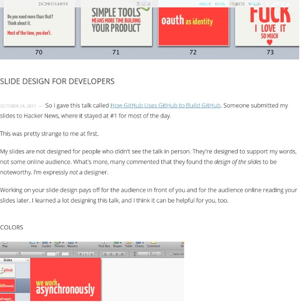
Gapminder: Unveiling the beauty of statistics for a fact based world view. Organize your slides into sections - PowerPoint In this article: Overview of sections Have you ever gotten lost in a giant presentation when the slide titles and numbers start blurring together, and navigating through the presentation becomes impossible? You simply lose track of where you are! In Microsoft PowerPoint 2010, you can use the new Sections feature to organize your slides, much like you would use folders to organize your files. While you can view sections in either Slide Sorter view or Normal view, Slide Sorter view tends to be more helpful when you want to organize and sort your slides into logical categories that you have defined. Below is an example of how you can view sections in Normal view: And, below is an example of how you can view sections in Slide Sorter view: Shows the selected section in the slide deck Another section in the slide deck Top of Page Add and name a section In either Normal view or Slide Sorter view, right-click between the two slides where you want to add a section. Rename a section Remove a section
PowerPoint 2013: See What's Coming with Presenter View | MS PowerPoint hints, tips, tutorials & discussion One of the most common questions in PowerPoint training is “how can I see something different on my screen to the audience?” The answer is complicated and involves multiple graphics card outputs. The Presenter View was added in 2010 but has really come into it’s own in PowerPoint 2013. In Presenter View you can see the current slide as well as the next slide and your notes on your monitor whilst the audience only sees the current slide. There’s a whole bunch of other tools underneath the main thumbnail, such as being able to zoom into slides to add emphasis, display a laser pointer to draw attention, and jump around the presentation without the delegates seeing what you’re doing. How to: The Presenter View will be used by default.