
CSS Differences in Internet Explorer 6, 7 and 8 « Smashing Magazine Advertisement One of the most bizarre statistical facts in relation to browser use has to be the virtual widespread numbers that currently exist in the use of Internet Explorer versions 6, 7 and 8. As of this writing, Internet Explorer holds about a 65% market share combined across all their currently used browsers. The interesting part of those statistics is that the numbers across IE6, IE7, and IE8 are very close, preventing a single Microsoft browser from dominating browser stats — contrary to what has been the trend in the past. Thanks to the many available JavaScript libraries, JavaScript testing across different browsers has become as close to perfect as the current situation will allow. This article will attempt to provide an exhaustive, easy-to-use reference for developers desiring to know the differences in CSS support for IE6, IE7 and IE8. This article does not discuss: Any item that is not supported by any of the three browser versionsProprietary or vendor-specific CSS Example
11 iPhone apps esenciales para diseñadores Si sois diseñadores y tenéis un iPhone, muchas veces habréis pensado que aplicaciones son las mejores para diseño y desarrollo web. Para no tener que irlas buscando por App Store, aquí os mostramos una excelente recopilación de aplicaciones para iPhone sobre diseño web y desarrollo que ayudará a más de uno y le ahorrará tiempo: 1. 2. 3. 4. 5. 6. 7. Igual que os presentamos una recopilación de referencias CSS, aquí tenéis la aplicación para iPhone. 8. 9. 10. 11. Vía | Designer-Daily
10 Best CSS Practices to Improve Your Code It’s really easy to find yourself wondering how your CSS got to be such a mess. Sometimes it’s the result of sloppy coding from the start, sometimes it’s because of multiple hacks and changes over time. Whatever the cause, it doesn’t have to be that way. Writing clean, super-manageable CSS is simple when you start off on the right foot and make your code easier to maintain and edit later on. Here are 11 tips for speeding up the process, writing CSS that is slimmer, faster and less likely to give you a headache. 1. Just like anything else, it pays to keep yourself organized. It will help you keep the cascading part of CSS in mind and sets your style sheet up to take advantage of style inheritance. Declare your most generic items first, then the not-so-generic and so on. Use a structure that works best for you while keeping future edits and other developers in mind. Resets and overridesLinks and typeMain layoutSecondary layout structuresForm elementsMiscellaneous 2. 3. 4. 5. 6. This: 7. 8. 9.
960 Grid System Design A Fresh Blog Theme On The 960 Grid | My Ink Blog CSS Frameworks Up until a couple of weeks ago I never really understood the fascination with using CSS frameworks in web design. They just seemed very limiting and boring. If you have been hesitant to give CSS frameworks a try for similar reasons, I suggest you at least give them a fair shake before you write them off completely. Introduction In this tutorial I’ll show you how to mock up a fresh looking blog theme in Photoshop that is designed to be used within the 960 framework. The Files In order to help you follow along and learn the techniques in more depth, below is the PSD file and a full size preview. Step 1 In some of my past Photoshop mockups and noticeably so for this project, Photoshop has a tendency to fade out colors like they’ve been through the wash too many times. We are going to use the 960 photoshop template that is provided in the download. Step 2 For now, hide the visibility on the grid by clicking on the eye icon in the layers palette for the 16 Col Grid group. Step 3
[Ask SM: CSS] Equal Spacing, CSS Font Replacement | CSS Advertisement This is our fourth installment of Ask SM, featuring reader questions about Web design, focusing on HTML, CSS and JavaScript. In this post we’ll cover how you can distribute the horizontal space between elements evenly, how you can achieve maximum sides on images; you’ll also learn best practices for CSS font replacement and answers to a couple of quickfire questions. If you have a question about CSS or JavaScript, feel free to reach me (Chris Coyier) via one of these methods: Send an email to ask [at] smashingmagazine [dot] com with your question.Post your question in our forum.Or, if you have a quick question, just tweet us @smashingmag or @chriscoyier. Please note: I will do what I can to answer questions, but I will certainly not be able to answer all of them. Distributing the horizontal space between elements evenly Antoine Nicolas writes: Do you know how to perfectly and dynamically distribute objects horizontally in a container using CSS? Let’s review the specific goals:
A Beautiful Apple-style Slideshow Gallery With CSS & jQuery – Tutorialzine Martin Angelov Introduction When speaking about design, there is one company that is impossible to go without. Apple values design – being a new product, a fancy catalog or their website – there is always something to admire. This week, we are making an Apple-like slideshow gallery, similar to the one they use on their website to showcase their products. So go ahead and download the example source code and continue with the first step. Step 1 – XHTML There is no need for a database nor a PHP back-end for this gallery. Lets take a closer look at the XHTML markup: demo.html The idea is simple – there are two main container DIVs – the one with id=”menu” holds the thumbnails, and the other – “slides” holds the slides themselves. To add a new slide, you’ll just have to add new elements to both containers. You can even put any kind of HTML in as well. Also notice that the thumbnail LI elements. Now lets continue with the next step. An Apple-like Slideshow Gallery Step 2 – CSS demo.css Step 3 – jQuery
Ordenación del CSS Ordenación del CSS 19 feb aNieto2k hace 1880 días en: CSS, Programacion, webdev Recuerdo que hace ya mucho tiempo hablamos con Daniel Mota sobre la cantidad de comentarios en nuestros CSS, pero aún podemos ser más meticulosos con estos ficheros. En Aloe Studio han dividido las propiedades en una serie de secciones (bastánte obvias) que engloban las propiedades ordenadas: Display y flujoPosiciónDimensionesMargenes, Padding, Border,…TipografíaBackgroundOpacidad,Cursores,… De esta forma obtenemos un listado de propiedades ordenadas como esta: Al igual que en el artículo, nunca me ha gustado ordenar las propiedades CSS alfabéticamente, no le encontraba lógica a definir antes el border: antes que la posición. ¿Y tu? Actualización Para complementar la lectura, recomiendo echarle un vistazo a las buenas maneras propuestas por Deziner Folio, son bastánte obvias pero importantes de conocer.
Easy front-end framework 7 Principles Of Clean And Optimized CSS Code | CSS Advertisement Some of you may remember the days when 30KB was the recommended maximum size of a web page, a value which included HTML, CSS, JavaScript, Flash, and images. I find with every new project with even the slightest bit of complexity, it’s not long before that 30 KB ideal is well out of my reach. With the popularity of CSS layouts and JavaScript-enriched web page experiences, it’s not uncommon, particularly for large sites, for the CSS files alone to jump well beyond that 30KB ceiling. But there are some principles to consider during and after you write your CSS to help keep it tight and optimized. 1. If you’re not already writing in shorthand, you’re late to the party. Margin, border, padding, background, font, list-style, and even outline are all properties that allow shorthand (and that’s not even an extensive list!). CSS Shorthand means that instead of using different declarations for related properties… … you may use shorthand properties to combine those values like so: 2. 3.
Beautiful Slide Out Navigation: A CSS and jQuery Tutorial Today I want to show you how to create an amazing slide out menu or navigation for your website. The navigation will be almost hidden – the items only slide out when the user hovers over the area next to them. This gives a beautiful effect and using this technique can spare […] View demoDownload source Today I want to show you how to create an amazing slide out menu or navigation for your website. The icons that we will be using are from the Colorful Sticker Icon Sets 1, 2, 3 and 4 by DryIcons. Ok, let’s get to work. 1. The only thing we will need for the navigation is a simple unordered list with links inside of the list elements: The list is getting an ID because we want to refer to it later in the JavaScript. 2. First, we define the CSS properties for the list: The navigation should always be accessible for the user, even if he scrolls down the page. Now, let’s look at the list element properties: For the links in the list elements, we define the following CSS properties: The JavaScript
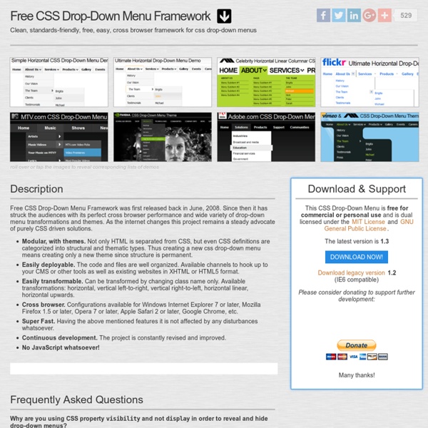
CSSLab