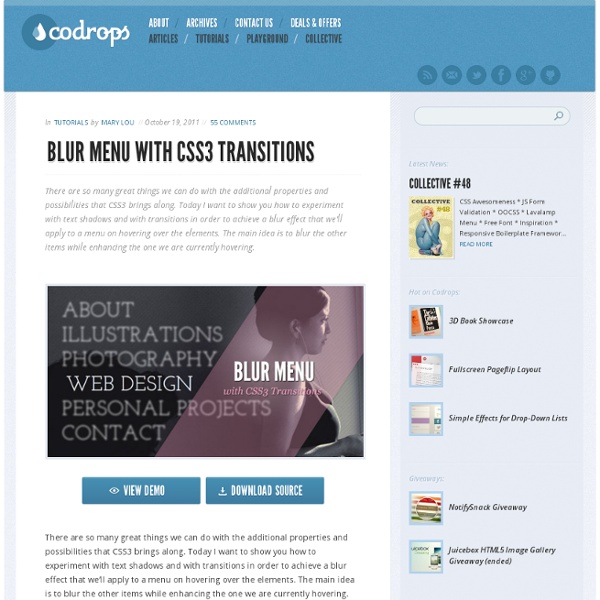
Blur Menu with CSS3 Transitions

http://tympanus.net/codrops/2011/10/19/blur-menu-with-css3-transitions/
CSS3 Image Styles
When applying CSS3 inset box-shadow or border-radius directly to the image element, the browser doesn't render the CSS style perfectly. However, if the image is applied as background-image, you can add any style to it and have it rendered properly. Darcy Clarke and I put a quick tutorial together on how to use jQuery to make perfect rounded corner images dynamically.
postcard from Paris – css3 keyframes animations in use
postcard from Paris – css3 keyframes animations in use I decided to explore the area of css3 keyframes animations. The idea was simple – to create a sort of virtual postcard. I live in Paris so obviously I send you my greetings from Paris :). Click here or on the image to view the animation demo. The css3 animations are supported by : Chrome 2+, Safari 4+, Firefox 5+, iOS Safari 3.2+ and Android 2.1+ (source Smashing Magazine).
15 Fresh and Powerful CSS3 Tutorials
CSS3 is here, it’s fun, and allows us to evolve the look of the web as we go. Features like gradients, drop shadows, rounded corners, animations, and opacity are giving us the promise of more fun. In this post we’ve collected some new and brilliant tutorials that will help you in mastering your CSS3 skills. We’ll create a document icon with pure CSS3.
(Better) Tabs with Round Out Borders
The following is a guest post by Menno van Slooten. You might notice we've been down this road before, but I quite like Menno's approach here. The end result proves you can get a little fancier with the design than I originally did, with borders, gradients, and shadows and while actually using less elements. A good-looking tab control usually has one feature that I've always found impossible to reproduce without images: borders that bend to the outside at the bottom of each tab.
Cross Browser HTML5 Progress Bars In Depth
Update (March 9, 2012): I have updated this document to include styling information for Internet Explorer 10. Screenshots of HTML5 progress bars with different styles applied. Details given below. As a web application developer, progress bars are great when you want to show the user that some action is happening, especially when it can take a long time.
Public Service Announcement: Watch Your @font-face font-weight
Let's say you're browsing Google Web Fonts for a free font to use on your website. You find one you like... You think it will look nice as headings on your site.
Adobe-like Arrow Headers
Adobe has some pretty cool header bars for modules on their site. The header bar is divided into left and right sections. The left being an explanatory title and the right being a related link. But let's get super critical of how they did it. First of all, they use a non-sprited image to do it:
Multiple Attribute Values
Elements can have multiple class names. For instance: Then in CSS, you could match that element based on any one of them: .module { }.accordion { }.expand { } You can limit your selectors to match only if several of them are present, for example:
Burst Title
During the previews for a movie I saw recently, there was an advertisement for an Oprah-related something or another. I wasn't paying attention because I was trying to get out my phone so I could snap a picture of it. Which I failed to do. There was these neat title screens that I thought would be fun to recreate with CSS. They looked like... well they looked like this:
Related:


