
50 outils et astuces pour mieux utiliser google plus Google plus occupe le devant de la scène depuis une semaine. Tout le monde ne parle plus que de cela. Chacun y va de son analyse, de son conseil, de ses louanges. Il faut dire que pour tout ceux qui sont réfractaires à Facebook, il n’existait jusqu’à maintenant aucune alternative crédible. C’est désormais le cas. Edit : aujourd’hui marquant l’ouverture de Google Plus au grand public accompagné de nombreuses nouveautés, nous vous proposons une mise à jour de ce billet vous présentant 50 outils pour mieux utiliser Google plus. Transférer ses photos de Facebook à Google plus avec Move2picasa Pas envie de ré-uploader toutes vos photos sur Google plus alors qu’elles sont déjà sur Facebook ? Rapatrier toutes ses données Google avec Google takeout Cette astuce est valable pour Google + mais pas seulement. Importer ses contacts Facebook dans Google plus Pourquoi repartir de zéro quand on a déjà rassemblé un vaste réseau sur Facebook ? Les raccourcis clavier Utiliser les cercles d’amis sur Facebook
Visualizing the Gravity Interest Graph / whatspop A log of things made by Kunal Anand [@ka] A few weeks ago, I prepared a series of data visualizations that would explain what the interest graph is and how it relates to the social graph. The concept I came up with was very straightforward. This was one of the first graphs to be generated. Here's another interest graph that has substantially more nodes. Perhaps the most gratifying part of this process was the ability to get many of these visualizations printed as large posters. Technically, I coded the entire process just using Core Image.
Google+ ouvre les pages pour les annonceurs À peine plus de 3 mois après son lancement (Google lance sa plateforme sociale unifiée Google+), les équipes de Google+ viennent d’annoncer le lancement officiel des pages pour les annonceurs : Google+ Pages, connect with all the things you care about. Alors que les rumeurs parlaient d’expérimentations avec des grandes marques internationales, l’accent est plutôt mis sur les marques locales et les personnes qui s’en occupent : De nombreuses marques sont déjà présentes comme Pepsi, Toyota, Macy’s, H&M, Uniqlo, The New York Times, Burberry… mais toutes ne sont pas encore vérifiées. On trouve également quelques marques européennes comme Air France ou Alitalia, mais j’ai l’impression que ce sont des initiatives locales spontanées car elles ne sont pas encore bien alimentées. Vous pouvez donc dès maintenant librement créer une page à l’adresse suivante : Google+ Pages Create. Maintenant que les pages sont ouvertes, les équipes vont devoir mettre les bouchées doubles pour :
Developing Empathy | Designing for Foreign Cultures By Janet M. Six Published: September 17, 2012 Send your questions to Ask UXmatters and get answers from some of the top professionals in UX. In this edition of Ask UXmatters, our experts discuss two different topics: how to become more empathetic designing user experiences for foreign cultures Ask UXmatters is a monthly column in which a panel of UX experts answers our readers’ questions about a variety of user experience matters. The following experts have contributed answers to this edition of Ask UXmatters: Developing Empathy Q: What activities can we practice in order to get better at empathy? “Develop an interest in what motivates others and, especially, what motivates their responses.” Jordan has a unique perspective on empathy. drama—When I was growing up, the most effective way for me to learn what other people might be thinking was to take on the persona of another person. Spending Time with Users “Let’s take the simple example of watching a usability test or design research session.
Google+ Pages & WordPress Les Google+ Pages viennent de faire leur apparition sur le réseau social de la Mountain View. Comme chez Facebook et ses pages fans, elle s’adressent aussi bien aux entreprises, associations, ou site Web et permettent de mettre en avant une marque. Je vous propose d’en bénéficier dès à présent pour votre site WordPress. Conférence Google+ – CCI de Bayonne Voici le PDF librement téléchargeable à propos de Google+ pour les entreprises. Google+ Pages c’est quoi ? Cette vidéo de présentation est particulièrement intéressante : elle démontre l’intérêt pour une TPE ou une PME d’être présente sur le Web pour entrer en contact direct avec ses clients. Comment créer une Google+ Page ? Rendez-vous sur l’URL de création d’une page entreprise. Étape n°1 – Choix d’une catégorie Choisissez ensuite une catégorie dans la partie gauche. Outil de création d’une Google+ Page Étape n°2 – Ajout des informations Remplissez les différents champs en indiquant notamment un URL vers votre site WordPress. Et WordPress ?
Know When to Stop Designing, Quantitatively Interface design is more than hand waving and color preferences. When you design anything to be used by humans, there are some fundamental tools which can tell you if one interface is better than another. Quantitatively. Don’t believe me? Which of the following two sentences contains more information? Cogito ergo sum.Shoes smell bad. [*] The careful reader may be waggling their finger at me. The first represents a foundational building block of Western rationalism, the second is a rather banal (albeit true) thought. The lesson here is that “meaning” and “information” are distinct concepts. A bit is the fundamental unit of information. As you can see, if you have some number of things to choose from–and that number happens to be a power of two–it is easy to find the number of bits of information that the choice represents: it’s just the power. Choosing any letter (e.g., “g”) is a 5 bit choice. So back to the two sentences. Time for an example. Digital Wrist Watches So far so good.
Google va-t-il engloutir l’Internet ? Le 28 juin 2011, Google lançait son application de réseau social en ligne, Google+, censée concurrencer directement Facebook, et plus indirectement Twitter, deux autres géants du Web. Google+ n’est pas la première tentative de Google pour s’imposer dans les réseaux sociaux en ligne et d’autres projets comme Orkut ou Google Wave avaient déjà vu le jour avec un succès limité. Google+ a conquis la population de la Belgique en deux semaines Pour sa part, le lancement de Google+ s’est fait dans les règles de l’art et a connu un important succès, avec près de 10 millions de membres en deux semaines—la population d’un pays comme la Belgique ! Le succès initial de Google+ est fondé sur trois éléments assez simples et qui ont fait leurs preuves. Une image de marque philanthropique qui attire les étudiants Ce développement récent de Google invite à une réflexion « géopolitique » sur l’avenir de l’Internet et du Web. Google menace Apple
Moments that Matter ... Moments that Don’t As consumers access more information across emerging media channels and new devices, marketers have responded by perceiving every new interaction as an available touchpoint to connect with and engage their target audiences. This has created an overpopulation of brand messaging that has had the reverse effect of dangerously distancing consumers at critically important buying moments. The result has been catastrophic for many companies—they’re bleeding customers and they don’t know why. What’s needed is a new approach engineered around what the customer wants to hear from us, not what we want to say to them. An approach that starts with a deep understanding of the moments that matter—the key trigger points for interacting successfully with buyers without alienating them. Simply said, by focusing on these pivotal moments, brands will have an easier time creating engaging experiences and maximizing their return on investment. The Moments That Matter Building Experiences “just for U”
Google+ launches an “ignore” option. Hide people but let them interact with your content. - TNW Google Google has just introduced a new way of customizing Google+ so you only see content from people you’re interested in without having to completely block them. The Block Option From day 1, Google has provided a means of “blocking” people entirely from your Google+ experience. This would involve clicking “block” on their profile and it would result in: them being removed from your circles and your extended circlesnot seeing of their new posts in the Streamnot seeing anything you share with your circlesand them being unable to comment on your posts The Ignore Option Today, with the less intense “ignore” option. With the ignore option, you: Won’t see their posts in the incoming streamYou won’t get notifications about their activitiesYou won’t see them in your circles page Sounds like this will come in particularly useful for all the celebs that Google’s hoping will flock to the service. It’s worth noting that both ignore and block won’t notify people that you’re not interested in them.
Know Thy User: The Role of Research in Great Interactive Design Comment Créer Une URL Personnalisée Pour Votre Profil Google Plus Google n’autorise pas actuellement la création d’une URL personnalisée pour votre profil Google Plus. La raison est simple : beaucoup de comptes Google sont liés à Gmail et les spammeurs pourraient ainsi obtenir des millions d’adresses gmail. Une solution existe qui permet toutefois de s’affranchir de la vilaine URL actuelle qui s’affiche sous la forme suivante : plus.google.com/108066871093857482458. Pas très facile à mémoriser ou encore à communiquer me direz-vous … Gplus.to est donc une application qui vous aide à créer une URL personnalisée pour votre profil Google Plus. Vous choisissez un nom puis vous renseignez votre ID Google Plus et le tour est joué. Il existe d’autres solutions pour s’affranchir de l’URL par défaut de Google Plus mais c’est celle-ci qui me paraît pour l’instant la plus indiquée. Source : Mashable US Tags: Google, google plus, gplus.to, url personnalisée Catégorie: Social Media
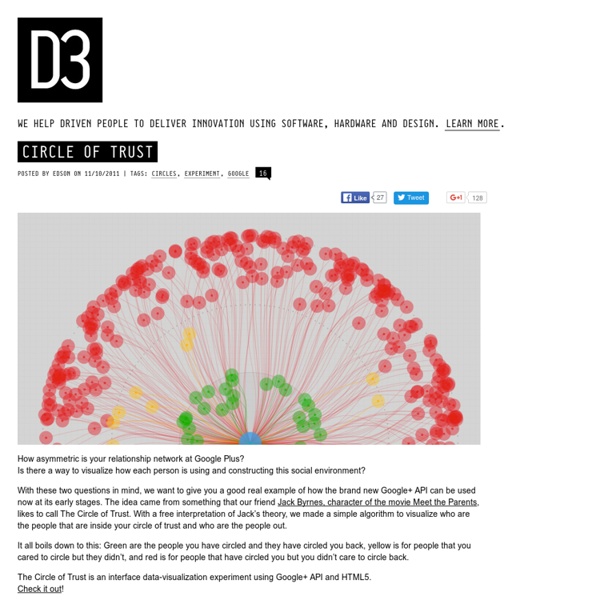
How asymmetric is your relationship network at Google Plus?
Is there a way to visualize how each person is using and constructing this social environment? by agnesdelmotte Oct 11