
Mockups Take a second. Let it sink in. The first impression might be disorienting. There are very few interface elements on the screen. Start exploring however, and you'll find out that Mockups is filled with powerful yet only-visible-when-you-need-them features. Getting your ideas out should be effortless. Our sweet spot: the ideation phase Mockups really shines during the early stages of designing a new interface. Mockups is zenware, meaning that it will help you get "in the zone", and stay there. Mockups offers the same speed and rough feel as sketching with pencil, with the advantage of the digital medium: drag & drop to resize and rearrange elements, make changes without starting over, and your work is clear enough that you'll make sense of them later. See what you can build with Mockups Download the samples above, or find more on Mockups To Go, our community-contributed stencils site. Designed for collaboration Your whole team can come together around the right design using Mockups. Two reasons:
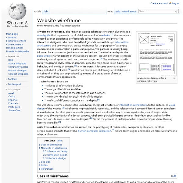
Lessons Learned Wireframes, de bouwtekening van een website - Yes2web Geplaatst op 25-11-2009 in Advies Webdeveloppers gebruiken vaak de term "wireframes" (ook wel eens "interactie ontwerp" genoemd). Dit artikel geeft een uitleg wat wireframes zijn, hoe ze kunnen worden ingezet, hoe u zelf wireframes ontwikkelt en waarom wireframes belangrijk zijn in het proces van het ontwikkelen van een website of (web)applicatie. Wat zijn wireframes? Wireframes zijn een visueel hulpmiddel bij het ontwikkelen van een website of -applicatie. In de wireframes worden zaken vastgelegd als navigatie, indeling en inhoud, zonder gebruik te maken van een grafisch ontwerp. Een voorbeeld van Wireframes van een bekende zoekmachine. Wanneer worden wireframes ingezet? Vanaf het eerste moment dat de doelstellingen van de website bekend zijn kunnen de ideeën in wireframes uitgewerkt worden. Communicatie hulpmiddel Met wireframes kunt u helder communiceren met de betrokkenen bij een webproject (klant, projectmanager, front-end developer, programmeur, zoekmachinespecialist). Concept toetsen
Mockup In manufacturing and design, a mockup, or mock-up, is a scale or full-size model of a design or device, used for teaching, demonstration, design evaluation, promotion, and other purposes. A mockup is a prototype if it provides at least part of the functionality of a system and enables testing of a design.[1] Mock-ups are used by designers mainly to acquire feedback from users. Mock-ups address the idea captured in a popular engineering one-liner: You can fix it now on the drafting board with an eraser or you can fix it later on the construction site with a sledge hammer.[2] Applications[edit] Mockups are used virtually everywhere a new product is designed. Automotive devices[edit] Mockups are used in the automotive device industry as part of the product development process, where dimensions, overall impression, and shapes are tested in a wind tunnel experiment. Systems engineering[edit] Early layouts of a World Wide Web site or pages are often called mockups. Military acquisition[edit]
Features - Proto.io Gestures, touch events, screen transitions, and animations Mobile apps, mobile websites and web apps are becoming more sophisticated and intricate when it comes to their presentation. Being able to add animations, screen transitions, and interactivity to your prototypes creates a new user experience for your clients. These features help to simulate and test a realistic representation of your mobile app, mobile website or web app. Proto.io supports all the major mobile gestures and touch events like tap, tap-hold, swipe, pinch, and zoom. Further than that, they’re not limited to just screen transitions either. Prototype for any device A new device just came out and you need to create an app prototype for it? Realistic UI component libraries When prototyping with Proto.io, you can use your own sketches, mockups or high-fidelity designs, as prepared in your favorite design software. Test your prototype directly on your mobile device Prototypes work, look and feel as real apps do. It’s alive!
Een website maken - Marketingportaal.nl Een mooie website maken is één ding, maar een website goed voorbereiden, zodat het ook een effectief marketinginstrument wordt, is een heel ander verhaal. Daar komt nog wel het nodige bij kijken. In dit artikel wordt er daarom aandacht geschonken aan verschillende stappen die genomen moeten worden, voordat een website fysiek (ontwerp en techniek) ontwikkeld gaat worden. Functioneel ontwerp Een functioneel ontwerp is een document waarin een website wordt beschreven, voordat deze wordt ontworpen en technisch geïmplementeerd. Een functioneel ontwerp bestaat uit verschillende onderdelen. 1. Voordat een website wordt ontwikkeld, is het belangrijk na te gaan wat u met de site wilt gaan doen. Wat de doelstelling ook gaat worden, het is ontzettend belangrijk om hier duidelijkheid over te hebben, voordat u echt aan de slag gaat. 2. Een heldere doelstelling vraagt iets van een site. Een professioneel designAansprekende inhoud gericht op de doelgroepenEen doelgroepgerichte navigatiestructuur 3. 4.
Web design Web design encompasses many different skills and disciplines in the production and maintenance of websites. The different areas of web design include web graphic design; interface design; authoring, including standardised code and proprietary software; user experience design; and search engine optimization. Often many individuals will work in teams covering different aspects of the design process, although some designers will cover them all.[1] The term web design is normally used to describe the design process relating to the front-end (client side) design of a website including writing mark up. History Web design books in a store Although web design has a fairly recent history, it can be linked to other areas such as graphic design. The start of the web and web design In 1989, whilst working at CERN Tim Berners-Lee proposed to create a global hypertext project, which later became known as the World Wide Web. Evolution of web design End of the first browser wars Modern browsers Page layout
What can I expect if I apply? The application process has three distinct phases: Phase 1: Data capture - we capture the application details and publish them on our website.Phase 2: Examination - we decide if your application is acceptable and search for identical/similar trade marks.Phase 3: Publication - once accepted, all applications are published and are then open to opposition. If the examiner doesn’t raise objections and it isn’t opposed, it will normally take around 4 months for your trade mark to become registered. If objections are raised, or if your mark is opposed, it can take longer. Apply to register a trade mark Design trends for 2011 Everything inside the design world is permanently changing, evolving and adapting into new ways of expression and communication looking to satisfy the new consuming needs and set innovative exchanging channels. 2010 made a huge closure for the final year of the first XXI century decade, we witnessed the rising of tablets (iPad, Samsung Galaxy Tablet among others), the demise of Internet Explorer 6 and the absurd fanaticism towards Flash (though it’s losing a lot of fans), which is going to be slowly replaced by HTML5 (we’re not saying that Flash is dead, only that HTML5 will begin to cover many of its current uses). Editorial disclaimer Of course that the common design elements such as typography, navigability, color and more have also changed and as you will see on this article, these changes must be apprehended by every designer that wants to set his mark during 2011. No more clutter, it’s time to clean things up More good examples Don’t be shy, start playing with typefaces
User experience design In most cases, user experience design (UXD or UED) fully encompasses traditional human-computer interaction (HCI) design, and extends it by addressing all aspects of a product or service as perceived by users.[1] User experience is any aspect of a person's interaction with a given IT system, including the interface, graphics, industrial design, physical interaction, and the manual.[2] History[edit] The field of user experience design has roots in human factors and ergonomics, a field that, since the late 1940s, has focused on the interaction between human users, machines, and the contextual environments to design systems that address the user's experience.[3] With the proliferation of workplace computers in the early 1990s, user experience became an important concern for designers. Elements of User Experience Design[edit] With the rise of the information age, many generalizations of the components have been based on the building blocks of the user experience design of digital systems.
How to Learn How to Be a Software Engineer for Free: 8 Steps Edit Article Edited by Confusionist, YuenglingMaster Acquiring skills in information technology is a smart way to boost your career. Gaining a degree in software engineering can help you to get jobs with excellent pay, or simply bring more skills to your current job. However, not all people are able to return to school to gain this degree. Ad Steps 1Sign up for a library card at your local branch. Ad Responsive CSS Framework Comparison: Bootstrap, Foundation, Skeleton Bootstrap 4.0.0-alpha is a fairly large update to the framework. It has dropped Less support in favor of Sass, converted from px-based to rem-based sizing, improved its grid system, and dropped IE8 support. Also, all its JS plugins were re-written in ES6, it now uses a customized reset CSS file called Reboot, and offers flexbox support via a Sass boolean variable. In addition to this update, Bootstrap now offers themes at themes.getbootstrap.com. Also, Bootstrap will continue supporting version 3, unlike the dropping of version 2 support after the release of version 3. You can read more here. Foundation 6 is a fairly major update which includes more grid flexibility, custom breakpoints, optional flexbox, and more. Like Bootstrap 4, Flexbox is now toggleable via Sass in Foundation 6. The Sass/CSS has been reworked and consolidated, and there are fewer default styles to override on common elements. Skeleton 2 was updated in December 2014 after remaining mostly unchanged for about three years.
Europe’s Tech Hubs: Let’s Startup Somewhere Else 20 Best Responsive Web Design Examples of 2012 | Social Driver ® | Get with the future. The Boston Globe The largest responsive website to date, The Boston Globe handles loads of content effortlessly, keeping the site intuitive and the content easily accessible on the device of your choice. Smashing Magazine I love this site. Food Sense Clean layout, beautiful photography and playful iconography made me like this site immediately on my first visit. Andersson Wise Type designer, Jan Tschichold once said, ‘Simplicity of form is never a poverty, it is a great virtue.’ Sphero If you haven’t check out Sphero, you should. CSS Tricks It might be the conspicuous green frog that causes me love this site. Grey Goose The Grey Goose site shows that designing responsively does not limit our designs to columns of fluid text and images on solid backgrounds. New Adventures In Web Design With a name like “New Adventures In Web Design,” one would expect a responsive site for this web design conference. Lancaster University Fundraise.com Web Designer Wall Heathlife London & Partners Oliver Russell Fork