Theo Inglis
Somebody submitted this question to my other blog (midcenturymoderndesign.tumblr.com) and I ended up writing quite a long answer, so I figured I may as well post it on here, just in case it helps anyone in anyway at all! It is a very hard question to answer really, but I tried to help and be honest. My answer is below: Hi, thanks for a tough question! I’m 25 and have been a designer professionally for about three years now, after spending four years at University. My advice would be this: You don’t have to be able to draw to be a designer per se, there are some areas of design that you can pursue where you don’t have to draw to succeed. A lot of graphic design can be done without ever getting off the computer, but you don’t want to be limited to that, and often doing things by hand (not necessarily drawing) can be enjoyable and help you work differently. I hope this helps!
CMYBacon
Coverjunkie
nokturnal > switch
I was looking through an old Print Magazine the other night, and came across some poster design that I loved. When I searched for them online I learned that Nokturnal Studio is no longer in existence, but you can still buy their posters. Now, Michael Carpenter (formerly of Nokturnal) is the artist behind Switch. Like, these beautiful save-the-dates: And these great business cards: And… a project for building studio
Gallery of Computation - StumbleUpon
LIVING WORKS binary.ring bit.10001 bone.piles box.fitting box.fitting.img new bubble.chamber buddhabrot city.traveler cubic.attractor deep.lorenz guts new happy.place new henon.phase henon.phase.deep new inter.aggregate new inter.momentary new invader.fractal limb.sand.stroke limb.strat limb.stroke mcp moonlight.soyuz nine.block node.garden new offspring orbitals new paths.i peter.de.jong sand.dollar sand.stroke sand.traveler new self-dividing.line stitches substrate new tree.garden.ii trema.disk trema.spike INFORMATION about the programmer about the medium ORDERING works available production qualities ordering policies CONTACT j.tarbell @ complexification.net
High Quality Texture 4 Fresh Green Leafs
fresh like the early mornings, droplets of dew and the sun started my day bright. I wanted to share the freshness of my day to the world. Love the earth to live better. Term of UseFull size each image are 2304 x 1728 pixel. Fresh Leaf 1 Fresh Leaf 2 Fresh Leaf 3 Fresh Leaf 4
Top 10 Websites for Designers - April 2012
This latest edition of the Top 10 Websites for Designers includes a new creative critique platform, a fun color picker for the real world and more. In November's Top 10 Websites for Designers you'll discover collections of thought-provoking posters, a flawlessly delivered digital story and more. In October's Top 10 Sites for Designers, check out a showcase of people from all backgrounds in design; a color gradient generator; fun agency site & more. In this month's roundup of websites for designers, you'll find font pairing tools, interesting portfolio sites, a product graveyard and more. This month's roundup of websites for designers features a history of cocktail lettering, a funny interactive film and goofy designer excuses. This month’s Top 10 Websites for Designers includes design portfolio inspiration, an interesting color resource and websites that offer unique storytelling experiences.
Fri, 07/08/2011 | Co.Design
Hello You Creatives
Achieving a Vintage Look Through Color Tones in Photoshop CS
by Guest Contributor Anna Gay Photographers are often striving for a “vintage” look in their photos, and even though there are endless ways of achieving a vintage look, there are a couple of characteristics to keep in mind. First of all, the color tones in a vintage photo often lean towards either a blue or a red hue, or a cross-processed look. Vintage photos also have an element of noise or grain that can be achieved through textures, and also a certain amount of vignetting around the edges of the photo. In this tutorial, we will look at adjusting color tones and adding vignettes. This photo is the result of adjusting the color curves, adding two vignettes, and a color fill, which we will walk through step-by-step. First, open your photo in Photoshop and make sure your foreground color is set to white in your side tool bar. You will see the above dialogue box. As you can see here, there should be three layers – your Background image, then your two gradient layers.
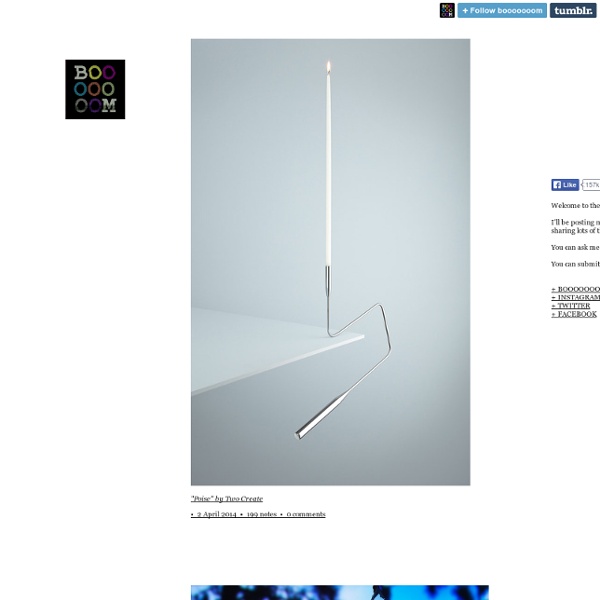
LES IMPREVISIBLES