
Blur Menu with CSS3 Transitions There are so many great things we can do with the additional properties and possibilities that CSS3 brings along. Today I want to show you how to experiment with text shadows and with transitions in order to achieve a blur effect that we'll apply to a menu on hovering over the elements. The main idea is to blur the other items while enhancing the one we are currently hovering. View demo Download source There are so many great things we can do with the additional properties and possibilities that CSS3 brings along. The images in the demos are by fabulous Mark Sebastian and they are licensed under the Attribution-ShareAlike 2.0 Generic (CC BY-SA 2.0) License. Please note that this will only work properly in modern browsers and unfortunately Internet Explorer does not belong to that category yet since it does not support transitions (and many other suggested CSS3 properties that others do support). The Markup Let’s create the HTML structure for our menu first. Now we’ll add some style!
Musings on the Relationship Between Grids and Guides Though it has been around for years in print design, the concept of working on the grid has become really popular in web design in recent times, especially with the success and availability of CSS frameworks like the 960 Grid System. Many tutorials and articles that I have seen make explicit use if grids, even going so far as to specifically recommend the use of one particular system. Musings on the Relationship Between Grids and Guides That’s great. Though certainly not a necessity, using a grid in web design is a great way to establish a strong, underlying structure that provides consistent, visual unity between the elements in a design. Personally, I’ve been used the 960 Grid System in several designs, and will be using some form of grid in the upcoming redesign of this very blog. As great as grids are, however, I do think that it’s important to distinguish them from another useful layout tool: guides. Grids A grid breaks space or time into regular units. Guides A common web grid
15 Places To Download Free High Quality Stock Photos There are many free stock photography sites. I set out to find as many good ones as I could. I found 15 good, solid resources out there. Royalty Free does not mean the images are free; it means that you don’t need to pay the photographer a royalty each time you use the image. Today I am going to share 15 websites where you can download free stock photos. You can easily get a quality and beautiful wallpaper for your desktop or simply an illustration for your blog. Free stock nature photography. This site is a community for travel photographers. This is a huge resource of over3 million photos! This site provides tons of high quality and high resolution free stock photos. The photos on Imagebase are free to use, and are licensed under a Creative Commons license. Stockvault is a very classy, modern site with thousands of images and some Photoshop tutorials. Morguefile is a completely free source for stock photos. All the photos are free to use. Related Posts:
postcard from Paris – css3 keyframes animations in use | PeHaa Blog postcard from Paris – css3 keyframes animations in use I decided to explore the area of css3 keyframes animations. The idea was simple – to create a sort of virtual postcard. I live in Paris so obviously I send you my greetings from Paris :). Click here or on the image to view the animation demo. The css3 animations are supported by : Chrome 2+, Safari 4+, Firefox 5+, iOS Safari 3.2+ and Android 2.1+ (source Smashing Magazine). The html structure is very simple : We will use the following images (I will discuss the sparkling effect a little bit later) Let’s start to complete the css stylesheet : Animating clouds To animate the three layers of clouds independently we use the following keyframes. This way we have defined the property of background-position for the beginning, middle and end of our animation. to associate the animations with the proper elements and to define the duration, timing-function and iteration count, respectively (I use the shorthand notation). Animating phare light
Responsive Design with CSS3 Media Queries Screen resolution nowsaday ranges from 320px (iPhone) to 2560px (large monitor) or even higher. Users no longer just browse the web with desktop computers. Users now use mobile phones, small notebooks, tablet devices such as iPad or Playbook to access the web. So the traditional fixed width design doesn't work any more. View Demo Responsive Design Download Demo ZIP See It in Action First Before you start, check the final demo to see how it looks like. More Examples If you want to see more examples, check out the following WordPress themes that I designed with media queries: Tisa, Elemin, Suco, iTheme2, Funki, Minblr, and Wumblr. Overview The page's container has a width of 980px which is optimized for any resolution wider than 1024px. HTML Code I'm not going to go through the details of the HTML code. HTML5.js Note that I use HTML5 markup in my demo. Reset HTML5 Elements to Block The following CSS will reset the HTML5 elements (article, aside, figure, header, footer, etc.) to block element.
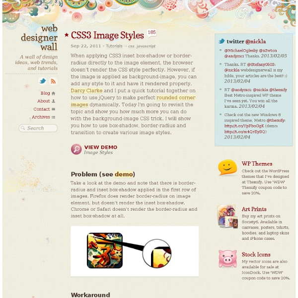
15 Fresh and Powerful CSS3 Tutorials CSS3 is here, it’s fun, and allows us to evolve the look of the web as we go. Features like gradients, drop shadows, rounded corners, animations, and opacity are giving us the promise of more fun. In this post we’ve collected some new and brilliant tutorials that will help you in mastering your CSS3 skills. We’ll create a document icon with pure CSS3. When applying CSS3 inset box-shadow or border-radius directly to the image element, the browser doesn’t render the CSS style perfectly. There are so many great things we can do with the additional properties and possibilities that CSS3 brings along. Designing a table is a challenge. During this tutorial we’re going to use CSS3 to create ticket-like tags, without relying on any images. We are going to create some thumbnail hover effects with CSS3 transitions. See how easy is to create a spinning rays animation with a bit of CSS. Still hyped by the possibilities of CSS3, we want to share some CSS3 button experiments with you.
Maximize the Use of Hover Usually, we create hover effects by changing: font color, font styles, border styles, background, and etc. But there are a lot more that we can do with hover. We can use hover to beautify design, minimize clutter, and display additional information. In this article, I'm going to provide various examples of websites that maximize the use of hover. 1. I use hover to beautify the layout of IconDock. 2. QBN makes its layout look cleaner by hiding the extra buttons on default. Gucci puts focus on their product images by hiding the variations. 3. Coda combines CSS and Javascript to create a beautiful tooltip. On Best Web Gallery, I use jQuery to display a larger image of the screencap. Tutorials Image Hover (see demo) The following CSS tutorial imitates the hover effect as seen on the Gucci and QBN site. Animated Hover (see demo) The following demo use jQuery to animate the <em> text when you hover the link, as seen on the Coda site. jQuery Tooltip
(Better) Tabs with Round Out Borders The following is a guest post by Menno van Slooten. You might notice we've been down this road before, but I quite like Menno's approach here. The end result proves you can get a little fancier with the design than I originally did, with borders, gradients, and shadows and while actually using less elements. A good-looking tab control usually has one feature that I've always found impossible to reproduce without images: borders that bend to the outside at the bottom of each tab. The markup <ul class="tabrow"><li>Lorem</li><li>Ipsum</li><li class="selected">Sit amet</li><li>Consectetur adipisicing</li></ul> This would be about as basic as you can get. Getting started To get started, let's get rid of the default <ul> and <li> styling and get these babies in line. LoremIpsumSit ametConsectetur adipisicing Selecting a tab The selected tab should of course be clearly visible. Getting to the bottom of things Every tab control needs a well-defined bottom edge. Above and beyond Around the bends Share On
CSS3 Transitions And Transforms From Scratch There are some amazing examples of CSS transforms and transitions, and whilst you may be blown away by them, there's a good chance that you're also overwhelmed and a bit intimidated! This tutorial will take you back to the very basics. We're going to create some fundamental CSS3 transitional movements, step by step. A Quick Note on Browser Support: Support across browsers is already pretty reasonable. The Axes and Grid To help understand the movement easily we'll be working on an axis grid (which you'll probably recognize from basic math). The only (crucial) difference is that on our axis the -y value is above the x axis, whilst it would ordinarily be below it. Note: I'm going to assume that you're already familiar with HTML and CSS file structure. 1: Horizontal Movement The first movement we'll demonstrate is "horizontal"; we'll animate the object to move to the right and to the left. Moving to the Right Open your favorite Text Editor and enter the following html markup, then save the file.
Cross Browser HTML5 Progress Bars In Depth Update (March 9, 2012): I have updated this document to include styling information for Internet Explorer 10. Screenshots of HTML5 progress bars with different styles applied. Details given below. As a web application developer, progress bars are great when you want to show the user that some action is happening, especially when it can take a long time. The HTML: Simple The HTML for a Progress bar is dead simple: <progress max="100" value="60"><strong>Progress: 60% done. Note that the HTML inside the <progress> tag is the fallback for browsers that do not support it. Note that: Firefox and Chrome will render the progress bar the same way that the host operating system would … except for Chrome for Linux, which uses it’s own custom style (thanks to Mounir Lamouri for correcting me on this exception).The color of the Opera progress value is always green (more on this later).The browsers that use the polyfill all render the progress bar with a nice bluish gradient effect It even works in Opera!