Slick login form with HTML5 & CSS3
All Standards and Drafts
Front-end development - RedTeamDesign
OverAPI.com | Collecting all the cheat sheets
10 CSS Rules Every Web Designer Should Know
Through experience as web designers we memorise all kinds of code syntax, hacks and snippets. With CSS in particular there is a number of rules and declarations that can really help transform your website designs and open up new possibilities when compared to older techniques. This post rounds up 10 declarations and tips that every web designer should have available in their CSS arsenal. @media screen and (max-width: 960px) { } The @media rule not only allows you to specify styling for your web page when printed. These days media queries are more associated with the creation of responsive or adaptive website designs. A cool and extremely useful CSS3 property that has now gained thorough browser support is background-size. One CSS3 property that has really helped transform the web over recent years is @font-face. The clever margin: 0 auto; declaration is one of the first snippets you learn when getting to grips with CSS.
Tutorials
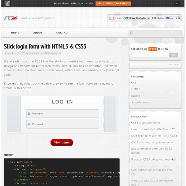
The goal of this post is to harness some new functionality provided by CSS3 and move away from images. We are going to create a CSS3 login form without images yet still have a visually pleasing result. Read More So you just purchased a new hosting account and you some great ideas for your next project. Instead of just having the host default page up for your domain name why not create a coming soon page that is simple and effective. Read More HTML5 and CSS3 are now able to be used in most modern browsers. Read More I am very excited to announce that Three Styles is now 6 Months old. Being a successful remote designer isn’t quite as simple as hopping onto a plane with your notebook. Read More Typography is often overlooked in todays design specifically by web developers.
Scalable JavaScript Application Architecture
View all articles My Summary: Nicholas showed a technique to build large scale applications, one which he used during his time as an engineer at Yahoo. The technique had specific relevance to single page applications all though could be employed on Multiple page applications as well. The architecture he described split an application into multiple tiers with each tier having specific roles and responsibilities and loosely coupled so that elements could be removed, replaced or updated. Slides from the talk are over on slide share. Nicholas Zakas is a regular speaker on the JavaScript circuit but for some reason I'd always missed his talks at other conferences. The Abstract: Building large web applications with dozens of developers is a difficult task. Nicholas took the stage and asked "How many people are building single page JavaScript applications?" Many people are using Application frameworks like backbone.js, but many don't realise it's actually pretty easy to build your own.
Related:
Related:
