
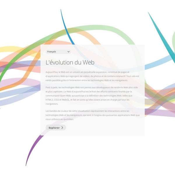
10/2014- Le HTML5 est officialisé en standard du web Le consortium W3C a annoncé que le HTML5 a reçu le statut de "recommandation". Cela signifie que le langage est officiellement considéré comme un standard du web. Le HTML5 est désormais officiellement considéré comme un standard du web. En effet, le W3C vient d'accorder au langage le statut de "recommandation" suite aux efforts consentis par le groupe de travail chargé d'élaborer ce nouveau format de données. Il aura fallu près de quinze ans pour qu'une nouvelle version du HTML soit finalisée. La "pierre angulaire" du web Le HTML5 vise donc à tirer un trait sur l'expérience mitigée du XHTML tout en faisant du HTML une plateforme beaucoup plus efficace pour les applications. "Aujourd'hui, nous ne sommes pas étonnés de voir des vidéos et écouter de la musique nativement dans un navigateur, pas plus que nous sommes surpris d'utiliser un navigateur dans un téléphone. De nombreuses entreprises ont contribué à l'élaboration du HTML5, comme IBM, Microsoft ou encore Samsung. Lire
04/2016 HTML5.1 arrive sur GitHub, la version finale attendue pour septembre Le travail sur la version 5.1 du standard HTML a officiellement pris un nouveau tournant avec l’annonce d’un dernier brouillon prévu pour mi-juin. Un développement ouvert passant notamment par GitHub, où les développeurs peuvent effectuer leurs remontées d’erreurs. HTML5 a beau avoir eu un impact profond sur le développement du web, il n’est pas pour autant une norme figée. On devrait parler de recommandation, puisque le standard est édité par le W3C, qui ne propose pas de « normes » en tant que telles. Le rôle crucial du HTML5 Il aura fallu le temps que le Consortium réalise ce qui était initialement un travail titanesque : harmoniser les pratiques qui s’étaient éparpillées dans de nombreuses directions. Le HTML5 est maintenant en piste depuis plusieurs années et a permis un rapprochement de l’interprétation des pages web dans le navigateur, même si chacun dispose encore de spécificités, notamment via des balises particulières (surtout sur le web mobile avec Webkit).
05/2016 Chrome favorisera encore plus le HTML 5 au détriment de Flash d'ici la fin de l'année Les développeurs de Chrome ont fait part de leur intention de désactiver autant que possible la lecture de plug-ins flash contenus dans les sites web d’ici la fin de l’année. Le HTML 5 sera alors davantage mis en avant. On ne revient pas sur les raisons pour lesquelles Google et les développeurs de Chrome ne veulent plus de Flash sur le web. Lourdeur, problèmes de sécurités, archaïsmes divers, les raisons sont aussi nombreuses que justifiées. Et c’est ce qui explique la décision des développeurs de Chrome de désactiver d’ici la fin de l’année (durant le quatrième trimestre de 2016) la lecture automatique des plug-ins Flash dans Chrome et de privilégier HTML 5. Concrètement, si l’utilisateur se rend sur un site web qui contient un plug-in Flash, Chrome le bloquera automatiquement et lui demandera s’il veut l’activer, comme on peut le voir sur l’image d’illustration de cette actualité.
03/2016 Hitbox upgrades to HTML5 Hitbox has upgraded to HTML5 live streaming. The video game streaming service has focused on providing the highest quality live streaming and has recently made the upgrade to HTML5. This means there's a new platform built on the new technology for Hitbox.tv members to use. Home to millions of gamers who like to stream and watch video games being played, Hitbox has become a rival to Twitch. The Vienna, Austria based streaming service boasts an advanced chat and interactive platform in addition to its low-latency video streaming. The service also allows all members to monetize their streams regardless of views or other requirements. Whether you are an eSports enthusiast or enjoy hanging out with fellow gamers online, Hitbox offers their new improved platform for all users. In addition to a smoother user experience the upgraded Hitbox platform will have improved video quality as well. This recently announced update will be available to all Hitbox users in the coming weeks.
02/2016 Google donne un an aux agences de publicité pour passer au HTML5 ActualitésNewsGoogle donne un an aux agences de publicité pour passer au HTML5 L'avenir des publicités en Flash semble déjà dessiné, car Google a averti que d'ici un an les publicités en Flash n'auront plus leur place sur sa régie. La firme de Mountain View faisant un peu la pluie et le beau temps dans ce domaine, il ne fait aucun doute que d'autres suivront. Il s'agit d'une nouvelle décision importante du moteur de recherche pour passer au HTML5 et en finir avec le Flash. Il s'agit sans aucun doute d'une conséquence logique de la décision d'Apple qui avait il y a quelque temps souhaité la mort du Flash, appuyé par d'autres grands acteurs du web, contre une technologie qui a montré ses limites. Google frappe un nouveau coup dur contre la technologie Flash car à partir du 30 juin prochain, il n'acceptera plus les nouvelles publicités dans ce format dans DoubleClick Digital Marketing et AdWords. Voir aussi : Soyez le premier à réagir !
10/2015 PMU PASSE AU 100% HTML5 SUR SES CRÉAS DYNAMIQUES, EFICIENS RELÈVE LE DÉFI ! - PMU - agence Eficiens Acteur majeur du digital, le PMU articule depuis longtemps sa stratégie autour du temps réel : l’intégralité des assets publicitaires digitaux (bannières, landing pages, emailing) inclut des données à très haut niveau de rafraichissement. Avec la démocratisation du HTML5, il était temps d’aller encore plus loin. Le temps réel et la data au cœur de l’activité du PMU Parier sur une course hippique ou miser sur un match de football partagent le même principe : il est important d’avoir la bonne information au bon moment. Ainsi, depuis 2010, la plupart des communications digitales du PMU sont dynamiques. HTML5, une opportunité à ne pas manquer Depuis le début de l’été, la transition accélérée vers de l’HTML5 a provoqué un véritable séisme dans le monde de la publicité digitale. Mais les résultats sont là ! Un avenir publicitaire en HMTL5
03/2016 Le HTML 5.1 devrait être finalisé d’ici la fin de 2016 Fin 2014, Le W3C (World Wide Web Consortium) livrait enfin les spécifications du HTML 5 en mouture stable (voir à ce propos nos précédents articles « HTML5 officialisé en mouture définitive par le W3C » et « HTML5 : les réactions de Microsoft et Mozilla »). L’organisation se fixe maintenant pour objectif de livrer la recommandation HTML 5.1 d’ici la fin de l’année. Le but est ici de coller mieux à la réalité du marché, en ajoutant des éléments améliorant l’interopérabilité, et en retirant ceux susceptibles de limiter cet aspect. Le W3C espère fédérer une communauté de personnes et de sociétés toujours plus grande, afin de mieux répondre aux besoins du public. Un brouillon du HTML 5.1 a été mis en ligne sur GitHub. Pour la suggestion de nouvelles fonctionnalités, le W3C recommande toutefois de passer par le WICG (Web Platform Incubator Community Group), qui se chargera de faire mûrir les nouvelles idées, avant de les intégrer – ou non – à la version officielle des spécifications HTML.
12/2015 Adobe se décide enfin à pousser Flash vers la sortie Il était temps ! Adobe ne soutient plus Flash et pousse les créateurs de contenu sur le Web à utiliser de nouveaux standards comme le HTML5. Pour autant, l’application flash telle que nous la connaissons n’est pas morte, elle va avoir le droit à un nouveau nom : Animate CC. Animate CC va avoir le droit à son propre support. Adobe annonce d’ailleurs un partenariat avec Facebook. Cette décision n’est pas vraiment une surprise quand on sait que les géants du Web se sont levés un à un pour prendre position contre le plug-in Web d’Adobe. Une bonne décision de la part d’Adobe qui veut aller dans le sens de tous les géants du web sans que ce changement de politique ne pose des problèmes à tous les développeurs du web utilisant cette technologie. Le changement de nom de Flash pour Animate CC est prévu pour 2016.