Data
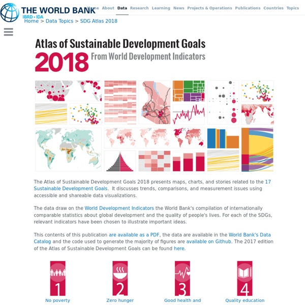
The Atlas of Sustainable Development Goals 2018 presents maps, charts, and stories related to the 17 Sustainable Development Goals. It discusses trends, comparisons, and measurement issues using accessible and shareable data visualizations. The data draw on the World Development Indicators the World Bank's compilation of internationally comparable statistics about global development and the quality of people's lives. For each of the SDGs, relevant indicators have been chosen to illustrate important ideas. This contents of this publication are available as a PDF, the data are available in the World Bank's Data Catalog and the code used to generate the majority of figures are available on Github. The 2017 edition of the Atlas of Sustainable Development Goals can be found here.
http://datatopics.worldbank.org/sdgatlas/
Related: G1 Des cartes pour comprendre le monde
• Cambio climático y desarrollo sostenible
A Network Map of the World's Air Traffic Connections
View the high resolution version of today’s graphic by clicking here. In 2017, airlines moved over four billion passengers, a number that continues to grow each year. As more and more people around the world can afford to scratch their travel itch, new connections and airports will be created to meet that demand. Remarkably, the world’s air transport network doubles in size every 15 years, and the International Civil Aviation Organisation (ICAO) estimates that it will do so again by the year 2030.
Acción por el Clima
Under the EU emissions trading system (EU ETS), industrial installations deemed to be exposed to a significant risk of carbon leakage receive special treatment to support their competitiveness. Carbon leakage refers to the situation that may occur if, for reasons of costs related to climate policies, businesses were to transfer production to other countries with laxer emission constraints. This could lead to an increase in their total emissions. The risk of carbon leakage may be higher in certain energy-intensive industries.
The world as 100 people, glimpsed over 200 years of history
Max Roser, the Oxford economist behind Our World In Data, has devoted his career to spreading a statistically informed view of global development. Chart how things have actually changed over history, he says, and you'll see that we've come a long way. Roser recently released a commentary on the last two centuries. It sums up world progress with the following six charts:
Global food production threatens to overwhelm efforts to combat climate change
Each year our terrestrial biosphere absorbs about a quarter of all the carbon dioxide emissions that humans produce. This a very good thing; it helps to moderate the warming produced by human activities such as burning fossil fuels and cutting down forests. But in a paper published in Nature today, we show that emissions from other human activities, particularly food production, are overwhelming this cooling effect. This is a worrying trend, at a time when CO₂ emissions from fossil fuels are slowing down, and is clearly not consistent with efforts to stabilise global warming well below 2℃ as agreed at the Paris climate conference. To explain why, we need to look at two other greenhouse gases: methane and nitrous oxide.
7 maps that will change how you see the world
A Japanese architect has won a prestigious award for creating a new map, because it shows the world as it really is. The AuthaGraph World Map angles continents in order to show their true distance from one another. Hajime Narukawa won the Good Design Award, beating over 1,000 entries in a variety of categories.
We didn’t see this coming
How would you describe 2018? Was it what you expected? We’d probably say no. From especially devastating natural disasters on the one hand to record numbers of women campaigning for office on the other, 2018 felt to us like a series of surprises.
EEA indicators
EEA indicators are designed to answer key policy questions and support all phases of environmental policy making, from designing policy frameworks to setting targets, and from policy monitoring and evaluation to communicating to policy-makers and the public. The indicators are classified as follows: - Descriptive indicators (Type A) responding to the question: What’s happening? - Performance indicators (Type B): Does it matter? Are we reaching targets? - Efficiency indicators (Type C): Are we improving?
Related: