
Responsive images using CSS3 Future CSS implementations should allow for some form of responsive images via CSS alone. This is an early idea for how that might be done. However, a significant drawback is that it would not prevent both “mobile optimised” and larger size images from being requested at larger screen resolutions. Note that the CSS presented here is not supported in any browsers at the time of writing. This method relies on the use of @media queries, CSS3 generated content, and the CSS3 extension to the attr() function. The principles are basically the same as those underpinning Filament Group’s work on Responsive Images. Using CSS @media queries you can target devices above certain widths. CSS3 generated content allows you to replace the content of any element using the content property. By combining the content property with the CSS3 extension to attr(), you will be able to specify that an attribute’s value is interpreted as the URL part of a url() expression. Fork the Gist
Code a Backwards Compatible, One Page Portfolio with HTML5 and CSS3 25th January, 2010 Tom Kenny Tutorials HTML5 is the future of web development but believe it or not you can start using it today. HTML5 is much more considerate to semantics and accessibility as we don’t have to throw meaningless div’s everywhere. It introduces meaningful tags for common elements such as navigations and footers which makes much more sense and are more natural. This is a run through of the basics of HTML5 and CSS3 while still paying attention to older browsers. View Demo | Download Files (.zip) The HTML <! Download the HTML here (Right-click and save as). First thing first, let’s make sure the code validates with W3C’s experimental HTML5 validator. Good news, it does! The HTML5 Goodness As you can see from the code above there are new tags that you may not be familiar with. Header The first one you’ll notice is <header> and it does exactly what it implies. The header element as described in the HTML5 specs. Nav The nav element as described in the HTML5 specs Section Footer The Form
Media Queries for Standard Devices If you think responsive’s simple, I feel bad for you son. We got 99 viewports, but the iPhone’s just one.—Josh Brewer, March 10, 2010 A major component of responsive design is creating the right experience for the right device. If you’re looking for a comprehensive list of media queries, this repository is a good resource. If you’re reaction to this is: you should never base your breakpoints on devices!! Make a concrete5 theme Concrete5 is a new-generation CMS, with which non-engineers can develop a website. This CMS system is ease to use. You can use the application to change your pages from the front-end of your site. It's a system with a low learning curve. In this tutorial you would learn to make your own theme for Concrete5. First of all we would explain the construction of a standard Concrete5 theme. csselementsimgjs Create a 'description.txt' file in the root of your theme. First line with a titleSecond line with a short description Now you can add a 'thumbnail.png' file in the root of your theme. width: 120pxheight: 90px Create a 'typography.css' file in the root of your theme. Now your ready to develop the theme. <? After we've developed our 'header.php' we could create the 'default.php' file in the root of your theme. <? After we've developed our 'default.php' file we could create a 'footer.php' file in the before created 'elements' folder. <? <? The 'view.php' is used by Concrete5 to show 'single pages'.
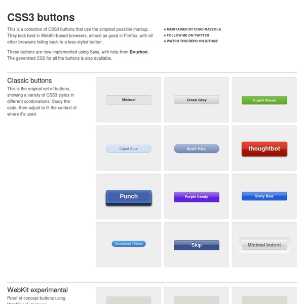
12 Excellent CSS3 Button and Menu Techniques | Tutorials 1139 shares 20 Fresh CSS3 Tutorials The design industry is probably one of the fastest changing and growing. Designers have to keep their eyes on everything, including new trends in visual design, as well as interaction technologies like jQuery, HTML5, and CSS3. Read More 559 shares Developing Streamlined and Efficient CSS Styles CSS can be compared to the sculptor’s tool set when crafting a sculpture.
Pimp Your Tables with CSS3 Today I am going to show you how to use some neat CSS3 properties to beautify your tables. With so many new selectors we can address specific table cells and rows in order to create a unique style without adding classes to the markup. We will be applying the -webkit and -moz […] View demoDownload source Today I am going to show you how to use some neat CSS3 properties to beautify your tables. We will be applying the -webkit and -moz gradients for creating a great look without images and learn how to insert content into elements with a specific class. Let’s start with the markup. The Markup The following will be our basic table structure: We have all the elements a table needs, a header, a body and a footer. CSS Table 1 The first table will be in green tones with some gradients for the descriptive cells, the “th” elements. We want to have some space between the table cells, so we will make the border-collapse separate. The th elements of the head will have the following style: CSS Table 2
hoverIntent jQuery Plug-in What is hoverIntent? hoverIntent is a plug-in that attempts to determine the user's intent... like a crystal ball, only with mouse movement! It is similar to jQuery's hover method. However, instead of calling the handlerIn function immediately, hoverIntent waits until the user's mouse slows down enough before making the call. Why? To delay or prevent the accidental firing of animations or ajax calls. Download hoverIntent r7 (fully-commented, uncompressed) Download hoverIntent r7 (minified) Examples <p><em>If you can see this message <strong>JavaScript is disabled</strong>. jQuery's hover (for reference) $("#demo1 li").hover( makeTall, makeShort ); hover ignores over/out events from children jQuery's built-in hover calls handlerIn and handlerOut functions immediately. .hoverIntent( handlerIn, handlerOut ) $("#demo2 li").hoverIntent( makeTall, makeShort ); hoverIntent also ignores over/out events from children hoverIntent is interchangeable with jQuery's hover. .hoverIntent( handlerInOut ) over: out:
Top 10 CSS Table Designs - Smashing Coding concrete5: Mastering Auto-Nav for Advanced Navigation Exclusive offer: get 50% off this eBook here concrete5 Beginner's Guide — Save 50% Create and customize your own website with the Concrete5 Beginner's Guide by Remo Laubacher | April 2011 | Beginner's Guides Open Source Web Development Creating a navigation isn't complicated but there are a few things you have to know if you want to customize the navigation. We're going to start with information about the use of the block. (For more resources on concrete5, see here.) Before we start customizing the autonav block, we're going to have a quick look at the different options and the output. Preparation You may have the autonav block included in your theme, more precisely in header.php of your theme. Open header.php from your theme; it's located in the themes/c5book/elements directory (Code Download-ch:7).Since the following code snippet doesn't show the complete file, make sure you replace the correct lines. What just happened? We had to undo a modification done before this article. Page order <?
Free PSDs & Resources for Web Designers by Orman Clark concrete5 SooperFish drop down navigation « CodeBlog.ch Creating a drop down navigation is an old technique by now but it’s still used in a lot of cases to hide parts of a navigation. In addition to the plain CSS menu I wrote more than 2 years ago, I decided to write a new tutorial which uses JavaScript as well. You might ask why: Avoiding JavaScript is nice but creating something as complex as a drop down navigation without any JavaScript leads to a few ugly work arounds. You’ll also have some difficulties to add a fade out and fade in effect unless you’re using CSS3 which isn’t well supported yet. But at the end it’s up to you, both solutions can work just fine! Using SooperFish is also a bit easier for us, you’ll see at the end of the tutorial how little code you needed. Prerequisite to create your drop down menu It’s rather simple, the only thing you need is the jQuery drop down plugin called SooperFish. Once you’ve got the ZIP file, extract all the files into a folder of your choice, we’ll later use some (not all) files from it.
CSSG Collections: Web Forms I am happy to present a new thing on CSS Globe: CSSG Collections! Approx. once a months I will design, code and give a way a collection of certain web elements for free. First in the series of CSS(G) collections are web forms. Take a look at the forms | Download CSSG Forms Collection If you like these forms and want more of these collections, please consider bookmarking this page to your favourite social bookmarking service In this collection I used my typical form markup. Here’s my typical markup: Also, as an announcement, I am currently developing a jQuery plugin for text fields and text areas that will handle their behavior and validation. Enjoyed the article? a collection of menus, galleries and web resources Blue print mega menu A responsive mega menu, more great work from Tympanus Blueprints. jQuery 1.9.1 Click action mega menu Great for those touch devices, nice job from Script Tutorials. Red Team CSS menu Slick animation on hover. Sky Blue menu One of the nicest dropdown menus we've seen. DD levels menu This is one of the smartest menus that we've come across. Fancy dropdown menu We almost used this menu for our newly designed Piccante Web Design site, but it tripped up in an old version of Internet Explorer. Soh Tanaka Another nice product from Soh Tanaka. Smooth dropdown horizontal menu Based on the DD levels menu, this has the same features, but it is just... smoother. Smooth dropdown vertical menu Based on the DD levels menu, this has the same features as its horizontal counterpart, but it is ,well, vertical.. Superfish dropdown menu A jquery version of the (fairly) famous Suckerfish menu. 'Droppy' dropdown menu Multi-level smooth dropdown menu. Sooperfish dropdown menu Grid menus Mega menu Tree menus
Button Maker