
Online Tabata Clock - Workout Timer - Interval Timer If you ever want to use the old tabata clock, it's still available here: Tabata Clock What's a Tabata? The word "tabata" refers to the format of the workout. You do 20 seconds of any high intensity exercise followed by 10 seconds of rest, for 8 rounds (4 minutes total). What's Tabata This? Tabata This is a popular tabata workout that was created by CrossFit. Tabata This Complete 8 tabata rounds of each exercise before moving to the next. What Are Some Good Tabata Exercises? Thrusters, Muscle-ups, Kettlebell Swings, Double-unders, Box Jumps, Burpees, Tire Flips, Toes-to-bars, Wall-balls, Handstand Walks, Sprints... almost anything as long as it is done at a high intensity and leaves you exhausted after only a short period of time. Why Do Tabatas? The Tabata was named after Izumi Tabata, Ph.D., a former researcher at Japan's National Institute of Fitness and Sports. Dr. After 8 days of this regimen, Dr. Dr. What is fitlb? Welcome to fitlb - Fitness Leaderboard.
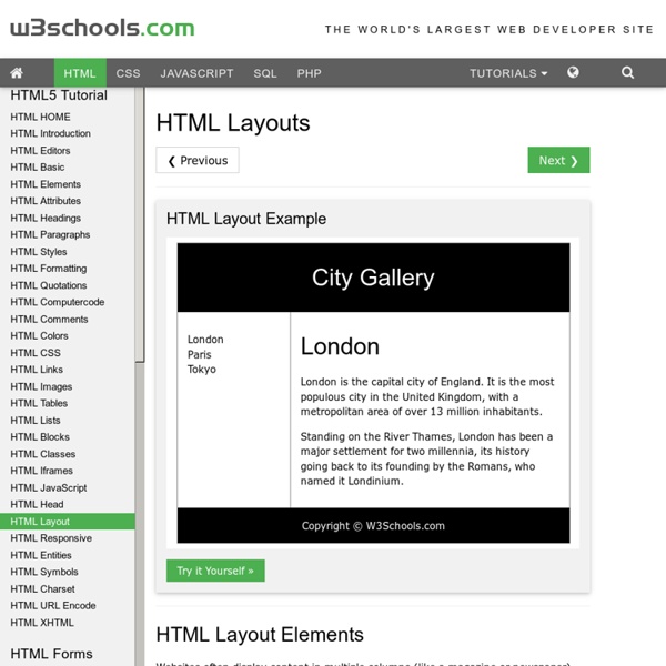
HTML Links HTML Entities Responsive Web Design: 50 Examples and Best Practices - Designmodo Responsive web design term is related to the concept of developing a website design in a manner that helps the lay out to get changed according to the user’s computer screen resolution. More precisely, the concept allows for an advanced 4 column layout 1292 pixels wide, on a 1025 pixel width screen, that auto-simplifies into 2 columns. Also, it suitably fixes on the smartphone and computer tablet screen. This particular designing technique we call “responsive design”. Now you can test your website using the Responsive Design Tool. Responsive web designing is an entirely different designing version than traditional web designing, and developers (especially fresher) must know about the pros and cons of responsive web designing. Pages that include data tables pose a special challenge to the responsive web designer. Images in responsive web designs are called context-aware. Designmodo Designmodo has a very clean and clear design with a perfect responsive design interface. Simon Collison
Apply different layout/styling to static pages Finally Blogger has come up with the much awaited static pages feature. Blogger simply refer to them as Pages. You can create up to 10 static pages, perfect for your About Me and Contact pages. However, a Page will look just like homepage or any other page. Okay let’s start with the tutorial, I. Go Dashboard > Design > Edit HTML. II. Your elements’ Ids and classes maybe different from the ones given in the code above. As you can see an element, be it a division, a section or a widget is assigned an ID and/or a class. Update: There is an easier method of finding Blogger widget and section Id’s. For example, if you want to remove the “Popular Posts” widget, all you have to do is add #HTML4 to the selector list; To remove the the whole lower left sidebar (which holds the Popular Posts and Labels widgets), add #sidebar2 to the list. III. (added Oct. 2010) Using the static_page conditional tag as explained above will apply the styling on all static pages. Enjoy!
21 Best Websites for Teaching Yourself Web Development Get the FlatPix UI Kit for only $7 - Learn More or Buy Now I remember how popular web design was even 5 or 10 years ago. Kids in high school were teaching themselves HTML and building small web pages from scratch. But it can still be difficult pinpointing exactly what you want to learn. Pixel2Life Smashing Magazine Coding W3Schools Tizag Webmonkey Treehouse Sitepoint Student Web Design Guide A List Apart Web Design From Scratch Net Tuts+ Web Design Tuts+ CSS Tricks Developer Drive Think Vitamin Blog Ajaxian .Net Magazine Tutorialzine 24 Ways Design Instruct PHP Academy About Jake Rocheleau Jake is a digital researcher and writer on many popular design magazines.
HTML Text Formatting Grid Layout & Flexbox City CSS GRID LAYOUT is nearly finalized. Which means it’s time for designers and front-end developers to set the flags enabling their browsers to support the new specification, put CSS Flexbox through its paces by using it to create layouts, and see if anything breaks. This way, if anything does break, we’ll have time to tell the framers of CSS Grid Layout what happened, and get the spec (and browser support) fixed before it is released. The links below can help you (and me) get up to speed with the new tech: CSS Grid Layout and CSS Flexbox Links Thank You Additional link curation by Rachel Andrew, author of Get Ready for CSS Grid Layout from A Book Apart, and speaker extraordinaire at An Event Apart Nashville, a three-day conference that wrapped yesterday.
Abate Blogger Template Configure Meta tags Login to your blogger dashboard--> layout- -> Edit HTML.Now Scroll down to where you see below codes : Replace DESCRIPTION HERE,KEYWORDS HERE as below. DESCRIPTION HERE:Write your blog description KEYWORDS HERE:Write the keywords of your blog separated by comma. How To Configure Favicon: Login to your blogger dashboard--> layout- -> Edit HTML.Now Scroll down to where you see below code : Now replace "YOUR-FAVICON-URL" with your Favicon address/url. Configure Featured Content Slider: Login to your blogger dashboard--> layout- -> Edit HTML.Find <! Now replace, "This is default featured post X title" with your featured post title." for each featured slide. How To Configure Second Navigation Menu Find <div class='menu-secondary-wrap'> inside your template. How To Configure a Navigation Menu How To Change Tab Names of Tab Widget If you want to change your tab names of your tab widget then find this: Now change the names "Popular", "Tags" and "Blog Archives" as you like. Important !!!
15 delicious examples of card-based web design The rise of the smartphone has ushered in a new way of thinking among web designers and developers, who need to create websites that work on smaller screens. The constraints of smaller screens have actually helped the web to become that little bit more modular, with responsive design now one of the foremost web design trends: pages can be broken up into their constituent parts, and reordered on the fly, depending on browser or screen sizes. Content spread over three or four columns can be repositioned into just one. This has refocused attention on 'cards', as a design pattern for displaying information in bite-sized chunks. What is a card, exactly? Cards were one of my 18 web design trends for 2014, and I wanted to highlight some beautiful examples of card-based user interfaces. Wander Card A picture and brief description, plus icons that convey further information. Mail Client A concept by Roman Shkolny. Food widget Cards, like your smartphone, don't always have to remain in portrait mode.
How To Upload/Install a Blogger Template This article have explained how to upload a blogger template into your blog. If you faced to an unexpected error when trying to install a template contact me, I will upload that template into your blog. Also if you have problems like undeletable widgets, layout not displaying correctly,.. contact me for fast support. First download your new blogger template to your computer. If the template is contained in a zip file, ensure you have extracted the XML template. 1. 2. You can see overview of your blog. 3. 4. "Backup / Restore" window will appear. 5. 6. You are done. Go to "Layout" to rearrange your widgets positions correctly.
Displaying a gadget only on the home page | Blogger-Hints-and-Tips This article is about how to set up a gadget / widget in Blogger so that it is only visible on the first place that a reader sees when they visit your blog (often called the "home page"). It is one of a series of articles about controlling what goes on the homepage of your blogspot blog. There are a number of reasons why you might want to put a gadget only the screen that shows when a visitor first navigates to your blog's home page. You may want to show a welcome message, or a topic-index page, or to give a view of your recent tweets or some other RSS feed. No matter what the reason, the process is very similar: How to make a gadget only appear on the first page: Note: in Blogger, the words "gadget", "widget", and even "page-element" all mean the same thing. 1 Add the gadget: Do this in the usual way. 2 Place the gadget Drag-and-drop the gadget to the place where you want it. 3 Find the Gadget-ID in the usual way. 4 Find the code for your gadget: Click on the checkbox (so it's turned on)
jQuery Accordion Widget for Blogger | Tech Tasks : Blogger Help,Asp.Net,C#.Net Articles Accordion is more use as Multi Tabbed Widget.you might have been seeing on many sites. I this article i am going to how to add Accordion as a Widget for your blog. Check out my other useful jQuery Widgets For BloggerCloseable jQuery Floating Message Box For BloggersSimple jQuery Multi Tabbed Navigation Widget For BloggerSmooth Scrolling Widget For Blogger Step 1:Login to Blogger dashboard » layout » Edit HTML Find(CTRL+F) ]]</b:skin>tag. Now copy and paste below code just before ]]</b:skin> this. /* End TechTasks accordian CSS*/ »If you want customize the Tabbed Widget colors just Follow the comments to Change the colors »Simply replace these colors with your custom colors in the above code respectively. Step 2:Find </head> . Cope and paste the below just before </head> this. /* OPENS THE DIV THAT IS ASSIGNED WITH THE ID open */ $("#open").trigger('click'); }); /*----------End TechTasks Tabber Script--------------*/ </script> Step 3:Find Now copy and paste below code just below that. <!