jQuery Masonry
Install A packaged source file includes everything you need to use Masonry. Bower If you are familiar with the command line and build processes, Masonry can be installed with Bower. Masonry is built on dependencies. Bower takes care of these.
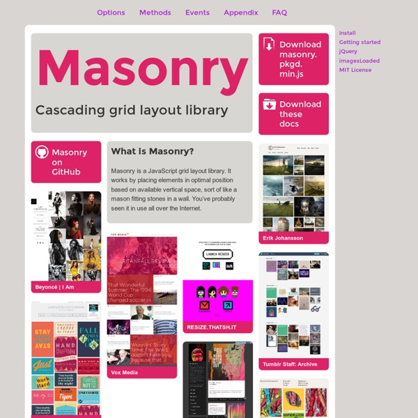
http://masonry.desandro.com/index.html
jQuery custom content scroller
Last updated on Mar 10, 2015 Originally published on August 1, 2010 by malihu, under Plugins. Highly customizable custom scrollbar jQuery plugin. Features include vertical and/or horizontal scrollbar(s), adjustable scrolling momentum, mouse-wheel (via jQuery mousewheel plugin), keyboard and touch support, ready-to-use themes and customization via CSS, RTL direction support, option parameters for full control of scrollbar functionality, methods for triggering actions like scroll-to, update, destroy etc., user-defined callbacks and more.
32 Libros de Diseño Gráfico para Descargar Gratis en PDF
Hoy quiero compartirles esta pequeña pero muy interesante recopilación de Libros de diseño Gráfico para que descarguen gratuitamente, vienen en formato PDF y descarga directa. Por qué leer?…Siempre deberíamos tener un libro que nos gustara mucho para leerlo en nuestros tiempos libres, ya que leer sobre temas muy relacionados con los que nos apasiona o con el área en que trabajamos ayuda a educarnos intelectualmente, hace que nuestro cerebro empiece a analizar y reflexionar creando en nosotros un pensamiento conceptual y de análisis sobre las temáticas de diseño que nos apasionan. 1) Libro dibujo y comunicación Gráfica
JavaScript Éloquent : Une introduction moderne à la programmation
scrollorama
Disclaimer: This is an experimental, just-for-fun sort of project and hasn’t been thoroughly tested. Design and build your site, dividing your content into blocks. Embed scrollorama.js after jQuery and initialize the plugin, passing the blocks class selector as a parameter.
QuoJS - Micro JavaScript Library
scrolldeck.js
Build a web page with each slide as a div. Pro-Tip: Use rem’s to make content scale (resize this window to see) Create section navigation by linking to slide id’s (optional) After linking all the required scripts (jQuery, Scrollorama, scrollTo, easing & scrolldeck), create the slide deck on document ready event. $(document).ready(function() { var deck = new $.scrolldeck(); });
Nikebetterworld Parallax Effect Demo
A couple of months ago, I created a jQuery Vertical Parallax Demo that manipulated CSS to make multiple backgrounds move at different speeds relative to the users movement of the scroll bar. This type of effect is slowly appearing across various websites on the web, achieved using many different techniques. Nikebetterworld took the idea to a new level. In today’s tutorial, we’re going to take the original jQuery Parallax script I wrote and recreate a webpage similar to Nikebetterworld.
Shadowbox.js
Unheap - A tidy repository of jQuery plugins
Related:
Related:
