
History of Western Typography Etymology[edit] Typography (from the Greek roots τύπος typos = "impression" and -γραφία -graphia = "writing"). Medieval design roots[edit] Typography, type-founding and typeface design began as closely related crafts in mid-15th-century Europe with the introduction of movable type printing at the junction of the medieval era and the Renaissance. Johannes Gutenberg employed the scribe Peter Schöffer to help design and cut the letterpunches for the first typeface—the D-K type of 202 characters used to print the first books in Europe. Classical revival[edit] In their enthusiastic revival of classical culture, Italian scribes and humanist scholars of the early 15th century searched for ancient minuscules[disambiguation needed] to match the Roman inscriptional capitals. Transition from humanistic minuscule to roman type[edit] Some time before 1472 in Venice, Johann and Wendelin issued material printed with a half-Gothic-half-roman type known as "Gotico-antiqua". Development of roman type[edit]
40 Witty Campaign Posters for a Cause Non-profit organizations use posters to deliver a particular message. These help inform people about current issues, problems and even the possible consequences of their actions. With a sentence that contains strong words or images, these posters give more impact than common commercial posters. To give you an idea, here are 20 sample campaign posters to provoke your imagination. Wildlife is becoming harder to find in Vietnam. Winter. Who are the real monsters? When they speak, we listen. Shit is not a cool band. Say no to child labor. Can you treat yourself better than your doctor? Nothing we do will ever bring them back. Please don’t dive with white sharks. All under 25 who are sexually active should test for Chlamydia every year and avery time they change partner. For some people, life is that expensive. Preparing today reduces the consequences of disaster tomorrow. Two thirds of college students in Mississippi don’t smoke. Please clean up after your dog. One mistake is all it takes.
Royalty Free Icons & Clipart Stock Images 10 Shirts and Shorts A style once reserved for cubicle jockeys and gas station attendants, the short sleeve button-down has picked up speed in the menswear market in recent years. And shorts? Well, they've always been popular. To celebrate the recent uptick in temperature most of the Northern Hemisphere is finally experiencing, we've pulled together a selection of short sleeve shirts and shorts from 10 brands we've been eyeing this season. Brooklyn Tailors Spring 2013 marks the first season Brooklyn Tailors has introduced short sleeve button-downs to their collection of finely constructed men's clothing. Kaptain Sunshine Another Japanese brand that does Americana better than most American brands, Kaptain Sunshine references vintage garments to make sure every detail is accurate. Beams+ A collection firmly rooted in classic Americana from one of Japan's most acclaimed menswear shops, Beams+ can't be argued against. Engineered Garments Norse Projects Unis Brixton Maiden Noir M.Nii Folk
Thinking with Type | Home 50 Fresh Free Fonts of 2010 | Template Monster Blog - StumbleUpon Though there's a broad variety of fonts available for download online, designers keep on tracing the fresh ones to enhance their design copy, a website, brochure, or even an advertisement in a brand new an' awesome way. Still, the free stuff could not always boast of good quality – premium goodies always demand some kind of money investment. However, now it's possible to find the appropriate font that's free, clear, beautiful, and effective for design purposes. Today's round-up actually goes outside the standard font variety. Geomancy Kilogram Tribbon Quadranta Adec Teardrop St Marie Dekar Code Cube Piron Glide Planer Paranoid Circled St Ryde Danger Pincoyablack New Garden Titillium Text Sylar Scriber Mentone Circula Sansation LT Oksana Font V4.0 Lintel Frgmnt Amsterdam Sol Pro Tenby Zag Real Origami Tenderness Vegur Cash Sertig Junction Blackout Railway League Ghothic Goudy Bookletter 1911 Oval About the Author Lilian Rigo
Greener Futures Project | Beau's All Natural Brewing Co. Bourbon Barrel Aged Beer Co-op Membership is the only way to get your hands on these extremely limited barrel-aged beers. There are still a few memberships still available, so sign up now to avoid disappointment! The Green Futures Project is a unique and limited beer club with the goal of helping Beau’s achieve its goal of becoming a totally sustainable brewery. Club members are entitled to 30 bourbon barrel aged beers (10 x 600ml bottles per year) over 3 years, at a membership fee of $300. How's it work? Step 1: Stop by the brewery and fill out the Sign-Up Form & Membership Agreement. Click Here To Download the Sign-Up Form & Membership Agreement Note: You must be 19 or over to participate. How many beers do I get? What kind of beers do I get? How frequently will the beers be released? Aging time will vary from one release to the next to make sure we get the best possible flavour profile and they are tied to the releases of our Wild Oats Series, so this won't be exactly like clockwork.
How To Create an Abstract Geometric Poster Design Some of the coolest designs can be created with the simplest of tools. In this tutorial we’ll create a cool abstract poster design using nothing more than a hexagon. With careful composition, an enticing colour scheme and a series of textures you can easily create a great looking design that would work perfectly as a poster, or even artwork for a book or album cover. The design we’ll be creating is made up of a series of repeating hexagon shapes. View the final abstract geometric poster design We’ll use a mix of Illustrator and Photoshop to create the artwork. Select the new offset shape and clear out the fill and stroke. Press CMD+Y to turn on Outline mode, then hit CMD+U to turn on Smart Guides. Hit CMD+D numerous times to repeat the transformation until you have a long line of hexagon shapes. Draw a selection around the line of shapes and scale them down to fit onto the artboard. Repeatedly press CMD+D to repeat this transformation. Press CMD+Y to turn off Outline mode.
Incredible vintage typography from Sanborn Map Company Trying always to go forward, we forget what Amazing works, others did in the past. Every Monday, at B | Creative will be published some great ad collections from the past. Founded in 1866 by Daniel Alfred Sanborn, a surveyor from Massachusetts, The Sanborn Company began making fire insurance maps in 1867. The company first gained recognition for the rich detail employed in the maps they produced in the 1800s, and today these archived maps are still widely used for research purposes. Sanborn still exists as a mapping and GIS company. The images below are examples of the incredible variety of ornate typographic titles which appeared on maps between 1880 and 1920. Alban Fejzaj is the founder of B | Creative.
65+ Free Handwritten Fonts for Elegant Designs Story of handwritten fonts (or we can say only fonts) starts from very old ages, when people was just realizing the need of communication between one and other. People learned to convey their message by using signs and symbols , this process continued and entered different stages of development until the languages and letters were formed. People used to communicate through letters and telegrams, then with the advancement in technology we started using Emails with formal fonts, leaving handwritten letters behind. 1. 2. 3. 4. 5. 6. 7. 8. 9. 10. 11. 12. 13. 14. 15. 16. 17. 18. 19. 20. 21. 22. 23. 24. 25. 26. 27. 28. 29. 30. 31. le Grand Saut 32. 33. 34. 35. 36. 37. 38. 39. 40. 41. 42. 43. 45. 46. 47. 48. 49. 50. 51. 52. 53. 54. 55. 56. 57. 58. 59. 60. 61. 61. 62. 63. 65. 66. 67. 68. We hope you liked the Free Handwritten Fonts collected by us in this article. Which font do you like most?
Sparkling Lemon Sorbet – Culinary Musings You know how grown-ups always told you never to eat yellow snow? Well, this time it’s okay. Go ahead. Eat yellow snow. I know. It doesn’t sound appetizing but truth be told, it’s the first thing that popped into my mind when I sat down to write my entry for this recipe. Anyway, back to business. We shared a dozen oysters, smoked salmon tartare, escargot, a hefty chunk of grilled bison along with a side of creamed spinach, celery and pear purée, and sauteed wild mushrooms. Ingredients: In a shallow container, combine all ingredients and mix thoroughly.
Tutorials • Blog.SpoonGraphics How To Create Digital Particle Waves in Adobe Illustrator The blend tool in Adobe Illustrator is often used to create abstract wave graphics, but I’ve been experimenting with some additional adjustments and discovered some handy tricks to create sci-fi inspired digital particle waves. This kind of imagery perfectly complements hi-tech interface designs with colourful data visualisation effects, or it could be used to create abstract art in its own right. We’ll create the initial effect in Adobe Illustrator, where I’ll show you a few options for randomising the result, then switch over to Adobe Photoshop for some extra colour enhancements to really boost the vibrancy. How To Create an Editable Retro Text Style in Illustrator Many of the text effect tutorials I produce for Adobe Illustrator and Adobe Photoshop tend to require the text to be permanently set, which means if the wording needs changing, the effect would have to be created all over again from scratch.
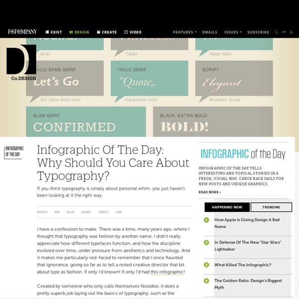
20 Useful Typography Tools Typography is a crucial component of a design. When used effectively, it sets the mood and solicits emotion about the design. Working with typography can be challenging, but fortunately, there is a plethora of free tools on the web that can help you work with type. In this article, you’ll find 20 tools for working with typography. You’ll find an assortment of tools that’ll help you with testing, identifying, sizing, and even making, fonts. 1. Typetester allows you to compare various fonts and styles on one page. 2. FontStructor is a free, web-based tool for creating your own fonts. 3. Font Tester is a free web-based tool for comparing different fonts. 4. Typechart lets you quickly evaluate an assortment of web typography. 5. OpentType Font Tester is a web-based tool that allows you to test over 20 OpenType fonts. 6. CSS-Typoset Matrix is a matrix that displays font sizes, line-heights, and margins (in pixel and em units) for various base font sizes. 7. 8. 9. 10. 11. 12. 13. 14. 16. 17.