
border-radius and -moz-border-radius < CSS One of the most keenly-anticipated CSS3 properties is border-radius. Web designers will no longer have to resort to complex table structures using custom-made corner graphics or including arcane JavaScript files in order to produce designs with rounded corners. While Internet Explorer before IE9 doesn't support many (or any) advanced CSS properties, the Mozilla (Firefox and related browsers) and WebKit (Apple's web browser engine used in Safari and Chrome) and Opera have supported them for many years. The vendor prefixes (-moz, -webkit) are now no longer necessary for the latest browser releases as they have all adopted the official CSS3 syntax. 1. As with many CSS properties relating to margins, padding and borders, there are four individual properties - one for each corner of a box element - and one shorthand property. Here are the CSS and browser-specific attributes in question: Prior to IE9 these CSS3 properties do not work in Internet Explorer. 2. Example 1 -moz-border-radius: 1em; 3.
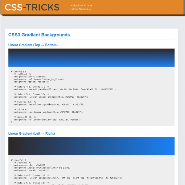
CSS drop-shadows without images Drop-shadows are easy enough to create using pseudo-elements. It’s a nice and robust way to progressively enhance a design. This post is a summary of the technique and some of the possible appearances. Demo: CSS drop-shadows without images Known support: Firefox 3.5+, Chrome 5+, Safari 5+, Opera 10.6+, IE 9+ I’ll be looking mainly at a few details involved in making this effect more robust. After a bit of back-and-forth on Twitter with Simurai, and proposing a couple of additions to Divya’s and Matt’s demos using jsbin, I felt like documenting and explaining the parts that make up this technique. The basic technique There is no need for extra markup, the effect can be applied to a single element. The pseudo-elements need to be positioned and given explicit or implicit dimensions. The next step is to add a CSS3 box-shadow and apply CSS3 transforms. One of the pseudo-elements then needs to be positioned on the other side of the element and rotated in the opposite direction.
About HTML semantics and front-end architecture A collection of thoughts, experiences, ideas that I like, and ideas that I have been experimenting with over the last year. It covers HTML semantics, components and approaches to front-end architecture, class naming patterns, and HTTP compression. We shall not cease from exploration And the end of all our exploring Will be to arrive where we started And know the place for the first time. T.S. Eliot – “Little Gidding” About semantics Semantics is the study of the relationships between signs and symbols and what they represent. Distinguishing between different types of HTML semantics The principle of writing “semantic HTML” is one of the foundations of modern, professional front-end development. However, not all semantics need to be content-derived. Despite the HTML5 specification section on classes repeating the assumed “best practice” that… …there is no inherent reason to do this. Take this very simple example: <div class="news"><h2>News</h2> [news content] </div> Front-end architecture
transform-function Syntax The <transform-function> data type is specified using one of the transformation functions listed below. Each function applies a geometric operation in either 2D or 3D. Matrix transformation matrix() Describes a homogeneous 2D transformation matrix. matrix3d() Describes a 3D transformation as a 4×4 homogeneous matrix. Perspective perspective() Sets the distance between the user and the z=0 plane. Rotation rotate() Rotates an element around a fixed point on the 2D plane. rotate3d() Rotates an element around a fixed axis in 3D space. rotateX() Rotates an element around the horizontal axis. rotateY() Rotates an element around the vertical axis. rotateZ() Rotates an element around the z-axis. Scaling (resizing) scale() Scales an element up or down on the 2D plane. scale3d() Scales an element up or down in 3D space. scaleX() Scales an element up or down horizontally. scaleY() Scales an element up or down vertically. scaleZ() Scales an element up or down along the z-axis. Skewing (distortion) skew() skewX() skewY()
What is BEM? This article describes the theory and practice of building web sites at Yandex , a large Internet company. There are plenty of sites under development here, thousands in fact. The approaches we use for HTML/CSS markup and other front-end technologies are in constant evolution. Developing for a big portal has a range of specifics and the process should be able to accommodate them: Fast-to-develop, long-lived projects It should be possible to develop and launch the first version quickly with an architecture that helps maintain it in the long run. Numerous people working on a project We should be able to organize work efficiently in teams of 2 or more developers. Team scalability Adding new people to a product team should improve its productivity. Code should be well-structured for a project to remain maintainable over time and team changes. Code reuse To maintain UI consistency and minimize development effort on typical interface components, those components have to be easily reusable. Block Element
CSS Style Guides As we wrap up our recent poll on ordering CSS properties, it brings up the larger issue of CSS style guides. Ordering properties is just one choice you have to make that makes up a complete styling strategy. Naming is a part of it. Sectioning is a part of it. Commenting, indentation, overall file structure... it all makes up a complete CSS style guide. Let's round up some existing ones. But first... I love pattern libraries. The List I'll list some excerpts from each that I like below. GitHub GitHub CSS Style Guide → As a rule of thumb, don't nest further than 3 levels deep. Unit-less line-height is preferred because it does not inherit a percentage value of its parent element, but instead is based on a multiplier of the font-size. Google Google HTML/CSS Style Guide → Use ID and class names that are as short as possible but as long as necessary. E.g. E.g. .demo-image not .demoimage or .demo_image Idiomatic CSS Nicolas Gallagher's Idiomatic CSS → Configure your editor to "show invisibles". ThinkUp
What Does “width: 100%” Do in CSS? It seems like this should be one of the easiest things to understand in CSS. If you want a block-level element to fill any remaining space inside of its parent, then it’s simple — just add width: 100% in your CSS declaration for that element, and your problem is solved. Not so fast. It’s not quite that easy. First Things First: Blocks Don’t Need 100% Width When we understand the difference between block-level elements and inline elements, we’ll know that a block element (such as a <div>, <p>, or <ul>, to name a few) will, by default expand to fit the width of its containing, or parent, element (minus any margins it has or padding its parent has). Most CSS developers understand this concept pretty well, but I thought it would be useful to point it out here as an introduction to explaining how percentages work when used on the width property. What it Really Means And of course, the exact same rule would apply to any percentage value. Should it Ever Be Used? What do you think?
Son of Suckerfish Dropdowns Single-level Dropdowns Right. Let's not beat around the bush. The initial HTML we're dealing with will look something like this: <ul id="nav"><li><a href="#">Percoidei</a><ul><li><a href="#">Remoras</a></li><li><a href="#">Tilefishes</a></li><li><a href="#">Bluefishes</a></li><li><a href="#">Tigerfishes</a></li></ul></li><li><a href="#">Anabantoidei</a><ul><li><a href="#">Climbing perches</a></li><li><a href="#">Labyrinthfishes</a></li><li><a href="#">Kissing gouramis</a></li><li><a href="#">Pike-heads</a></li><li><a href="#">Giant gouramis</a></li></ul></li></ul> A good wholesome structured unordered list. To set things up we need some basic styling: Note that you need to specify a width in the #nav li selector or else Opera will chuck a wobbly. The CSS specs say that top, right, bottom and left values should offset an absolutely positioned box from its containing block. And there you go. Multi-level Dropdowns There are a few things we need to add to the single-level method. Examples
The CSS Overflow Property Every single element on a page is a rectangular box. The sizing, positioning, and behavior of these boxes can all be controlled via CSS. By behavior, I mean how the box handles it when the content inside and around it changes. For example, if you don't set the height of a box, the height of that box will grow as large as it needs to be to accommodate the content. There are four values for the overflow property: visible (default), hidden, scroll, and auto. Let's take a look at each and then discuss some common uses and quirks. Visible If you don't set the overflow property at all, the default is visible. The important thing to remember here is that even though the content is visible outside of the box, that content does not affect the flow of the page. Generally, you shouldn't be setting static heights on boxes with web text in them anyway, so it shouldn't come up. Hidden The opposite of the default visible is hidden. Scroll Auto Float Clearing Cross Browser Concerns IE 8 expanding box bug Demo
Equal Height Columns with Cross-Browser CSS and No Hacks by Matthew James Taylor on 17 October 2008 Creating equal height columns with CSS is not as easy as it may first seem. This tutorial highlights the display problems that occur with multiple column layouts, and then shows a simple solution that works in all common web browsers. The method shown here is 100% CSS hack-free, image-free and JavaScript-free so it can even be used on the most strictly coded websites. For those who want some action immediately check out my demo pages: 2 column, 3 column, 4 column and 5 column. The problem with equal height columns In the example above we have three columns each with a different amount of content. Separating the column content from it's background colour The first step to solving the equal height problem is to break it into smaller pieces that can be solved separately. A floated container div will always be the height of it's floated contents This is the central principle behind this equal column height method. Three column HTML div structure
CSS Floats 101 The float property is a valuable and powerful asset to any web designer/developer working with HTML and CSS. Tragically, it can also cause frustration and confusion if you don’t fully understand how it works. Article Continues Below Also, in the past, it’s been linked to some pretty nasty browser bugs so it’s normal to get nervous about using the float property in your CSS rule sets. Let’s calm those nerves and ease that frustration. I’ll show you exactly what the float property does to your elements and how incredibly useful it can be once you master it. We see floats in the print world every time we pick up a magazine article with an image on the left or right with text flowing nicely around it. The definition#section2 Let’s start with the definition of a float. A float is a box that is shifted to the left or right on the current line. The float property has four values that we can apply to it: left, right, inherit, and none. How floats behave#section3 Let’s look at a few more examples.
CSS Positioning 101 If you’re a front end developer or a designer who likes to code, CSS-based layouts are at the very core of your work. In what might be a refresher for some, or even an “a-ha!” for others, let’s look at the CSS position property to see how we can use it to create standards-compliant, table-free CSS layouts. Article Continues Below CSS positioning is often misunderstood. Sometimes, in a bug-fixing fury, we apply different position values to a given selector until we get one that works. The CSS specification offers us five position properties: static, relative, absolute, fixed, and inherit. Get with the flow#section1 First, let’s take a step back to recognize the world we’re working in. Boxes in the normal flow belong to a formatting context, which may be block or inline, but not both simultaneously. Think of a “box,” as described by the spec as a wooden block—not unlike the ones you played with as a young whippersnapper. Static and relative—nothing new here#section2 In action#section6
Understanding CSS Floats Using css floats effectively can be confusing and it’s probably one of the things that trips up most people when they’re first learning css. However once you learn to control floated elements it opens up a whole new world of possibilities in your design and makes developing layouts much simpler. And best of all floats really aren’t that hard to work with once you understand a few key points. What is a Float? A float is a box that is shifted to the left or right on the current line. The most interesting characteristic of a float (or “floated” or “floating” box) is that content may flow along its side (or be prohibited from doing so by the ‘clear’ property).— w3.org The float property has 3 values; none, which is the default, left, and right. Floats sit as far left or as far right as possible within the immediate containing div. The Difference Between Floats and Positioning In css there are 3 types of positioning schemes. How to Effectively Use Floats There are two main ways floats are used.
2 Column CSS Layout: Fixed Width And Centered One of the more common css layout patterns you’ll come across is the fixed width 2 column layout. It’s relatively easy to code and understand, though it sometimes trips up developers new to css layouts. A few weeks ago I promised to offer boilerplate code for some common css layout patterns. This is the first of that boilerplate code and I’ll continue to offer more in the coming weeks. If you prefer to skip the explanation and get right to the code you can view the source of the demo. The HTML The html for this layout is rather simple as you can see below. We have a single div for each of the 4 main areas of the layout — header, content, sidebar, and footer. One thing to note is the structure of the html above follows the structure of the page itself. Later in this post I’ll offer two ways to change the layout above so the sidebar is to the left of the content. The CSS If you’ve already viewed the source code of the demo you’ll note the css like the html is rather simple. Floated Elements