
StatsModels: Statistics in Python — statsmodels 0.8.0 documentation statsmodels is a Python module that provides classes and functions for the estimation of many different statistical models, as well as for conducting statistical tests, and statistical data exploration. An extensive list of result statistics are available for each estimator. The results are tested against existing statistical packages to ensure that they are correct. The package is released under the open source Modified BSD (3-clause) license. The online documentation is hosted at statsmodels.org. Since version 0.5.0 of statsmodels, you can use R-style formulas together with pandas data frames to fit your models. You can also use numpy arrays instead of formulas: Have a look at dir(results) to see available results.
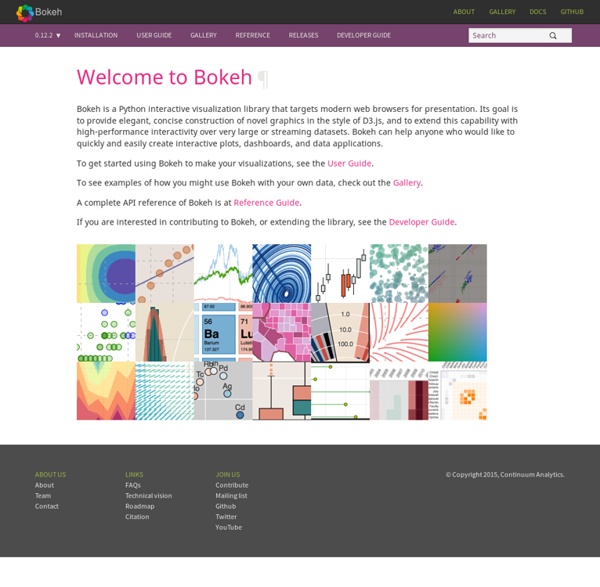
Interactive Plotting in IPython Notebook (Part 1/2): Bokeh | PyScience Summary In this post I will talk about interactive plotting packages that support the IPython Notebook and allow you to zoom, pan, resize, or even hover and get values off your plots directly from an IPython Notebook. This post will focus on Bokeh while the next post will be about Plotly. I will also provide some very rudimentary examples that should allow to get started straight away. Interactive Plots: +1 for convenience Anyone who’s delved into ‘exploratory’ data analysis requiring a depiction of their results would have inevitably come to the point where they would need to fiddle with plotting settings just to make the result legible (much more work required to make it attractive). Well, with interactive plotting the days of the static plot are dwindling. Bokeh Bokeh is a package by Continuum Analytics, authors of the Anaconda distribution of which I spoke in this previous post. Bokeh is a Python interactive visualization library that targets modern web browsers for presentation. Usage
List of Physical Visualizations Laina is a shape-changing art piece, presenting physicalized running routes over a delayed period of one or two days. Over this time, some of the pins on Laina are pushed out one by one, creating a data physicalization pattern corresponding to the mapping of the last running route. The length the pins come out represent a specific effort given at that point on the route. Laina is a shape-changing art piece, presenting physicalized running routes over a delayed period of one or two days. Getting Started with Plotly for Python Plotly for Python can be configured to render locally inside Jupyter (IPython) notebooks, locally inside your web browser, or remotely in your online Plotly account. Remote hosting on Plotly is free for public use. For private use, view our paid plans. Offline Use Standalone HTML Offline mode will save an HTML file locally and open it inside your web browser. Learn more by calling help: import plotly help(plotly.offline.plot) Copy to clipboard! Inside Jupyter/IPython Notebooks Learn more about offline mode Hosting on Plotly Plotly provides a web-service for hosting graphs. In the terminal, copy and paste the following to install the Plotly library and set your user credentials. $ pip install plotly $ python -c "import plotly; plotly.tools.set_credentials_file(username='DemoAccount', api_key='lr1c37zw81')"Copy to clipboard! You'll need to replace 'DemoAccount' and 'lr1c37zw81' with your Plotly username and API key. Find my API key. To host your graph in your plotly account: In your Terminal, enter:
Numpy and Scipy Documentation Creating interactive crime maps with Folium You can see this Domino project here I get very excited about a nice map. But when it comes to creating maps in Python, I have struggled to find the right library in the ever changing jungle of Python libraries. After some research I discovered Folium, which makes it easy to create Leaflet maps in Python. This blog post outlines how I used Folium to visualize a data set about crime in San Francisco. Folium Folium is a powerful Python library that helps you create several types of Leaflet maps. By default, Folium creates a map in a separate HTML file. Data For this example I needed some interesting data that contains locations. Script My Jupyter notebook contains only a few lines of code. When running this, it creates a map with location markers that are clustered (clustered_marker = True) if close together. You save a map as an html file by using map.create_map(path='map.html') instead of display(map) Choropleth map Well, that was fun! Wikipedia: Building a self-service reporting tool
Concevoir sa plateforme Big Data Introduction Les Entreprises évoluent dans un contexte économique difficile leur imposant de maximiser leurs profits et de réduire leurs dépenses. Elles ont besoin de cibler au mieux leur clientèle, de comprendre les canaux de distribution, de réussir à vendre leurs offres, ainsi que de satisfaire leurs actionnaires. Il est important de comprendre comment un DW traditionnel fonctionne. La question est toutefois de savoir si ces DW sont aptes à faire face au phénomène Big Data. Limitations des Data Warehouse traditionnels Les solutions traditionnelles de bases de données relationnelles ne sont pas forcément plus adaptées que les DW pour traiter la plupart des ensembles de données. De toute évidence, les environnements DW existants, qui ont été conçus il y a des déjà plusieurs décennies, n'ont pas la capacité de capturer et de traiter les nouveaux formats de données dans un temps de traitement acceptable. Les différentes approches pour construire une plateforme Big Data Conclusion
28 Jupyter Notebook tips, tricks and shortcuts Jupyter Notebook Jupyter notebook, formerly known as the IPython notebook, is a flexible tool that helps you create readable analyses, as you can keep code, images, comments, formulae and plots together. In this post, we’ve collected some of the top Jupyter notebook tips to quickly turn you into a Jupyter power user! (This post is based on a post that originally appeared on Alex Rogozhnikov’s blog, ‘Brilliantly Wrong’. Jupyter is quite extensible, supports many programming languages and is easily hosted on your computer or on almost any server — you only need to have ssh or http access. The Jupyter interface. Project Jupyter was born out of the IPython project as the project evolved to become a notebook that could support multiple languages – hence its historical name as the IPython notebook. When working with Python in Jupyter, the IPython kernel is used, which gives us some handy access to IPython features from within our Jupyter notebooks (more on that later!) 1. The command palette. 2.
SymPy Step by step Kaggle competition tutorial – Datanice Kaggle is a Data Science community where thousands of Data Scientists compete to solve complex data problems. In this article we are going to see how to go through a Kaggle competition step by step. The contest explored here is the San Francisco Crime Classification contest. Here, the objectives are fixed by Kaggle. For data exploration I like to use IPython Notebook which allows you to run your scripts line by line: import pandas as pd df = pd.read_csv('train.csv') len(df) #884262 df.head() We have 800k data points in our training set covering about ten years of crime. A simple pandas function which allows to find outliers in the data is : df.describe() Looking at this description we can think that we have some outliers in the data. plt.plot(df.X,df.Y,'o', markersize=7) Here we don’t have any missing data , but it’s very important to look for missing values in your data. empty = df.apply(lambda col: pd.isnull(col)) In the visualization below, every line represents a category of crime.
Mettre en place un projet Big Data en entreprise Le Big Data est une opportunité pour l’entreprise. En utilisant toutes les données issues de ses réseaux sociaux, de ses sites et de ses bases de données, l’entreprise peut améliorer sa connaissance des clients et des prospects. Elle peut aussi optimiser ses coûts ou innover. Mais pour mettre en place un projet Big Data, l’entreprise doit aussi repenser son fonctionnement, adopter des solutions techniques adaptées et être prête à suivre une nouvelle stratégie. Le Big Data : quels enjeux pour l’entreprise ? Le Big Data (ou Smart Data, Analytics…) désigne les données numériques qui circulent sur les réseaux sociaux et sur l’ensemble des supports web. Tous les secteurs sont concernés : le commerce et le e-commerce bien sûr, mais aussi la santé, les transports, les collectivités, le sport… Pour l’entreprise, les enjeux du Big Data sont notables : Le Big Data est pourtant encore peu mis à profit par les entreprises. Mettre en place une stratégie Big Data : étapes En savoir plus Forge of Empires
Data visualization with Seaborn Welcome back. Please sign in. Welcome back. {* #userInformationForm *} {* traditionalSignIn_emailAddress *} {* traditionalSignIn_password *} {* traditionalSignIn_signInButton *} {* /userInformationForm *} Please confirm the information below before signing in. {* #socialRegistrationForm *} {* socialRegistration_firstName *} {* socialRegistration_lastName *} {* socialRegistration_displayName *} {* socialRegistration_emailAddress *} {* providerName *} {* profileURL *} {* profilePreferredUsername *} {* profileIdentifier *} {* /socialRegistrationForm *} You're now signed in to O'Reilly.com. Please confirm the information below to create a new account. {* #registrationForm *} {* traditionalRegistration_firstName *} {* traditionalRegistration_lastName *} {* traditionalRegistration_displayName *} {* traditionalRegistration_emailAddress *} {* traditionalRegistration_password *} {* traditionalRegistration_passwordConfirm *} {* /registrationForm *} We'll send you a link to reset your password.
Non-Linear Least-Squares Minimization and Curve-Fitting for Python — Non-Linear Least-Squares Minimization and Curve-Fitting for Python Lmfit provides a high-level interface to non-linear optimization and curve fitting problems for Python. It builds on and extends many of the optimization methods of scipy.optimize. Initially inspired by (and named for) extending the Levenberg-Marquardt method from scipy.optimize.leastsq, lmfit now provides a number of useful enhancements to optimization and data fitting problems, including: Using Parameter objects instead of plain floats as variables. The lmfit package is Free software, using an Open Source license.
Visualizing Summer Travels - Geoff Boeing This is a series of posts about visualizing spatial data. I spent a couple of months traveling in Europe this summer and collected GPS location data throughout the trip with the OpenPaths app. I explored different web mapping technologies such as CartoDB, Leaflet, Mapbox, and Tilemill to plot my travels. Here is the series of posts: My Python code is available in this GitHub repo. This series serves as an introduction and tutorial for these various technologies and methods. Interactive maps Here are some brief highlights. I also visualized this spatial data as an interactive map using the Leaflet javascript library, and by rolling my own set of web map tiles then rendering them with Tilemill and Mapbox. Exploring the data set Beyond mapping my GPS location points, I also visualized other aspects of this data set. I also calculated the most isolated locations in my data set.