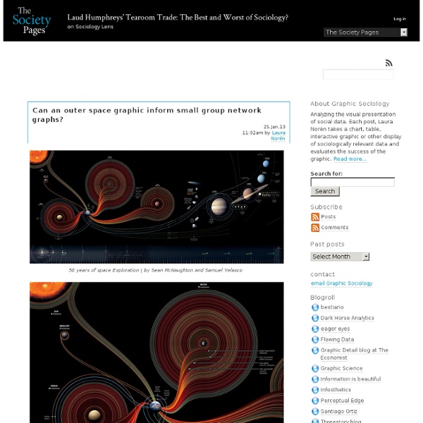
Graphic Sociology » Seeing Social Data
Gephi, an open source graph visualization and manipulation software
jacomyal/domino.js
“Drug Deal” Network Analysis with Gephi (Tutorial)
Via a trackback from Check Yo Self: 5 Things You Should Know About Data Science (Author Note) criticising tweet-mapping without further analysis (“If you’re making Gephi graphs out of tweets, you’re probably doing more data science marketing than data science analytics. And stop it. Please. I can’t take any more. … what does it gain a man to have graphs of tweets and do jack for analysis with them?”), I came across John Foreman’s Analytics Made Skeezy [uncourse] blog: Analytics Made Skeezy is a fake blog. Skimming through the examples described in some of the posts to date, Even Wholesale Drug Dealers Can Use a Little Retargeting: Graphing, Clustering & Community Detection in Excel and Gephi not surprisingly caught my attention. If you had a big dataset that you prepped into a trimmed nearest neighbors graph, keep in mind that visualizing it in Gephi is just for fun. Done that? So how would I have attacked this dataset (note: IANADS (I am not a data scientist;-) And for the customers?
2012 Perceptual Edge Dashboard Design Competition: We Have a Winner!
I was pleased and frankly surprised to receive 91 submissions to my dashboard design competition. Surprised because designing a student performance dashboard from scratch based on the data that I provided was not a trivial task. I was especially pleased to find a dramatic improvement over the general quality of entries since the last competition that I judged back in 2006. Almost every entry exhibited qualities that far surpass the dashboards that are typically produced and used today. This competition served many purposes: To give dashboard designers an opportunity to test and further hone their skills.To provide me with many fresh examples of dashboards that were all designed to serve the same audience and purpose—a teacher who needs to regularly monitor the performance and behavior of her students—that I could include in the second edition of my book Information Dashboard Design. All three purposes were well served by this rich and varied collection of entries. Take care,
Datawrapper Blog
revisit
revisit is a real–time visualization of twitter messages (tweets) around a specific topic. You can create your own twitter wall at a conference or an ambient display at your company or whatever use you come up with. In contrast to other twitter stream tools, it provides a sense of the temporal dynamics in the twitter stream, and emphasizes the conversational threads established by retweets and @replies. The tool is currently offline due to major changes in the Twitter API (more info), but please find a screencast here: revisit see5 from Moritz Stefaner on Vimeo. revisit aligns all twitter messages for your search terms along a timeline. When new tweets arrive, they are brought to the front and highlighted. A more complex conversational situation, with multiple interconnected retweets and replies. Source code + standalone version can be downloaded at github
chartsnthings
19 Sketches of Quarterback Timelines On Sunday Eli Manning started his 150th consecutive game for the Giants, the highest active streak in the NFL and the third-longest streak in NFL history. (One of the other two people above him is his brother, Peyton.) The graphics department published an interactive graphic that put Eli’s streak in the context of about 2,000 streaks from about 500 pro quarterbacks. It’s not particularly important news, but the data provided by pro-football-reference is incredibly detailed and the concept lended itself to a variety of sketches. A couple bar charts in R. And percent of games started (the people are 100% are players like Andrew Luck or RGIII who just haven’t played a lot of seasons.) Ported to a browser, just using total starts: And share of total possible starts A different angle, showing teams with all the QBs who have started for them since 2004. A similar idea, but mapping when each quarterback played for a particular team …or all the way back to 1970
That’s green, well maybe more blueish. You mean Grue? | Latest
During my senior year at Savannah College of Art and Design, I took Language, Culture and Society with Désiré Houngues. Two cultural insights about language stuck with me. In some societies men and women speak with entirely different vocabularies but still communicate verbally with one another. The second was that some languages only have two words for color, white and black (light and dark); if a language includes a third color, it is always red. The WCS collected data from 2696 native speakers, representing 110 languages, asking each of them to identify 330 colors. Where did this all start? In 1969, Berlin and Kay published their book “Basic Color Terms: Their Universality and Evolution”. (From “Basic Color Terms: Their Universality and Evolution” by Berlin & Kay) Berlin and Kay surveyed 20 native speakers representing 20 languages and asked them each to identify 330 colors. The debate between “relativism” and “universalism” considers how language and thought affect each other.
Related:
Related:
