
App ComicBook! en App Store ComicBook! is YOUR Creative Superpowers!Transform the ordinary to share-worthy extraordinary easy as: B.A.M!Arm yourself with the best graphic effects, 105 inspiring layouts, 374 hand-drawn* comic Stickers, 12 caption and text tools, auto-content from Facebook and Flickr, and you have the superpowers to Rule the Universe - in Your stories! TOP SELLING COMIC BOOK CREATION APPAWARDED iTUNES BEST PHOTO APP OF 2011WAS APP OF THE WEEK IN 12 COUNTRIES "The Best App for Making Comics: ComicBook!" YOUR IMAGES YOUR WAYImport images from your library and FlickrCapture a new imageScale, rotate & position imported images 10 IMAGE FILTERSAutomatic "Classic" styleAdjustable Comic stylePhoto Adjustment filterNoir, Sinkcity, Poster, Moody, Rock & Hope Effects 374 AWESOME STICKERS INCLUDEDVast majority lovingly hand-drawn by Joanna Mulder! 11 CAPTION TOOLS"Messy" option for drawn look, each is unique! 10 COMIC FONTS INCLUDEDFonts feature bold & international characters Title text tool in 6 colors and 3 sizes
@coolcatteacher Blog - Teaching students with new tools, enthusiasm and belief that teaching is a noble calling. How to Use OneNote at School: 10 Tips for Students & Teachers Advertisement Stephanie is just one of the 950 students at Sammamish High School in Seattle who have taken wholeheartedly to Microsoft OneNote along with their teachers. It makes it easier to think during class—and I’m doing less busy work. Across the country in Ohio, teachers gave their students “blizzard bags” when schools got closed for bad weather. Lugging around a satchel full of books pales a bit in comparison, doesn’t it? The notetaking member in Microsoft’s suite is a cross-platform productivity application. Outline Class Lectures Verbatim learning is the shortcut to mind numbness. Here, each outline is more than a simple list of bullet points. Move the outline using the grab handle of the container.Create multi-level outlines (up to 5 levels). Doodle or Sketch Away Are you a visual learner who learns better with drawings and pictures? A graph, the formation of a chemical bond, or an ecological cycle are best understood with a diagram. Doodling is better with a stylus. Ink Math
ToonDoo - World's fastest way to create cartoons! Escritura Creativa by Carlos Velilla on Genially Reutilizable Creatu propia. HISTORIA. Siguiente. @carlosvelilla_. Web 2.0 Tools for Kids Page 1 / 28 1. Mind42 2. Powered by JOGTHEWEB Index Share It : Web 2.0 Tools for Kids The page must be refreshed to take effect. StoryWriter Students Join now to get your very own Boomer. Get writing on BoomWriter today and you could be a published author! Join Now Educators & Schools BoomWriter is free in the School environment - Join now and get your students working on their first book! Join Now
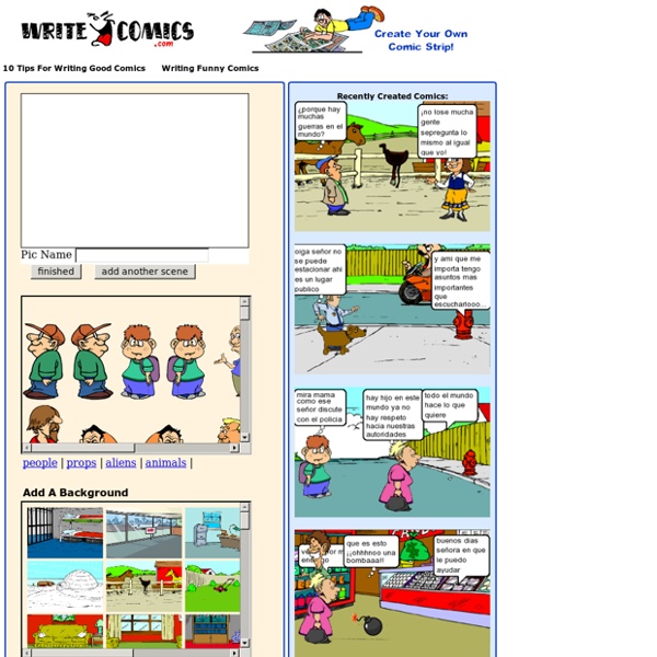
Comic Master Creative Writing: Topics, Tips & Guidelines Storyboard That - VER MANUALES The 10 Commandments of Typography Valentine Proust is Creative Director at Fontyou, a Paris-based online co-creation platform dedicated to typography. This post originally appeared on the Fontyou blog, and has been adapted with permission. With millions of beautiful typefaces scattering the Web, we felt it was time to lay down the rules on what makes typography great, and how to use them effectively. 1. There are so many font families with several weights and styles, so why do some of you insist on bolding manually? If you need something bold or light, choose a font with several weight. The same rule goes for widths. If you didn’t know, a real small cap has a specific design, it’s not only an uppercase which have been reduced. 2. Ideally, combine two fonts, (okay, a maximum of three) and enjoy all their styles and variations to create contrasts. For example, choose a serif font and a sans serif font and play with weights, italics, small caps etc. 3. Too short: Too long: 4. 5. The ellipsis is not the same as “dot dot dot”!