
10 design hacks for responsive emails that don’t suck Vivek Sharma is the co-founder and CEO of Movable Ink. Vivek is leading the charge to make email a more dynamic and relevant communication channel for marketers and consumers. With a background in both sales and product development, Vivek brings a potent combination of engineering talent and business savvy to his role as Movable Ink’s CEO. Creating responsive emails that look great on mobile devices isn’t a nice-to-have anymore – it’s a necessity. According to our Q4 2014 Consumer Device Report, nearly 67 percent of emails were opened on a mobile device. But according to Salesforce’s 2015 State of Marketing report, nearly half (42 percent) of marketers say that they rarely or never create responsive emails. The thing is, it’s not that hard to create responsive emails. Here are 10 quick design hacks that brands can use when they’re designing responsive emails: 1. Image credit: ivivva A lot of brands create regular email newsletters with multiple columns to split up content. 2. 3. 4. 5. 6.
Prism Effect Slider with Canvas A tutorial on how to create a slider with a "prism" effect using HTML5 canvas globalCompositeOperation and a layering technique. From our monthly sponsor: Automate manual QA and catch visual bugs with Percy’s all-in-one visual testing and review platform. Today we’d like to show you how to build a simple slider with an interesting “prism” effect. The idea is to place a shape in front of the slider and “reflect” the images of each slide, in order to create the illusion of a prism. The demo is supported in all major browsers, including Internet Explorer 9. The Technique The technique used to create the effect is actually pretty simple: first we’ll load and render the mask, which could be either an SVG or a PNG image (the important thing is that it has to have transparency), then we will render the slide’s image and apply the globalCompositeOperation. The ‘globalCompositeOperation’ canvas property lets you define how an image should be drawn over another image. The HTML and CSS The JavaScript
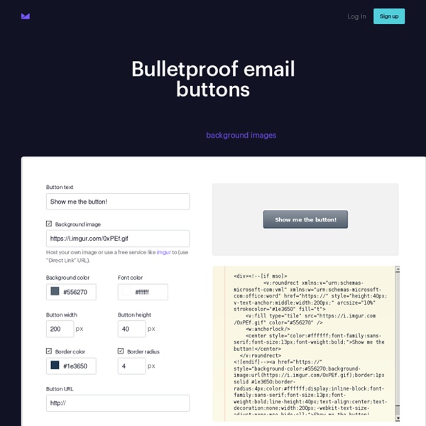
Les astuces pour coder un emailing sans s'arracher les cheveux Coder un emailing c’est… tout un art. L’art de faire en sorte d’écrire du code HTML lu de la même façon par tous les mailers dans tous les navigateurs. Ce n’est pas mission impossible, mais il faut savoir ce qui passe et ce qui ne passe pas, et connaître quelques petits « hacks » pour corriger certains bugs d’affichages. C’est après m’être arrachée les cheveux pour savoir comment supprimer l’espace blanc de 3px qui apparait entre deux images avec des liens dans une newsletter que j’ai décidé d’écrire cet article ou je vais recenser toutes les astuces à connaître. Je commence donc avec cette histoire d’espace blanc entre deux images : Problème de code newsletter : espace blanc entre deux images avec des liens Il arrive de devoir découper une image en plusieurs parties pour pouvoir mettre deux liens différents derrière, et compter sur le fait que les deux images se touchent pour que le découpage ne se voit pas. La solution : ajouter l’attribut style="display:block;" à votre image.
How to Dynamically Change the Colors of Product Images using CSS Blend Mode and SVG Learn a simple technique for adding a color swap functionality to your product images by creating an SVG and applying a mix-blend-mode to the composition. From our monthly sponsor: Automate manual QA and catch visual bugs with Percy’s all-in-one visual testing and review platform. To better explain that title right off the bat, here’s what we’re about to learn, and it’s easier than you think. Give it a go, change the shirt from yellow to blue by using the color picker in the bottom right corner: You can see another example of this in the demo Color this sofa! Imagine this for a second: You’ve finally done it, over the summer, you and a buddy are about to launch your screen printing start up out of your shared house, it’s not much, but you have a working setup and a few local bands and non-profits have already shown interest. You’ve seen this often happen online, and the solution is almost always a picture of one color, and little dots that represent the rest of the options. JavaScript
Foundation for Emails 2 Docs Getting Started There are two ways to get started with Foundation for Emails: the CSS version and the Sass version. The CSS version is a ZIP file download with all the HTML and CSS you need to get started writing an HTML email. Get Started with CSS Version The Sass version gives you more control over the visual styles of the framework, and a full build process, which includes a Sass compiler and image compression. Get Started with Sass Version What's in the Box? Get to know the pieces of Foundation. General Components Solving the Last Item Problem for a Circular Distribution with Partially Overlapping Items Easily manage projects with monday.com Let's say we wanted to have something like this: At first, this doesn't seem too complicated. We start with 12 numbered items: - 12.times do |i| .item #{i} We give these items dimensions, position them absolutely in the middle of their container, give them a background, a box-shadow (or a border) and tweak the text-related properties a bit so that everything looks nice. So far, so good: Now all that's left is to distribute them on a circle, right? The result seems fine at first: However, on closer inspection, we notice that we have a problem: item 11 is above both item 0 and item 10, while item 0 is below both item 1 and 11: There are a number of ways to get around this, but they feel kind of hacky and tedious because they involve either duplicating elements, cutting corners with clip-path, adding pseudo-elements to cover the corners or cut them out via overflow. So, what's the best solution then? 3D to the rescue! Let's tackle these issues one by one.
Emailing : comment attirer l'attention des consommateurs ? Les Français passent de moins en moins de temps sur les emails et préféreraient des messages plus informatifs que promotionnels, révèle la dernière étude d'Adobe sur l'utilisation de l'email par les consommateurs. Changement d'habitudes en matière de messagerie électronique : selon la troisième enquête annuelle menée par Adobe auprès de 3 000 cadres européens, avec un focus sur la France, les consommateurs passent de moins en moins de temps sur leurs emails. Avec 5,1 heures par jour consacrées par les Français à la lecture des messages électroniques (contre 6,5 heures en 2016), l'exigence, pour les marques, de se démarquer pour être lu s'accentue. D'autant, que les consommateurs affirment préférer les emails informatifs aux messages commerciaux (promotions). L'indifférence face à la consultation d'emails ? L'ordinateur reste le device privilégié pour consulter ses emails personnels et professionnels (85 %). 74 % des emails professionnels et 60 % des emails personnels sont ouverts.
line-clamp Easily manage projects with monday.com The line-clamp property truncates text at a specific number of lines. The spec for it is currently an Editor's Draft, so that means nothing here is set in stone because it's a work in progress. That said, it's defined as a shorthand for max-lines and block-overflow, the former of which is noted as at risk of being dropped in the Candidate Recommendation. It's easy to see how max-lines would be nixed since it's function (setting the number of lines before truncating) is already baked into line-clamp and any further abstraction might be unnecessary. #Syntax line-clamp accepts the following values in the current draft of the spec: none: sets no maximum on the number of lines and no truncation will happen as a result. That ellipsis should render as a Unicode character (U+2026) but could be replaced by an equivalent based on the content language and writing mode of the User-Agent being used. #Hey, can't I do this with text-overflow? (See what I did there?)
20 erreurs à ne pas commettre en emailing Nous vous avons souvent prodigué des conseils sur comment préparer, concevoir, rédiger et envoyer votre emailing. Mais cette fois ci, nous vous proposons une liste des choses à ne surtout pas faire. Utilisez-la comme un reminder, un post-it de bureau, un livre de chevet ou que sais-je, et ne commettez pas ou plus ces erreurs encore trop vues aujourd’hui… Ne jamais, ô grand jamais… 1. C’est la BASE de toute campagne réussie. 2. Même principe : les gens qui recevront vos emailing doivent absolument être intéressés par le contenu. 3. « Nouveauté High-Tech ! Ok, j’exagère. 4. On à l’ère du web 2.0. 5. Alors ça aussi, j’ai déjà eu le coup. Quant à ceux qui ne proposent même pas de lien de désabonnement dans leurs emailing ou alors bien, BIEN caché et BIEN petit tout en bas à droite en gris clair sur fond blanc… je ne pense même pas avoir besoin d’aborder le sujet. 6. Bon, pour ce point-là, je suis plus tolérant. 7. 8. Besoin d’une explication ? Annonce: 9. 10. 11. 12. 13. 14. 15. 16. 17. 18.
pour afficher les arrondis sur outlook by mayi5 May 11