
http://csslayoutgenerator.com/
Grid Designer 2 If you're familiar with the grid, a bit of design and basic typography, using this script should be pretty easy - most of the functions are pretty self-explanatory. If you're unfamiliar with grids in general, you could start by reading an excellent series of articles by web designer Mark Boulton. For those who want a real understanding of the theory of grids in relation to design and typography, I strongly recommend this book.
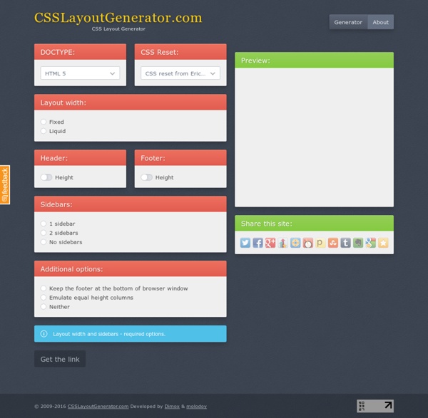
CSS Layout Generator About the CSS Layout Generator The CSS Layout Generator was first released by Tony Aslett in October 2003, since then over 871,000 layouts have been generated. Updated in November 2010, HTML5 doctype can now be selected and a simple HTML5 template with appropriate tags will be created. Other HTML and XHTML doctypes are still available. The generator helps you create the structure of your website template using valid HTML and CSS. You can create a fluid or fixed width floated column layout, with up to 3 columns and with header and footer.
Style Master CSS Editor for Windows and Mac OS X Cool Tools and Toys for Web Developers John, the lead developer (ok, pretty much the only developer) of Style Master is an avowed hacker. He loves exploring and experimenting with the latest features in browsers. Here's a collection of tools for web developers he's put together to help you analyse and debug your sites (and other people's sites as well), play with CSS3 features (bleeding edge browsers recommended) and more. XRAY works in Safari, Firefox and Internet Explorer. Grid-A-Licious Back in mid 2008, I created a jQuery plugin. I named it Grid-A-Licious and described it as, "Divs are placed in chronological order with a special grid" because I had no clue how to explain it better. I used this script a lot and designed many sites with it during 2008. At first, people were very skeptic and confused on how to read the grid, and thought this kind of layout belonged in real papers. This reaction slowly faded away once the layout became more and more popular when different developers and designers started to create their own script's interpretation of the floating grid layout effect. Not saying it was based on my work or script, because there were a few others that brought a similar layout effect to our attention, but not necessarily distributed as a plugin.
85 Top Responsive Web Design Tools As the mobile market continues to grow, demand for responsive website design intensifies. This has introduced a new set of tools, 10 of which we've listed below, to help lay out, design, code and plan a responsive website. While some may overlap, each deserves a spot on the list; when combined, they can help you craft a website that provides an optimal viewing experience for users on all devices. (Along with each recommendation is a list of alternative tools that may be useful.) If you are a designer or developer, what are some of the indispensable tools in your responsive toolbox?
Text Shadow Generator Use this CSS3 text shadow generator to easily add text shadow styles into your web project. Your browser does not support the CSS3 text-shadow property. You can still use this tool to generate the CSS3 rule, but you won' be able to see the results. <div class="error_msg">Please enable Javascript to use this page.</div> Text Shadow Explained HTML and CSS Table Border Style Wizard Compatibility Notes If you are using Internet Explorer 6, you should be able to use this wizard with only minor limitations. This page does not work with Opera 8 or IE 5 on Mac. Internet Explorer 6 does not support the border-spacing CSS2 table property. It also does not support any Netscape-specific CSS properties that are prefixed with -moz, and has limited support for the cursor property. This means you will not see all the effects in this wizard unless you use a browser like Firefox.
CSS3 Animator, HTML5 Animations, Create Stunning Animations with Ease The Sencha Web Application Lifecycle Management platform simplifies the challenges of managing the software development lifecycle of web applications. Now you can seamlessly design, develop, and test data-intensive web applications and deliver the right user experience, on the right screen, at the right time. Sencha Platform for Web Application Lifecycle Management The Sencha portfolio of products and services forms an integrated, modular platform for managing the lifecycle of your cross-platform web applications. Sencha products can be deployed separately or together to form an end-to-end solution.
UPrinting.com: Download our Free Templates! If you’re having trouble setting up your own design files, then you can use our setup templates. UPrinting’s print templates help you set up proper bleeds and margins for your single-page prints, folded cards, multi pagers, large format prints, and mailers. Categorized per product and file type, our print templates can be downloaded for free. They’re available in all standard sizes and major products like business cards, brochures, postcards, posters, catalogs and more! You can even choose among these file formats: .jpeg, .psd, .innd, .pdf, .tiff, .cdr, .ai, and .pub. It’s easy to download our free templates online.
css3 menu,animation navigation menu In this new category called “Tips and Tricks” we will introduce some quick and interesting methods around web development and web design. In today’s tip we’ll show you how to spice up your menu by adding a neat hover effect to it. The idea is to slide an image out to the right when hovering over a menu item.