
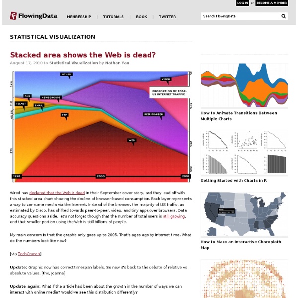
Visual Mapping.com 37 Data-ish Blogs You Should Know About You might not know it, but there are actually a ton of data and visualization blogs out there. I'm a bit of a feed addict subscribing to just about anything with a chart or a mention of statistics on it (and naturally have to do some feed-cleaning every now and then). In a follow up to my short list last year, here are the data-ish blogs, some old and some new, that continue to post interesting stuff. Data and Statistics By the Numbers - Column from The New York Times visual Op-ed columnist, Charles Blow, who also used to be NYT's graphics director.Data Mining - Matthew Hurst, scientist at Microsoft's MSN, also the co-creator of BlogPulse.Statistical Modeling - We might disagree on certain things, but Andrew's blog is one of the few active pure statistics blogs.The Numbers Guy - Data-minded reporting from Carl Bialik of the Wall Street Journal.Basketball Geek - Like statistical analysis and basketball? Statistical/Analytical Visualization Maps Design & Infographics Others Worth Noting
indiemapper is free - Axis Maps Blog by David Heyman on January 5, 2012 With the start of 2012, we’ve decided to make indiemapper free to use. Since indiemapper launched in 2010, our business has grown and changed to where supporting and maintaining indiemapper is no longer a major part of what we do at Axis Maps every day. We’re making indiemapper free so that it can continue to exist as a useful tool for map-makers while freeing us up to be as awesome as possible at our custom cartography business. To allow us to give it away for free, we’re scaling back what indiemapper does. We’re really happy about this change and we hope you are too. Launch indiemapper
Junk Charts This post is part 2 of an appreciation of the chart project by Google Newslab, advised by Alberto Cairo, on the gender and racial diversity of the newsroom. Part 1 can be read here. In the previous discussion, I left out the following scatter bubble plot. This plot is available in two versions, one for gender and one for race. The story appears to be a happy one: in many newsrooms, the leadership roughly reflects the staff in terms of gender distribution (even though both parts of the whole compare disfavorably to the gender ratio in the neighborhoods, as we saw in the previous post.) Unfortunately, there are a few execution problems with this scatter plot. First, take a look at the vertical axis labels on the right side. I find this decision confounding. The horizontal axis? Here is the same chart with improved axis labels: Re-labeling serves up a new issue. The solution, as shown below, is to shift the vertical gridlines by 5% so that the 45-degree line bisects every grid cell it touches.
Axis Maps LLC - Cartography. Visualization. Design. Information is Beautiful: You've Been Quango'ed visualisation | News Information is Beautiful on quangos Illustration: David McCandless for the Guardian We all know 'quango' is a dirty word. Like bad fruits, they're useless, extraneous, over-funded non-government bodies that need to be quoshed or squeezed. Right? There are over 1,000 such organisations in the UK. Many face severe cuts and even the axe in the next government spending review on 20th October. Problem is, I don't know what most quangos do. Frustrated by this, I set about researching these bodies and what they did. So here I've: • Visualised every quango that receives over £25m in direct funding from the government • Filtered out exclusively Welsh, Scottish and quangos from Northern Ireland (just to make it manageable) • Described the purpose or role of every quango in plain English (many quangos have arcane names and jargonistic self-descriptions) • Detailed the major quangos to be abolished or 'under review'. UK Quangos Visualization - InformationIsBeautiful.net About the data About Me
Infosthetics: the beauty of data visualization The beauty of information aesthetics: Visual Poetry 06 by Boris Müller. " Boris Müller's newest 'visual theme' for a annual international German literature festival. 2006 the theme consisted of beautiful visualizations of the poetry texts themselves. Each word corresponded to a numerical code by adding the alphabetical values of its letters together. This number was mapped onto the position on a circle, and marked by a red dot. Gray lines connect the dots in the sequence the words appear in the poem. The diameter of the circle on which the dots are placed is decided by the length of the poem," Andrew explains . Andrew Vande Moere digs deep in his information channels to gather the most interesting forms of data visualization. Written by Verena Stamen are amongst Andrew’s all time favorites. First, would you quickly sum up your background for us? Way back, I studied Architectural Engineering at the K.U.Leuven University in Belgium. Beautiful diagram, again from Stamen !
Announcing a California High Speed Rail Station Area Mapping Tool! (Beta Version) | Advanced GIS: Web GIS Topic, Description, and Functionalities Railway to Heaven seeks to buoy the California High Speed Rail Authority’s community outreach efforts through a new web-based interactive mapping tool. The Proposed CAHSR Station Area Study website displays the proposed alignment for California’s High Speed Rail with detailed station area analyses for Los Angeles and Anaheim. At the station area level, this tool displays data on proposed station location, transit intermodality, proximate built environment characteristics, and housing affordability. Users can access information at two scales within the site: state and station-area level. Statewide map featuring alignment information and station area study sites At the station-area level users can display live data from Zillow, Flickr, and Los Angeles County Metropolitan Transportation Authority in addition to published data from the High Speed Rail Authority and Orange County Transportation Authority. Audience, Strategies, and Implementation
Power of Data Visualization - An infographic inspiration site. Datavisualization