How to Create Infographics
10 Types of Infographics: Which Works For You?
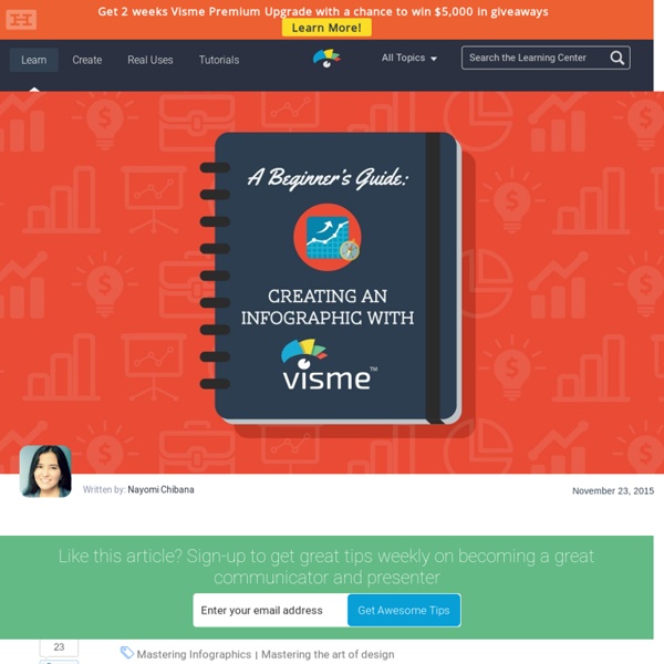
Do you have your next big infographic idea but know how to get it on paper? Do you have all the data you need but aren’t sure how to visualize it? Creating a really cool, memorable and–above all–shareable infographic comes down to investing the necessary time and attention in all the steps that lead up to an awesome data visualization. In a previous series of posts, we discussed the steps to creating your own infographic. ChronologicallyAlphabeticallyGeographicallyCategoricallyHierarchically The visual format you choose will depend on how you want to organize your information. 1 Mixed charts Source: MHPM As its name implies, this type of infographic incorporates different chart and graph formats. This mixed bag of charts and graphs is the best option when you have many statistics, facts and figures to communicate to your audience. 2 Informational / List Business 2 Community Another common type of infographic is the list-based or informational visual. 3 Timeline Funders and Founders 4 How-to
Bad Infographics: 11 Mistakes You Never Want to Make
In an increasingly visual world, bad infographics have become the bane of the Internet. Just ask users who are bombarded on a daily basis with everything from poorly designed visuals to flat-out inaccurate data visualizations. This pandemic has gotten so bad that up to 95% of infographics from unknown sites have distorted the truth or just plain lied. It’s ruining the Web–so much so that users have gotten better and better at spotting misleading data as soon as they see it. Take a look, for example, at this infographic (click to enlarge). Not so fast. Internet users–like the ones below–have gotten smart to the tricks used by marketers looking for a fast way to get more links. To help you avoid the fate of a badly designed or, worse yet, a misleading data visualization, we’ve compiled a list of some of the most common mistakes made when creating infographics. 1 It just doesn’t add up We’ve all seen these before. 2 Choosing the wrong type of chart 3 Including too much information
What You Can Do With Piktochart – Librarian Design Share
We’ve shared a lot of Canva designs on Librarian Design Share recently, but there are other easy-to-use graphic design sites with pre-made design elements like Piktochart that can help you create great looking posters and advertisements for your library. Kendall Hinesley, Liaison Library & Reference Coordinator at California State University Dominguez Hills, has created some wonderful marketing and outreach materials for her library’s new Co-Lab and Reference Services. Here’s Kendall describing this fun Co-Lab poster: This poster is 2ft. by 3ft. and announces the opening of a new high-tech group-study room in the library we are calling the Co-Lab (collaborative lab). She’s also created helpful reference desk signage using Piktochart’s icons and elements: These two signs are for our Research Help Desk (reference) for times when there is no one at the desk. Table tents & monitor cards help complete her well-thought-out reference signage: Like this: Like Loading...
Related:
Related:
