background preloader

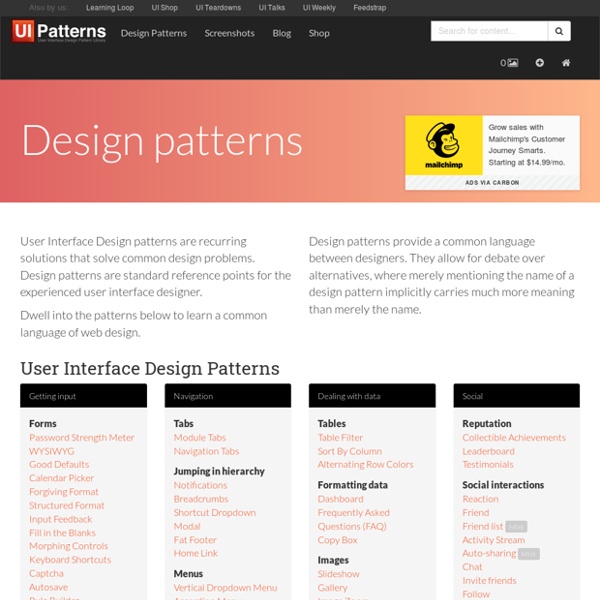
Design patterns

Design patterns

Web Culture: Grid-based Layout Designs The semantic web has brought on a new generation of Internet technology. As designers and developers work together to redefine the rules of the web, the number of open-source projects and third-party APIs continues to grow. The opinions of web scholars differ on the use of grid systems. Many argue that setting grid points limits the creativity of designers. Both sides provide interesting arguments. The grid isn’t a master key to perfect design. A Comparison to the Classic Web Older generations used design as a control mechanism. In their wake, a new web culture is stirring. One reason for this development is the significant increase in the number of people working on the semantic web. Working for a pay day is satisfying, but not something to be passionate about. Where Grids Have Evolved There hasn’t been a major study comparing pre-standards and post-standards web design techniques. The grid system is based on current technological trends and advancements. Visual Grid Designs Yahoo!

httpster.net Design patterns, de nouvelles librairies pour la conception d’interface Les sont des schémas de conception, c'est-à-dire des modèles d'interface répondant à des cas typiques d'interaction. Les design patterns permettent d'avancer rapidement lors de la conception en fournissant des gabarits qu'il suffit d'adapter et d'assembler pour construire l'interface. Notre dernière liste de librairies et sa mise à jour commençaient à dater un peu, voici une nouvelle mise à jour plus complète. Au menu de cet article : des librairies de patterns pour trouver des solutions ergonomiques ( ici ), des galeries de patterns pour s'inspirer ( ici ), et des librairies interactives pour se faire une idée ( ici ). Les librairies de patterns Les librairies ont l'avantage non seulement de proposer de nombreux patterns, mais surtout d'en expliquer l'usage. Les nouvelles librairies Des patterns actuels, avec une explication sur leur usage en contexte. Une librairie qui mérite de s'enrichir, car ses patterns sont tous actuels. Les librairies incontournables Le site est très riche. Note :

Designing More Efficient Forms: Structure, Inputs, Labels and Actions People who use your app or site have a particular goal. Often the one thing that is standing between the user and his goal is a form. Because forms still remain the one of the most important type of interaction for users on the web and in the apps. Forms are just a means to an end. In this article, you’ll see practical guidelines that have been crafted from usability testing, field testing, eye tracking and actual complaints made by disgruntled users. The Components Of Forms The typical form has following five components: Structure. Forms could also have following components: Assistance. This article covers many aspects related to the structure, input fields, labels and action buttons. Form Structure A form is a conversation. Only Ask What’s Required Make sure you only ask what you really need. Order the Form Logically Details should be asked logically from a user’s perspective, not the application or database logic. Group Related Information One Column vs. Input Fields Number of Fields Labels

A better Photoshop grid for responsive web design Posted on 20 January 2012 • 90 comments In making the move to responsive web design, one of the potential hurdles is the rather awkward maths for calculating the percentage-based widths necessary for fluid layouts. If, for example, you’re designing with a 960px grid in Photoshop and you have six columns, each 140px wide, you divide 140 by 960 to get your percentage-based width: 14.583333%. Now, I don’t know about you, but numbers like that look a little scary. It doesn’t matter that there are great calculation tools built into TextMate to do the maths for you; the point is that the final figure looks like an arbitrary number with no immediate relation to either the container’s pixel width (960) or the element’s pixel width (140). Compare that to a container that has a width of 1000px. 1000 is a nice, easy, round number. Here’s the PSD. But what about our precious 960 grids? I should point out here that I’m not proposing a new framework. Caveat 1: margins Caveat 2: rounding errors

5 Tips To Improve Your Design Skills It doesn’t matter how good you are today. What really matters is how fast you progress and what steps you take every day to improve your design skills. Recently, I tried to sum up my last several years of being a graphic designer in order to discover what really brought me to the level I’m at today. Nothing happens overnight. It takes a countless number of hours, plus practice and patience. I tried to select five actions and routines I’ve been doing regularly for the last few years in order to become a better designer. 1. If you want to create great designs, first you need to learn to recognize a good design from a bad one. “Every artist was first an amateur.”— Ralph Waldo Emerson You should train yourself in order to hone this precious skill every day. The rule is simple: browse design projects every day. Study well-designed pieces and try to answer the question: “What makes it so good?” Treat your ability to identify good design like a muscle. 2. 3. 4. 5. Conclusion Written by Rafal Tomal.

Patterns : Designing Interfaces Selected patterns from the book are featured here on the website, in their entirety. Here are all of the patterns in the second edition of the book, sorted by chapter. Most of these patterns are not online yet, but many of them will become available over time as featured patterns. What users do Patterns of user behavior Safe Exploration Instant Gratification Satisficing Changes in Midstream Deferred Choices Incremental Construction Habituation Microbreaks NEW Spatial Memory Prospective Memory Streamlined Repetition Keyboard Only Other People’s Advice Personal Recommendations NEW Getting around Navigation, signposts, and wayfinding Clear Entry Points Menu Page NEW Pyramid Modal Panel Deep-linked State NEW Escape Hatch Fat Menus NEW Sitemap Footer NEW Sign-in Tools NEW Sequence Map Breadcrumbs Annotated Scrollbar Animated Transition Organizing the page Lists of things Images, messages, search results, etc. Doing things Showing complex data

Less Framework 4 I called Less Framework "a CSS grid system for designing adaptive websites". It was basically a fixed-width grid that adapted to a couple of then popular screen widths by shedding some of its columns. It also had matching typographic presets to go with it, built with a modular scale based on the golden ratio. The resources it was originally published with are still available on GitHub. Contrary to how most CSS frameworks work, Less Framework simply provided a set of code comments and visual templates, instead of having predefined classes to control the layout with. /* Default Layout: 992px. Less Framework was popular in the early days of responsive design. Eventually, I moved on from fixed-width grid systems and worked on a fully fluid-width one, in the form of Golden Grid System. Less Framework's popularity was helped by the following contributions and the lovely people behind them (dead links crossed off):

Defonic - fabulous noise generator Où trouver de l'inspiration pour vos animations ? Avez-vous déjà remarqué à quel point les animations sont devenues un composant essentiel au cœur des interfaces utilisateur ? Pour en tenir compte dans vos projets futurs et vous inspirer, découvrez quelques sites et outils de référence à connaître. Annonce Aujourd’hui, l’animation n’est plus réservée à des sites de jeux, pour des expériences interactives poussées ou simplement des applications mobiles. Les traditionnels blocs plats, sans vie et en 2D prennent vie avec des mouvements « réalistes » qui suivent les lois de la physique du monde réel. « Une animation bien réussie est celle que l’utilisateur ne va pas remarquer » La clé d’une animation réussie réside dans sa justesse. Pour avoir une animation qui fonctionne, pensez au réalisme de celle-ci avant tout. Des galeries pour trouver l’inspiration : Les bonnes pratiques sont dans la nature et encore plus dans de belles galeries à bookmarker sans plus attendre. UI Movement User Interfaces Use Your Interface Codepen Patterns Atomic Invsion

Less Framework 4 Every layout in Less Framework is based on a single grid, composed of 68 px columns with 24 px gutters. The only measures that change from layout to layout are the amount of columns and the width of the outer margins. The three sets of typography pre­sets are aligned to a 24 px baseline grid; one is based on 16 px body text, one on 17 px, and one on 18 px. Both sets contain several harmonious type sizes calculated using the Golden Ratio. Technically The idea is to first code the Default Layout (992 px), and then use CSS3 media queries to code seve­ral child layouts: 768, 480, and 320 px. If you think of Mobile First as progressive enhancement, Less Framework will feel more like graceful degradation; old desktop and mobile browsers will only use the default 992 px layout. Philosophically The goal of Less Framework is to make building websites with mul­tiple layouts efficient, and to make the layouts feel consistent. Less Framework is simple.

.resizr - Test your CSS media queries

Related: