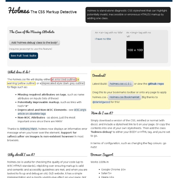
Holmes.css - CSS Markup Detective
Font sizing with rem
Determining a unit of measurement to size our text can be a topic of heated debate, even in this day and age. Unfortunately, there are still various pros and cons that make the various techniques less desirable. It's just a matter of which less-desirable is most desirable. There are two main techniques that are extolled: Size with pxSize with em Let's review these two approaches before I reveal the magical third. Sizing with px In the early days of the web, we used pixels to size our text. I, personally, have been of the camp that px-based layouts provide the consistency I prefer and users have enough tools available to adjust their view that accessibility is less of a concern. Sizing with em That whole inability to resize text in IE has been a continuing frustration. The technique modifies the base font-size on the body using a percentage. The problem with em-based font sizing is that the font size compounds. Sizing with rem But what pitiful browser support do we have to worry about?
CSS Stress Testing and Performance Profiling / Andy Edinborough
Now let me explain: I have been losing my sanity over the oddest issue. The project I’m working on right now has a fairly complex stylesheet. Performance for the site is absolutely critical. I’ve done my best to squeeze and optimize every line I can. In all browsers, it runs like a champion. Something specific to IE9 was causing a serious performance glitch. Sadly, no one had an answer So, as I lay there in the corner of the closet, weeping bitterly, I realized that writing my own CSS stress tester wouldn’t be that difficult. Of course it took a while to work out the exact implementation. My first implementation was written synchronously. Instead of: var time0 = new Date().getTime(); window.scrollBy(0,100);var delta = (new Date().getTime()) - time0; I needed to add an event handler to window.scroll, scroll the page, then capture time in the event. (this isn’t how the code is actually written—just showing some insight into the how it works) Fast forward a several weeks. Was it box-shadow?
jqmPhp | HTML Code Generator for jQuery Mobile Framework | jqmPhp
CSS-Crush – CSS preprocessor
Edit ‘Vendor prefixing’ on Github Vendor prefixes for properties, functions, @-rules and even full declarations are automatically generated – based on trusted sources – so you can maintain cross-browser support while keeping your source code clean and easy to maintain. In some cases (e.g. Edit ‘Variables’ on Github Declare variables in your CSS with a @define directive and use them with the $() function. Variables can also be injected at runtime with the vars option. Conditionals Sections of CSS can be included and excluded on the basis of variable existence with the @ifdefine directive: Edit ‘Direct @import’ on Github Files referenced with the @import directive are inlined directly to save on http requests. If you specify a media designation following the import URL — as per the CSS standard — the imported file content is wrapped in a @media block. @import "print.css" print;@import url( "small-screen.css" ) screen and ( max-width: 500px ); Edit ‘Rule inheritance’ on Github Referencing by name
lorempixum - placeholder images for every case
Needle: Automated tests for your CSS — Needle 0.1a1 documentation
Needle is a tool for testing your CSS with Selenium and nose. It checks that CSS renders correctly by taking screenshots of portions of a website and comparing them against known good screenshots. It also provides tools for testing calculated CSS values and the position of HTML elements. Installation If you haven’t got pip installed: As root, or in a virtualenv: Getting started Create test_bbc.py in an empty directory: from needle.cases import NeedleTestCase class BBCNewsTest(NeedleTestCase): def test_masthead(self): self.driver.get(' self.assertScreenshot('#blq-mast', 'bbc-masthead') This is a test case which tells the Selenium web driver (by default Firefox) to open BBC News and check the bar across the top of the page looks correct. assertScreenshot() take two arguments: a CSS selector for the element we are capturing and a filename for the image. To create an initial screenshot of the logo, we need to run Needle in ‘baseline saving’ mode: Selecting a WebDriver
Skeleton: Beautiful Boilerplate for Responsive, Mobile-Friendly Development
PCSS - CSS Server-side Preprocessor
Leaflet - a modern, lightweight JavaScript library for interactive maps by CloudMade
Related:
Related:
