
Isotope Xinha – Trac Awesome Cufonized Fly-out Menu with jQuery and CSS3 In today’s tutorial we will create a full page cufonized menu that has two nice features: when hovering over the menu items we will move a hover-state item that adapts to the width of the current item, and we will slide out a description bar from the left side of the page, […] View demoDownload source In today’s tutorial we will create a full page cufonized menu that has two nice features: when hovering over the menu items we will move a hover-state item that adapts to the width of the current item, and we will slide out a description bar from the left side of the page, reaching towards the current menu item. We will use jQuery for the effect and some CSS3 properties for the style. So, let’s start! The Markup The HTML structure will consist of an unordered list that represents our menu and a div for the description elements: We leave out the description for “Home” since there is nothing to describe. The CSS The background is going to be dark gray: The menu items are hoing to float right:
Elastic Stack Saudade Tuqburni Retrouvailles Onsra Mamihlapinatapai Koi No Yokan If you enjoyed this, you might also like: Colorbox - a jQuery lightbox A lightweight customizable lightbox plugin for jQuery View Demos Released under the MIT License, source on Github (changelog) Download Install via NPM npm install jquery-colorbox Compatible with: jQuery 1.3.2+ in Firefox, Safari, Chrome, Opera, Internet Explorer 7+ Supports photos, grouping, slideshow, ajax, inline, and iframed content.Lightweight: 10KB of JavaScript (less than 5KBs gzipped).Appearance is controlled through CSS so it can be restyled.Can be extended with callbacks & event-hooks without altering the source files.Completely unobtrusive, options are set in the JS and require no changes to existing HTML.Preloads upcoming images in a photo group.Currently in use on a million-plus websites. Instructions & Help The FAQ has instructions on asking for help, solutions to common problems, and how-to examples. Usage Colorbox accepts settings from an object of key/value pairs, and can be assigned to any HTML element. Settings Public Methods Event Hooks Hey,
liteAccordion - a horizontal accordion plugin for jQuery Slide One1 Slide Two2 Slide Three3 Slide Four4 Slide Five5 <p>Please enable JavaScript to get the full experience.</p> Responsive and WordPress versions available! New! Accordion Pro JS is a responsive version of liteAccordion, with lots of upgrades and new features (vertical accordions!). Download More details and download link for liteAccordion here. Q. A. Q. A. Q. A. Q. A. Q. A. Q. A. liteAccordion is free to use for commercial and personal projects. If you find any bugs, please file a ticket on Github and I'll fix it as soon as possible. Version 2.2 (21/01/13) Responsive layout and auto scale images options removed After some consideration, I've decided to remove the responsive options. Development status: on indefinite hiatus After this update, I do not plan to continue developing this plugin. New in 2.0! Methods: liteAccordion now has play, stop, trigger next slide, trigger previous slide, destroy and debug methods. Mouseover activation Custom easing Linkable slides 1. 2.
CSS-Only Responsive Layout with Smooth Transitions A tutorial on how to create a 100% width and height smooth scrolling layout with CSS only. Using a radio button navigation and sibling combinators we will trigger transitions to the respective content panels, creating a "smooth scrolling" effect. View demo Download source In this tutorial we will create a responsive 100% width/height layout with some smooth page transitions. The idea is to have some content panels and a navigation which will allow us to navigate between the panels. Please note: the result of this tutorial will only work as intended in browsers that support the respective CSS properties. Note that we will exclude vendor prefixes in this tutorial. The Markup The structure will be consist of a main container with the class st-container which will contain the radio buttons and link, and the wrapper with the class st-scroll for the panels. What we want to do is basically move the panel wrapper by changing it’s top value and bringing the respective panel into the viewport.
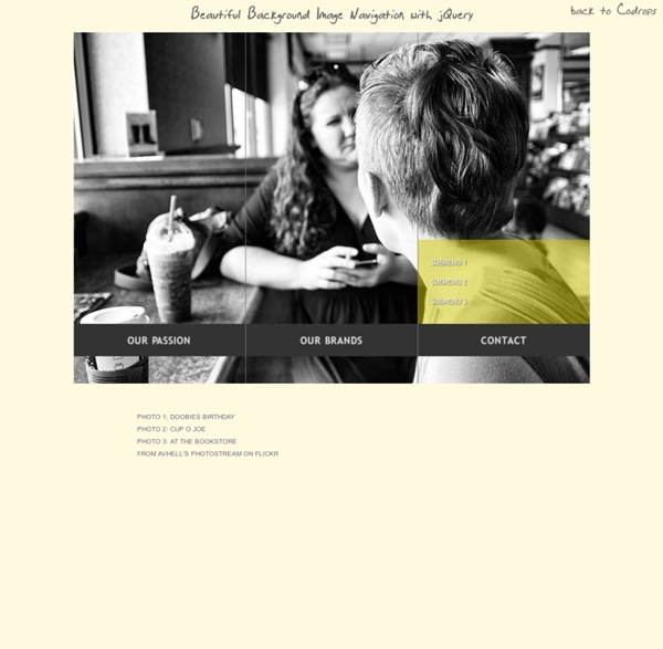
Simple Icon Hover Effects with CSS Transitions and Animations Previous Demo Back to the Codrops Article Mobile Desktop Partners Support Security Settings Time Videos List Refresh Images Edit Link Mail Location Archive Chat Bookmarks User Contact Note that the dashed border on a round pseudo-element (border-radius: 50%) does not work in FF 21.0 Mobile Desktop Partners Support Security Settings Support Fav Contract Refresh Settings Time Videos List Refresh Archive Chat Bookmarks User Contact Images Edit Link Mail Location If you enjoyed these effects you might also like: Creative Button Styles Creative Link Effects
How To Become A Hacker - StumbleUpon Copyright © 2001 Eric S. Raymond As editor of the Jargon File and author of a few other well-known documents of similar nature, I often get email requests from enthusiastic network newbies asking (in effect) "how can I learn to be a wizardly hacker?". If you are reading a snapshot of this document offline, the current version lives at Note: there is a list of Frequently Asked Questions at the end of this document. Numerous translations of this document are available: ArabicBelorussianBulgarianChinese, Czech. The five-dots-in-nine-squares diagram that decorates this document is called a glider. If you find this document valuable, please support me on Patreon or SubscribeStar. The Jargon File contains a bunch of definitions of the term ‘hacker’, most having to do with technical adeptness and a delight in solving problems and overcoming limits. The hacker mind-set is not confined to this software-hacker culture. 1. 2. 3. 5. 2. 3. 4. 1. 2. 3. 4.
Mohawk Concept posters for the new Mohawk identity. A family business founded in 1931, Mohawk is North America’s largest privately owned manufacturer of fine papers and envelopes. The paper business has changed enormously in recent years, with revolutions in digital technology transforming the ways people use paper. To meet this challenge, Mohawk is leveraging connections in the digital, design and photo spaces to develop new web-based offerings. This week the company launches a dynamic new identity system designed by Pentagram’s Michael Bierut and his team that helps reinvent Mohawk for the digital world. The new mark is based on the letter M. The identity is the third Pentagram has created for Mohawk in the past 20 years, following logos designed in 1991 and 2002. The new identity functions as a monogram and suggests rolls of paper, presses and connection. The logo accompanies a change of the company’s name to “Mohawk” from Mohawk Fine Papers and can appear with the name or stand alone.
Career Planning Resources - Home