background preloader

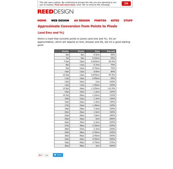
Approximate Conversion from Points to Pixels

Approximate Conversion from Points to Pixels

rgba.php test page Want to use RGBA in your projects but a solid color fallback for Internet Explorer 8- (and other old browsers) is just not good enough? Do you find that creating fallback semi-transparent pngs is too time-consuming? With rgba.php you get to use RGBA backgrounds in every browser with just one extra CSS declaration! How? background: url('rgba.php/rgba(255, 255, 255, 0.3)'); background: rgba(255, 255, 255, 0.3); or, for named colors (you specify them, only black and white by default): background: url('rgba.php? The old (v1.1 and below) way of specifying the color also works: background: url('rgba.php? Please note: If you use the a parameter, bear in mind that it ranges from 0-100 instead of 0-1. Get it now from Github Installation Just upload the file somewhere. History I wrote the first version of rgba.php as a complement to a blog post on RGBA that I posted on Februrary 2009.

Free Coding Guide for Beginners — Code Conquest CSS3 Patterns Gallery Browser support The patterns themselves should work on Firefox 3.6+, Chrome, Safari 5.1, Opera 11.10+ and IE10+. However, implementation limitations might cause some of them to not be displayed correctly even on those browsers (for example at the time of writing, Gecko is quite buggy with radial gradients). Also, this gallery won’t work in Firefox 3.6 and IE10, even though they support gradients, due to a JavaScript limitation. Submission guidelines If you have a new pattern to submit, please send a pull request. Does it present a new technique? Animatable: One property, two values, endless possiblities box-shadow From: 0 0 black To: 0 150px 10px -50px rgba(0,0,0,.5) Author: @leaverou

CSS2 - The display declaration The display property lets you define how a certain HTML element should be displayed. display: block display: block means that the element is displayed as a block, as paragraphs and headers have always been. Live example: display: inline display: inline means that the element is displayed inline, inside the current block on the same line. display: block display: inline display: none display: none means that the element is not displayed at all (so you won't see it in the example either). display: none display: inline-block An inline block is placed inline (ie. on the same line as adjacent content), but it behaves as a block. display: block Let's add some content to see how the block behaves. display: inline-block; width: 10emLet's add some content to see how the block behaves. Let's add some content to see how the block behaves. The real use of this value is when you want to give an inline element a width. Here’s the same example, but with display: inline. display: list-item display: list-item

PrefixFree: Break Free From CSS Prefix Hell Advertisement This article is the first piece in our new series introducing new, useful and freely available tools and techniques presented and released by active members of the Web design community. Lea Verou is well-known for her experiments with CSS and JavaScript and in this post she presents her recent tool, prefixfree, which will hopefully help you break free from the CSS prefix hell. So What’s the Problem With Prefixes? I’m sure we all agree that CSS3 is pretty cool and that it enables us to do things that were previously impossible. I’m not saying that prefixes are bad. A Solution: prefixfree The code I write in my live demo slides and presentations doesn’t have any prefixes, even for things like @keyframes or the transition property, which aren’t yet supported anywhere prefix-less. The script essentially does everything in JavaScript’s power to allow you to completely forget about vendor prefixes. So, what does the rule above become with prefixfree? Download the Script on GitHub!

Getting Started - Google Web Fonts This guide explains how to use the Google Fonts API to add fonts to your web pages. You don't need to do any programming; all you have to do is add a special stylesheet link to your HTML document, then refer to the font in a CSS style. A quick example Here's an example. Copy and paste the following HTML into a file: Then open the file in a modern web browser. Making the Web Beautiful! That sentence is ordinary text, so you can change how it looks by using CSS. You should now see a drop shadow under the text: And that's only the beginning of what you can do with the Fonts API and CSS. Overview You can start using the Google Fonts API in just two steps: Add a stylesheet link to request the desired web font(s): Style an element with the requested web font, either in a stylesheet: or with an inline style on the element itself: For a list of fonts you can use, see Google Fonts. Specifying font families and styles in a stylesheet URL For example, to request the Inconsolata font: For example:

Developing Responsive Designs With Opera Mobile Emulator Advertisement This is our seventh article in a series that introduces useful and freely available tools and techniques, developed and released by active members of the Web design community. The first article covered PrefixFree; the second introduced Foundation, a responsive framework; the third presented Sisyphus.js, a library for Gmail-like client-side drafts. The fourth shared a free plugin called GuideGuide with us, and later we’ve announced Erskine’s responsive grid generator Gridpak and Remy Sharp’s debugging tool JS Bin. Back in 2009, when coding version 10 of Opera Mobile, my Opera colleagues decided to tune the Opera Mobile build machine so that it would churn out builds not only for common mobile platforms, but for Windows and Linux as well. So, we decided to iron out the wrinkly bits, added a Mac build channel, and turned it into a publicly available developer tool, called Opera Mobile Emulator. Basic Usage When launching the emulator, you are greeted with a profile selector.

The Best CSS3 Tools, Experiments And Demos For Web Developers | Blog CSS3 is already the present on the Web. An authentic reality bursting with possibilities. On a daily basis Awwwards selects the best of the Web universe with the most spectacular examples of the latest version of web styling language par excellence.Tools & Generators | Experiments & Demos | Animations & PicturesEnjoy! CSS3 Tools & Generators: At the same time that the use of CSS3 has extended, lots of tools and code generators have popped up all over the place to try and facilitate coding work and simplify the application of new properties for the developer. Cubic-bezier Animatable The Web Font Combinator Prefix Free -prefix-free lets you use only unprefixed CSS properties everywhere. CSS3 Experiments & Demos: As if those weren't enough, a few fantastic artists of this language share their excellent experiments and innovative ideas for the use and enjoyment of whoever's interested. CSS3 Animations & Pictures:

HTML5 Please - Use the new and shiny responsibly

Related: