
Income inequality, as seen from space Last week, I wrote about how urban trees—or the lack thereof—can reveal income inequality. After writing that article, I was curious, could I actually see income inequality from space? It turned out to be easier than I expected. Below are satellite images from Google Earth that show two neighborhoods from a selection of cities around the world. In case it isn’t obvious, the first image is the less well-off neighborhood, the second the wealthier one. Rio de Janeiro Rocinha Zona Sul Oakland West Oakland Piedmont Houston Fourth Ward River Oaks Chicago Woodlawn Hyde Park Beijing Fengtai Chaoyang Boston metro area, Massachusetts Ball Square, Somerville West Cambridge Your examples Do you have other cities or neighborhoods in mind? Be sure to include the names of the cities and neighborhoods you’re highlighting and if you’d like me to mention your name. Your examples are now posted! Related posts: Urban trees reveal income inequality Income inequality in the Roman Empire Ghosts of geography
Not a Drop to Drink More Infographics on Good Millenium Development Goals More Infographics on Good Census Maps Using Word Frequency From 19 Million Dating Website Profiles Chicago area Each decade the United States government embarks on a census of its entire population in order to update population numbers and demographic information that aids in the allocation of Congressional seats, electoral votes, and government program funding. But as helpful and interesting as this data is, what does it really tell us about who we are? What about our likes, dislikes, feelings, and the ways we choose to define ourselves? In his project A More Perfect Union , artist R. Luke Dubois asked this very question and set out to answer it by joining 21 dating web sites and aggregating language used in the profiles of 19 million people. To join a dating site you have to, quite literally, “put yourself out there”, describing yourself for the express purpose of being liked. I joined twenty-one dating sites in order to make my own census of the United States in 2010. Below are some examples of maps where locations are substituted with words people used to describe themselves.
If the world’s population lived like… Shortly after I started Per Square Mile, I produced an infographic that showed how big a city would have to be to house the world’s 7 billion people. There was a wrinkle, though—the city’s limits changed drastically depending on which real city it was modeled after. If we all lived like New Yorkers, for example, 7 billion people could fit into Texas. Here’s that infographic one more time, in case you haven’t seen it: What’s missing from it is the land that it takes to support such a city. It turns out that question is maddeningly difficult to answer. But what we can do is compare different countries and how many resources their people—and their lifestyles—use. Sources: Global Footprint Network. 2011. Wackernagel, M., Kitzes, J., Moran, D., Goldfinger, S. & Thomas, M. (2006). Related posts: If the world’s population lived in one city… 7 billion Spare or share?
The Origins of Electricity, Tesla vs. Edison More Infographics on Good Paying the Same Amount for Smaller Products More Infographics on Good Census 2011 interactive: find out the truth about where you live | UK news Ethnicity On the rise Below are the ethnic groups whose populations have grown most in your area between 2001 and 2011. Overall growth is expressed as a percentage change. The figures under the circles to the right indicate the number of people in these groups in each of the two years. Falling Below are the ethnic groups whose populations have declined most in your area between 2001 and 2011. National Religion Below are the religious groups whose populations have grown most in your area between 2001 and 2011 based on answers to the voluntary question: 'What is your religion?' Below are the religious groups whose populations have declined most in your area between 2001 and 2011 based on answers to the voluntary question: 'What is your religion?' Industry (men) The top three Below are the top industries employing males in the 2001 and 2011 census. Industry (women) Below are the top industries employing females in the 2001 and 2011 census. Household Composition
Cartography: The true true size of Africa LAST month Kai Krause, a computer-graphics guru, caused a stir with a map entitled "The True Size of Africa", which showed the outlines of other countries crammed into the outline of the African continent. His aim was to make "a small contribution in the fight against rampant Immappancy"—in particular, the fact that most people do not realise how much the ubiquitous Mercator projection distorts the relative sizes of countries. A sphere cannot be represented on a flat plane without distortion, which means all map projections distort in one way or another. Some projections show areas accurately but distort distances or scales, for example; others preserve the shapes of countries but misrepresent their areas. Gerardus Mercator's projection, published in 1569, was immediately useful because it depicts a line of constant bearing as a straight line, which is handy for marine navigation.
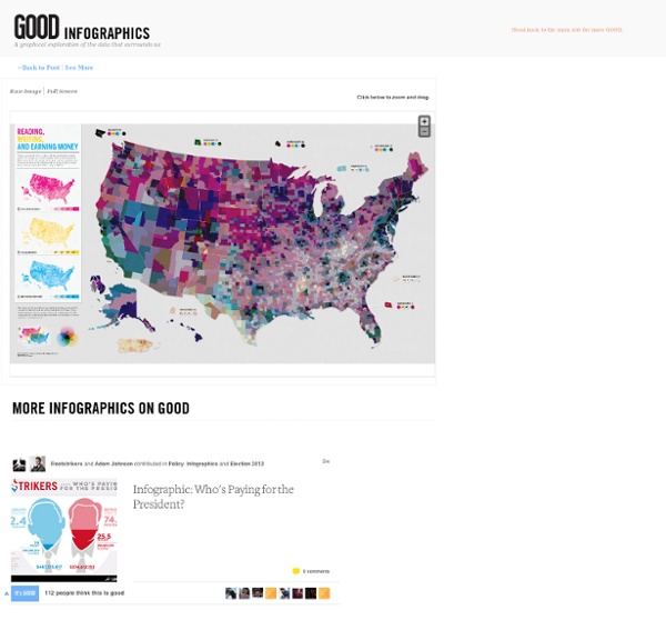
Educating the Workforce of the Future More Infographics on Good What Congress Would Look Like If It Were Demographically Representative of America More Infographics on Good