
10 of the coolest CSS3 and CSS effects We all know it and we all love it, and of course by now you probably already know I am talking about CSS and CSS3. Actually, we should probably take a moment to thank CSS3 before going any further for speeding up the load times for all of your favorite sites. They, if they know what they are doing, are more than likely using CSS3 in place of a ton of images to enhance user load times, which is pretty awesome. Text-based effects Anaglyphs They say Anaglyphs, even when done in CSS3, can be displayed in 3D if you have some snazzy goggles at your house. <h1>Anaglyph</h1> We will then do: This will give us that nice repetition, and will display: “Anaglyph Anaglyph” on the page. Using RGBA here is very important because it allows an alpha transparency to be set so that the overlaid text will not completely block the text under it, and gives us a nice transparency. Text gradients gradients seem to be all the rage these days, and rightly so. Linear, left to right: Radial Gradient: Dripping text or
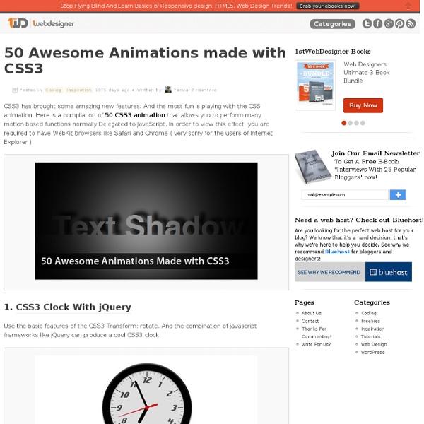
25 Excellent CSS3 Animations CSS3 has brought about a number of impressive new features. CSS3 animations is one of the most fun a new feature of CSS3. CSS3 Transitions in real use were introduced in late 2007 by Safari. At that time, they were referred as “CSS Animations”, but the terminology changed when Safari introduced their proprietary features also called CSS Animations. On previous post we are published article “15 CSS3 Menu Navigation Tutorials”. Create Animated Landscape using Pure CSS3 This tutorial is based on a simple animated experiment that showcases just one of the amazing things you can create using CSS. Some months ago we have created an animated landscape using Photoshop and jQuery. CSS3 Hover Image Gallery FormBox – A jQuery & CSS3 Drop-Down Menu With Integrated Forms FormBox is a jQuery and CSS3 powered navigation menu that supports integrated forms. CSS3 Car Animation CSS3 Progress Bar Our Solar System in Modern Browsers Ajax Style Loading Animation in CSS3 (no Images) CSS3 Accordion Snow
5 Extremely Useful But Rarely-Used CSS3 Properties - DesignFestival Diligent designers stay up to date with the latest in web design and development. Staying on the cutting edge of the web can give you an advantage in your web design business and can even make your design work substantially easier and better. Most web designers know and use CSS to create beautiful websites that are browser-friendly and consistent across all platforms. Having said that, there are some CSS3 properties that aren’t used as often as you would expect. Despite their rarity, they are extremely useful. Multiple Backgrounds Many designers don’t realize that you can implement multiple backgrounds into your website designs. To implement multiple backgrounds, you need to define them in the body tag and separate them with commas. The result is that the two images (the life preserver and the anchor) are placed in the top-right and the top-left of the browser. Transitions One of the biggest outcries with the decline of Flash is the lack of animation or transitional properties in CSS.
CSS3: Polaroid effect Sometimes photos looks much more better when they are displayed in Polaroid effect. Earlier, this effect is accomplished using photo editors such as Photoshop, corel draw etc. But now, using some simple CSS3 properties, you can create a realistic polaroid effect. This section explains you, to create a polaroid effect using CSS3 and a polaroid photo gallery with a simple animation without using javascript. The important thing should be noted that this works best in recent version of Chrome, Safari, Mozilla and Opera. The above code uses unordered list to create the polaroid effect. The below css code creates polaroid effect for the photos, I have used two different classes for ‘li’, they are ‘trans_-5′ and ‘trans_5′. Thats all folks! Like this: Like Loading...
CSS hacks & browser detection More and more web developers are ditching tables and coming round to the idea of using CSS to control the layout of their site. With the many benefits of using CSS, such as quicker download time, improved accessibility and easier site management, why not? The problem with CSS Historically the main problem with using CSS has been lack of browser support. This is no longer the case as version 5 browsers, which all have good support for CSS, now account for over 99% of browsers in use. Instead, the problem is that browsers can sometimes interpret CSS commands in different ways, causing developers to throw their arms up in the air and switch back to pixel-perfect table layouts. How browser detection using CSS hacks works The way browser detection using CSS hacks works is to send one CSS rule to the browser(s) you're trying to trick, and then send a second CSS rule to the other browsers, overriding this first command. The first command is intended for IE, the second for all other browsers.
CSS3 Cookbook: 7 Super Easy CSS Recipes to Copy and Paste CSS3 Cookbook: 7 Super Easy CSS Recipes to Copy and Paste By now you’ve probably seen enough lengthy CSS3 tutorials to last a lifetime. You’re probably starting to become familiar with what CSS3 has to offer and are ready to move past basic theory and see some practical design examples that you can copy and paste right into your code without without wading through tons of commentary. Well you’re in luck because that’s exactly what we have for you today! Letterpress Insetting text is fairly simple in CSS. To start off, fill your text with the darker shade of your background color. The HTML <body><div id="container"><p>pressed</p></div></body> The CSS Small Caps The small caps effect is when all of the letters in a headline are capital, but the initial letters in each word are larger than the rest. One easy way to do this is simply to insert “small” tags into your HTML and then to style those tags with a slightly smaller font size than the rest of the headline. CSS Coupon Stitched Gloss Conclusion
Writing a flippable book So. The day has come. You have finally grown bored of long scrolls of text and are looking for a new format. Something elegant. Something compact. Something that takes the long scroll, cuts it into neat little rectangles and binds them together. With the power of CSS regions (CanIUse, go to and enable CSS Regions) and CSS 3D transformations, cutting-edge book technology is finally available on modern browsers. Let’s start off by defining our book structure. <div class="book"><div><! We’re going to use CSS regions to flow the book text into the book pages. <span id="book-content"> blah blah blah ... Now that we have written our book, let’s define the flow CSS. Now the content from the #book-content span will go into the .book-pages divs instead. The guardian of the rainbow bridge imparts on us the wisdom of stylish structural selectors so that we may turn our HTML book structure into a more book-shaped form:
CSS2 - The display declaration The display property lets you define how a certain HTML element should be displayed. display: block display: block means that the element is displayed as a block, as paragraphs and headers have always been. Live example: display: inline display: inline means that the element is displayed inline, inside the current block on the same line. display: block display: inline display: none display: none means that the element is not displayed at all (so you won't see it in the example either). display: none display: inline-block An inline block is placed inline (ie. on the same line as adjacent content), but it behaves as a block. display: block Let's add some content to see how the block behaves. display: inline-block; width: 10emLet's add some content to see how the block behaves. Let's add some content to see how the block behaves. The real use of this value is when you want to give an inline element a width. Here’s the same example, but with display: inline. display: list-item display: list-item
5 CSS3 Design Enhancements That You Can Use Today Cascading Style Sheets (CSS) is the language of Web design, and the next generation of CSS design properties are just chomping at the bit to be released. Are you eager to start using them, but don’t know where to start? Although many of the new properties are not yet “official”, some browsers have already implemented many of the features of the coming CSS Level 3 specifications. The problem is that many browsers—most notably Internet Explorer—have not. The trick to using these new CSS3 features is to treat them as design enhancements. A design enhancement (which I discuss in my new book Speaking In Styles: The Fundamentals of CSS for Web Designers) is any flourish you add to your site designs that increases its visual appeal without diminishing its usability if the style is not rendered. This can be a tricky call, with there being a fine line between enhancement and not diminishing usability: This is the original design, before applying any CSS3 design enhancements 1. 2. border-radius: r; 3.
A JavaScript Content Switcher That Works Without JavaScript Recently, while doing research/work on a completely unrelated topic, I came across the beautiful illustrations on Rype Arts, which are displayed inside of a JavaScript-driven content switcher. For some reason, I happened to visit the page with JavaScript disabled and noticed that the content switcher was still working (albeit, with a few flaws). At first I couldn’t figure out how it was functioning. Normally, with JavaScript disabled, this type of content switcher (or content slider) will just display one item, or else display all items, without allowing any “switching” functionality. After some poking around, I realized it’s not a very difficult thing to do. View the Demo to preview what I’ll be describing below. Here is the HTML that I’ll be using to demonstrate this effect with and without JavaScript: The key part of this code is the <div> with the id “content-slider”. The CSS to style the content switcher is as follows (I’ve excluded all irrelevant styles): How it Works Compatibility
La propriété border-image en CSS3 Par Estelle Weyl Bien que ce ne soit pas vraiment une nouveauté pour les navigateurs, la propriété border-image est désormais disponible dans la spécification CSS3. border-image (littéralement : image de contour, NdT) offre une méthode pour ajouter des contours décoratifs à n’importe quel élément. Avec les propriétés de border-image, vous pouvez créer des contours décoratifs pour des éléments qui vont bien au-delà des simples coins arrondis, avec des images très légères ou même avec des dégradés. La propriété border-image vous permet de prendre une petite image, de la découper virtuellement en neuf tronçons, et de disposer ou d’étirer les morceaux de votre petite image au sein d’un autre élément beaucoup plus grand. Vous pouvez prendre une image et l’étirer sur toute la largeur d’un bouton ou d’une page entière. Dans ce second exemple, au lieu d’étirer le milieu de l’image de contour, nous l’avons répété. La propriété border-image est un raccourci qui permet de déclarer : border-image-width
CSS3 pronti per l'uso | Articoli Css | Css.HTML.it I CSS3 rappresentano il complemento ideale per formattare una struttura di contenuti realizzata con il nuovo linguaggio di marcatura di HTML5, e in questo articolo allestiremo graficamente il template per un blog realizzato per la guida HTML5, utilizzando quelle proprietà CSS3 che sono state implementate nei browser più moderni. Gli esempi presentati (prima e seconda demo) costituiscono un ottimo banco di prova per testare la compatibilità delle varie tecniche: nello specifico, i browser meglio supportati sono Internet Explorer 9, Firefox 4, Safari 5, Chrome 9 e Opera 11. Una delle novità più importanti dei CSS3 è che non sono più inglobati in una unica specifica monolitica in cui spingere tutti gli aggiornamenti del team di sviluppo del W3C; al contrario, essi consistono in una serie di moduli progettati per essere implementati separatamente e indipendentemente gli uni dagli altri. Figura 1 – Browser vendor prefixes
Domptez vos puces, dressez des listes Par Mark Newhouse Dès juillet 1999, je pontifiais à propos des vertus des feuilles de style dans diverses listes de discussion. Certaines choses ne changent pas. Mais ce qui a changé, c'est la façon dont je réfléchis à la mise en forme CSS et à la structure (X)HTML sous-jacente à laquelle elle est appliquée. Bien sûr, la raison pour laquelle nous ne les implémentons pas de cette manière est que nous ne voulons pas d'une puce devant chacun des liens de notre menu. Aujourd'hui, je vais montrer comment utiliser les CSS pour reprendre le contrôle de listes peu maniables au premier abord. Préparer le terrain Dans le cadre de cet article, j'utilise des listes non ordonnées. <ul><li>Item 1</li><li>Item 2</li><li>Item 3</li><li>Item 4</li><li>Item 5 - un peu plus long pour avoir plusieurs lignes</li></ul> Chaque liste est simplement placée dans un div différent, et le code CSS définit le comportement de chaque liste en fonction du div où elle se trouve. Le positionnement Les puces La navigation