
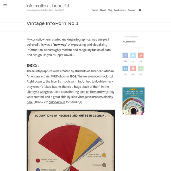
Black History Charts, 1900 Over 60 charts and maps, along with specially commissioned photographs were prepared for The Georgia Negro Exhibit, which was part of the larger display. Only three of these infographics are available in color from the Library of Congress. Click on them to view them larger. There are black and white reproductions of the entire group (see selection below), at the extensive online archive created by Professor Eugene F. Provenzo, Jr., of the University of Miami. The following excerpts from Professor Provenzo’s site offer more detail about the information graphics. Du Boise described the project in his autobiography:In 1900 came a significant occurrence which not until lately have I set in its proper place in my life. The variety and inventiveness of charting devices used, is quite impressive, especially for undergraduate Sociology students in 1900.
GCSE Bitesize: Key terms About What this is Zoom.it is a free service for viewing and sharing high-resolution imagery. You give us the link to any image on the web, and we give you a beautiful new way to experience it — along with a nice short URL. How it works Zoom.it converts your image to the Deep Zoom format, which lets you smoothly and efficiently explore the whole image, no matter how large. Zoom.it runs on Windows Azure and enhances the experience with Microsoft Silverlight when available. Why we made it We think every image on the web should be a beautiful, high-resolution one. The Exhibit of American Negroes The Exhibit of American Negroes was a sociological display within the Palace of Social Economy at the 1900 World's Fair in Paris. The exhibit was a joint effort between Daniel Murray, the Assistant Librarian of Congress, Thomas Calloway, a lawyer and the primary organizer of the exhibit, and W.E.B. Du Bois with the goal of demonstrating the progress and commemorating the lives of African Americans at the turn of the century.[1] It included a statuette of Frederick Douglass, four bound volumes of nearly 400 official patents by African Americans, photographs from several educational institutions (Fisk University, Howard University, Roger Williams University, Tuskegee Institute, Claflin University, Berea College), an African-American bibliography by the Library of Congress containing 1,400 titles, and W. E. Founding[edit] Current location Today the Exhibit of American Negroes is housed at the Library of Congress. References[edit] External links[edit]
Blología y Geologia ¡Por fin está lista! Ya está terminado el video sobre la exposición que hemos montado en IESNAPA Félix Urabayen sobre Cervantes y su época. Éste es el logo identificativo, con dos bacías y dos lanzas, en representación de don Quijote y su fiel escudero. La primera parte de Don Quijote de la Mancha,se publicaría el 16 de enero de 1605 por primera vez, para en 1615 aparecer la segunda parte del Quijote de Cervantes con el titulada “El ingenioso caballero don Quijote de la Mancha”. Muchos le conceden al extraordinario experimento de Cervantes el honor de haber inventado la novela, en oposición a la narrativa picaresca”, explica Harold Bloom en su ensayo El canon occidental. Este año celebramos el cuarto centenario de su muerte. Desde el Departamento de Cultura clásica se establece el paralelismo entre el episodio de las ovejas y el de Áyax, relatado por Homero en la Ilíada. Continúa por sus trabajos, contribuciones, relevancia en la actualidad y curiosidades.
MIT SENSEable City Lab W.E.B. Du Bois, radical visualization, and the transformative power of information « Seeing Complexity These graphics do actually have to do with my conference because at the time, Du Bois was teaching at Atlanta (now Clark Atlanta) University which happens to sit on the same campus as Morehouse (which is very nice, by the way). In fact, I was struck by how similar some of the images looked to hip contemporary visualization methods (see my posts here, here, and here). Of course, none of these are interactive or widely available, but they had in mind a similar goal: the dissemination of information in a compact form that tells a story, carrying meaning or implication beyond the numbers alone. This also got me thinking about the historical development of data visualization, a topic that I have covered before here, here and here. I commented to a friend yesterday that some of these were more reminiscent of the modernist graphic design–especially in advertising–coming out of New York, Los Angeles, or Rome in the 1930-1950’s. Like this: Like Loading...
WikiDidácTICa ( Educacion infantil, primaria, secundaria, bachillerato) De WikiDidácTICa Bienvenidos/as a la WikiDidácTICa. Con ella se pretende aprovechar el conocimiento colectivo del profesorado para construir un espacio útil que facilite la incorporación paulatina de los recursos digitales como medio didáctico en las distintas áreas y etapas educativas: Cada artículo de esta wiki tendrá información relacionada con un tema del currículo y presentará tres apartados: Recursos digitales útiles para aprender el contenido de que se trate, siempre que sean de acceso libre y gratuito. El contenido está disponible bajo los términos de la licencia Creative Commons Datavisualization A short visual history of charts and graphs « Seeing Complexity Most of the charts used today in data visualization among virtually all of the social sciences (economics included–you can’t get out of it this time) derive from the original design of William Playfair (1759-1823), political economist and a product of the Scottish enlightenment, and Johann Heinrich Lambert (1728-1777), a mathematician of the Alpine inclination. Together, they more or less popularized the idea that data could be presented to a mass audience. (The power of the long tail. Chart by William Playfair, 1786. via Robin Good) In the 1790′s, as people got wind of his pioneering work, they accused him of lie-telling and fabricating his data. (Playfair pie chart, via VML) Playfair’s Commercial and Political Atlas presented the first line chart in his examination of the imports and exports differences between Britain and various other countries. (The Universal Commercial History, Playfair, 1805. via Mrinal Wadhwa) Now Priestly was a somewhat different character. (via Wikipedia) Awesome.
Kidipede - History and Science for Kids feltron Mapping Neighborhoods in Boston, San Francisco and New York. Hand-drawn animation of 43 years of the Sun’s weather. (via kottke) William Stone Branching Drawings (identified by wowgreat) Geometric choropleths 1895 vs 1978