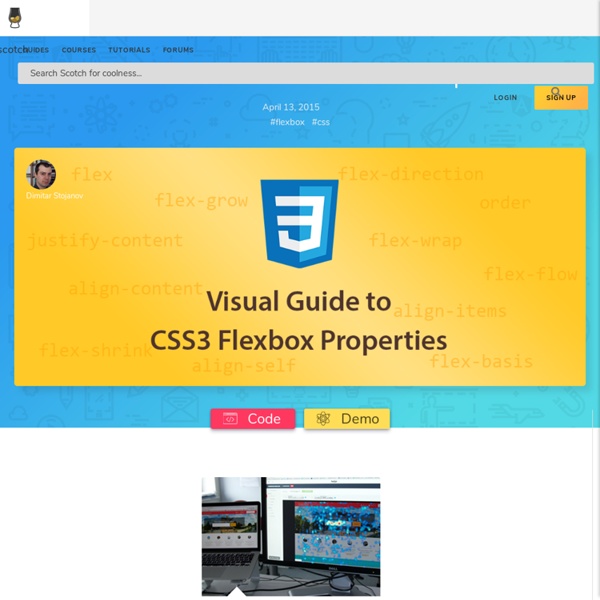
A Visual Guide to CSS3 Flexbox Properties ― Scotch
Solved by Flexbox — Cleaner, hack-free CSS
All of the code samples on this site show how to solve a particular design problem with Flexbox. They show just the code that's needed to make the demos work in a spec-compliant browser. Some browsers do not fully comply with the latest version of the spec, so sadly, a few workarounds were necessary. Workarounds for non-compliant browsers are not shown in the code samples, but if you're curious about those implementation details, you can check out the source files. Each demo links to its source, and all browser-specific workarounds are well-documented, so don't be afraid to take a look. The vendor prefixing and translating of current flex properties to their legacy equivalents is all handled by autoprefixer. The class naming convention used in the code samples and source files is taken from SUIT CSS, which is based on BEM methodologies. If you find a mistake or would like to suggest an additional example, feel free to open an issue or submit a pull request on Github.
Take Command of CSS Flexbox - Responsive Tutorial with Bootstrap 4
As a kid I loved playing with toy plastic army men. I would line them up and pretend to be in command giving orders to my soldiers in order to defeat the enemy. Since I was in full command, the soldiers would look to me for their orders. Sometimes a hot shot recruit would overstep my orders and go rogue, He would ignore and override my orders and just do what he wanted. My example demonstrates the basic principle of the CSS display property flexbox which is… Flex items (soldiers) follow the orders given by their flex container (commander). In addition, an individual flex item has the ability to override the orders given out by the flex container if required. In this post, I will be answering some of the most common questions and show you how to start using flexbox in your projects. What is flexbox? Flexbox is a CSS display property that was introduced in CSS3. The parent-child relationship of an unordered list <ul><li>list item</li><li>list item</li></ul> How does flexbox work? Your turn! flex
What is Bootstrap ? - Web Design Terms Glossary
The Bootstrap CSS framework is a front end toolkit built in style guide form. Or basically a collection of CSS and JS code recipes call components to help developers build responsive websites quickly. When Bootstrap was first created at Twitter it was built as a toolkit of reusable components with additional documentation and code snippets on how to use them. The documentation and ease of implementation, made it easy to share and reference with others, regardless of their skill level. Today, Bootstrap can be used in two main ways: Linking to a precompiled version via CDN or locallyA customized build using the Sass source files On the next page (Fig. 5) I explore the pros and cons of each method and also break them into smaller sub-methods to help you decide which is best for your project. For more information: What is Bootstrap? Term: Bootstrap Are you a beginner? Do you know what you're missing? Learn More
Designing the Flexbox Inspector - Mozilla Hacks - the Web developer blog
The new Flexbox Inspector, created by Firefox DevTools, helps developers understand the sizing, positioning, and nesting of Flexbox elements. You can try it out now in Firefox DevEdition or join us for its official launch in Firefox 65 on January 29th. The UX challenges of this tool have been both frustrating and a lot of fun for our team. Built on the basic concepts of the CSS Grid Inspector, we sought to expand on the possibilities of what a design tool could be. I’m excited to share a behind-the-scenes look at the UX patterns and processes that drove our design forward. Research and ideation CSS Flexbox is an increasingly popular layout model that helps in building robust dynamic page layouts. Our earliest research on design-focused tools included interviews with developer/designer friends and community members who told us they wanted to understand Flexbox better. We also ran a survey to rank the Flexbox features folks most wanted to see. Visualizing a new layout model What’s next
Related:
Related:
