
Псевдо-классы Псевдо-класс CSS это ключевое слово, добавленное к селектору, которое определяет его особое состояние.Например, :hover применит стиль, когда пользователь наводит курсор на элемент, указанный селектором. Псевдо-классы, вместе с pseudo-elements, позволят вам не только применить стиль к элементу, относящемуся к контенту дерева документа, но и к внешним факторам, таким как история навигации (:visited, например, статус контента (как :checked на некоторых элементах формы), или позиция курсора мыши ( :hover, которая дает знать, наведен ли курсор на элемент или нет. СинтаксисEdit Как читать CSS синтаксис. Список стандартных псевдо-классовEdit СпецификацииEdit Смотрите такжеEdit pseudo-elements Метки документа и участники Обновлялась последний раз:bychek.ru,
Compose to a Vertical Rhythm “Space in typography is like time in music. It is infinitely divisible, but a few proportional intervals can be much more useful than a limitless choice of arbitrary quantities.” So says the typographer Robert Bringhurst, and just as regular use of time provides rhythm in music, so regular use of space provides rhythm in typography, and without rhythm the listener, or the reader, becomes disorientated and lost. On the Web, vertical rhythm – the spacing and arrangement of text as the reader descends the page – is contributed to by three factors: font size, line height and margin or padding. All of these factors must calculated with care in order that the rhythm is maintained. The basic unit of vertical space is line height. Establishing a suitable line height The easiest place to begin determining a basic line height unit is with the font size of the body copy. Spacing between paragraphs With our rhythmic unit set at 18px we need to ensure that it is maintained throughout the body copy.
Атрибут title Атрибут title в HTML Атрибут создаёт всплывающую подсказку при наведении курсора мышки на элемент. Внешний вид подсказки изменить нельзя. <mark title="какой-то текст">Title</mark> Содержимым атрибута может быть только текст. <mark title="строка 1 строка 2 строка 3">Title</mark> Для того, чтобы внутри title сделать кавычки, их следует заменить на специальные символы. <a href="" title=""какой-то текст"">специальные символы</a> Если нужны свойства title, но не нужно, чтобы данные были показаны человеку во всплывающей подсказке, то применяется атрибут date-*. <div data-tel="89033000000">номер телефона</div> В JavaScript от ищется как .dataset.name <div>номер телефона</div><script> document.querySelector('div').dataset.tel = "89033000000"; </script> title не индексируется: Яндекс, Google. title в изображениях | SEO Title в теге img учитывается только Яндексом [эксперимент Devaka]. title в ссылке: Яндекс, Google title в картинке: Яндекс, Google alt: Яндекс, Google Вывод:
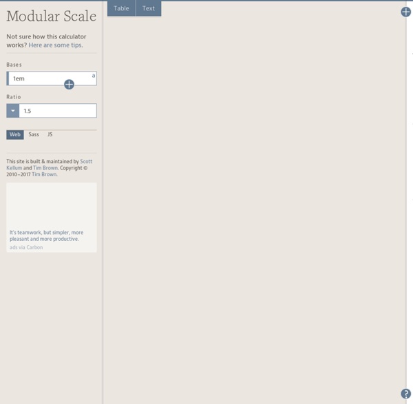
47 Top Typography Tools and Resources Typography is the foundation of design on the web. Back in 2006, designer and founder of iA Oliver Reichenstein even went so far as to proclaim "web design is 95% typography." It's imperative, then, to have a thorough, grounded education in optimizing and utilizing typography to create a balanced, harmonious, accessible hierarchy of content, when working on the web. To help you improve and learn more about typography, we have compiled 25 useful tools and resources, from fundamentals to modular scales. Have we left out your favorite typography tool or resource? If so, please share your recommendations with other readers in the comments. 1. Founded in 2008, Typekit offers a library of fonts, from old classics to new favorites, which can be used on the web. The browsing interface is well organized. 2. Recently acquired by Monotype, Typecast provides a platform to quickly style type in the browser and check for readability, rendering and beauty as you work. 3. 4. 5. 7. 8. 9. 10. 11. 12. 13.
easy2code
Calculateur de proportions (en pixel) basé sur le chiffre d'Or by mebae Oct 28